- Window Views
- Working with Icon View
- Working with List View
- Working with Column View
- Working with Cover Flow
- Customizing Window & Desktop Views
This chapter is from the book
This chapter is from the book
This chapter is from the book
Customizing Window & Desktop Views
You can customize views a number of ways:
- Change the settings for the default view for icon, list, column, and Cover Flow views.
- Change the settings for an individual window's view.
- Change the view for the desktop.
The view options window offers a number of options for the active window:
- Icon view settings include icon size, grid spacing, label text size and position, display options, arrangement, and background.
- List view settings include icon size, text size, columns, date format, and item size calculation.
- Column view settings include text size, icon appearance, and preview column.
- Cover Flow view options include icon size, text size, columns, date format, and item size calculation.
- Desktop view settings include icon size, label text size and position, display options, and arrangement.
You can also display the status bar with disk information and the path bar with information about a file's location on disk in any Finder window.
To open view options
- Open the window you want to set view options for.
- If necessary, switch to the view you want to customize.
Choose View > Show view options (Figure 5), or press
 .
.The view options window for that view appears (Figures 38, 48, 49, 50, 53, and 55).
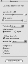
Figure 38 Default view options for icon view.
)
To set icon view options
- Open the view options window (Figure 38) for the icon view window you want to customize (Figure 39).
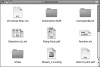
Figure 39 Here's a typical icon view window with default options applied.
- To set the window so it always opens in icon view, turn on the Always open in icon view check box.
- To change the size of icons in the window (Figures 39 and 40), drag the Icon size slider to the left or right.
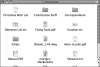
Figure 40 In this example, I've reduced the icon size and grid spacing and increased the font size.
- To change the amount of horizontal space between each icon, drag the Grid spacing slider to the left or right (Figures 39 and 40).
- Choose a type size from the Text size pop-up menu. Your options range from 10 to 16 points. The font size for item names changes accordingly (Figure 40).
- Select a Label position option button to specify where icon labels should appear: Bottom (Figure 40) or Right (Figure 41).
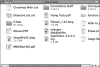
Figure 41 In this example, labels are on the right and item info is displayed.
- Toggle check boxes to specify how icons should appear:
- Show item info displays information about the item beneath its name (Figure 41).
- Show icon preview displays a document's preview, if available, in place of its standard icon.
- Choose an option from the Arrange by pop-up menu (Figure 42). None does not arrange the icons at all. Snap to Grid forces icons to snap to the window's invisible grid, thus ensuring consistent spacing between icons. The remaining options keep icons automatically arranged in the order you choose.
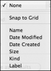
Figure 42 Use this menu to set automatic arrangement options.
- Select a Background option:
- White makes the background white.
-
Color enables you to select a background color for the window. If you select this option, click the color well that appears beside it (Figure 43), use the Colors dialog (Figure 44) to select a color, and click OK.
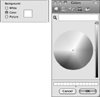
Figures 43 & 44 When you choose Color in the Background area (above) you can use a standard Colors dialog to choose a color for a window's background.
-
Picture enables you to set a background picture for the window. If you select this option, click the Select button that appears beside it (Figure 45), use the Select a Picture dialog to locate and select a background picture (Figure 46), and click Select.
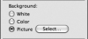
Figure 45 When you choose Picture in the Background area...
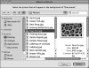
Figure 46 ...you can use the Select a Picture dialog...
- To make the settings the default settings for all icon view windows, click the Use as Defaults button at the bottom of the view options window (Figure 38).
When you're finished setting options, click the view option window's close button to dismiss it.
A background picture fills the window's background behind the icons (Figure 47).
Figure 47 ...to set a background picture for a window.
)
)
)
)
)
)
)
)
To set list view or Cover Flow options
Open the view options window (Figure 48) for the list view window you want to customize (Figure 50).
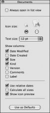
Figure 48 Here are the default view options settings for a list view window...
or
Open the view options window (Figure 49) for the Cover Flow window you want to customize.
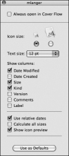
Figure 49 ...and here are the default view options settings for a Cover View window.
To set the window so it always opens in list view, turn on the Always open in list view check box.
or
To set the window so it always opens in Cover Flow, turn on the Always open in Cover Flow check box.
- Select an Icon size option by clicking the radio button beneath the size you want. Figure 50 shows an example with the large icon size.
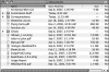
Figure 50 Here's a typical list view window with default settings applied.
- Choose a type size from the Text size pop-up menu. Your options range from 10 to 16 points. Figure 51 shows an example with 16-point type.
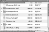
Figure 51 In this example, I've selected the larger icon and font size, enabled size calculation, and am displaying the modification date instead of the creation date. (And no, my eyes aren't that bad. Yet.)
- Select the columns you want to appear in list view by turning Show columns check boxes on or off:
- Date Modified is the date and time an item was last changed.
- Date Created is the date and time an item was first created.
- Size is the amount of disk space the item occupies.
- Kind is the type of item. I tell you about types of items in Chapter 2.
- Version is the item's version number.
- Comments is the information you entered in the Spotlight Comments field of the Info window. I tell you about the Info window in Chapter 7.
- Label is the label assigned to the item.
-
Toggle check boxes to set other options:
- Use relative dates displays the date in relative terms (that is, using the words today and yesterday).
- Calculate all sizes displays the disk space occupied by items and the contents of folders in the list.
- Show icon preview shows a document preview for the icon if a preview is available.
To make the settings the default settings for all list view windows, click the Use as Defaults button at the bottom of the view options window (Figure 48).
or
To make the settings the default settings for all Cover Flow windows, click the Use as Defaults button at the bottom of the view options window (Figure 49).
- When you're finished setting options, click the view option window's close button to dismiss it.
)
)
)
)
To set column view options
- Open the view options window (Figure 52) for the column view window you want to customize.
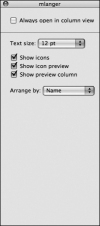
Figure 52 The default view options settings for a column view window.
- To set the window so it always opens in list view, turn on the Always open in column view check box.
- Choose a type size from the Text size pop-up menu. Your options range from 10 to 16 points.
- Toggle check boxes to set other options:
- Show icons displays icons with item names.
- Show icon preview displays an item's preview as its icon.
- Show preview column displays an item preview in the rightmost column when the item is selected.
- Choose an option from the Arrange by pop-up menu (Figure 53) to specify the sort order for each column.
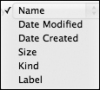
Figure 53 The Arrange by pop-up menu.
- When you're finished setting options, click the view option window's close button to dismiss it.
)
)
To set desktop view options
- Click anywhere on the desktop to activate it.
- Display the view options window (Figure 54).
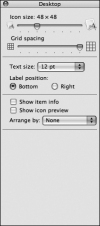
Figure 54 The view options window for the desktop.
- To change the size of icons on the desktop, drag the Icon size slider.
- To change the amount of horizontal space between each icon, drag the Grid spacing slider to the left or right.
- Choose a type size from the Text size pop-up menu. Your options range from 10 to 16 points.
- Select a Label position option button to specify where icon labels should appear: Bottom or Right.
- Toggle check boxes to specify how icons should appear:
- Show item info displays information about the item beneath its name.
- Show icon preview displays a document's preview, if available, in place of its standard icon.
- Choose an option from the Arrange by pop-up menu (Figure 42). None does not arrange the icons at all. Snap to grid forces icons to snap to the window's invisible grid, thus ensuring consistent spacing between icons. The remaining options keep icons automatically arranged in the order you choose.
)
To display the status & path bars
To display the status bar, choose View > Show Status Bar (Figure 5). The status bar appears above the window's contents (Figure 55).
)
Figure 55 A window displaying the status bar and path bar.
Or
To display the path bar, choose View > Show Path Bar (Figure 5). The path bar appears at the bottom of the window (Figure 55).
TIPs
- The status bar always appears when the toolbar is displayed (Figure 1).
- As shown in Figures 1 and 55, the status bar shows the number of items in the window and the total amount of space available on the disk.
- If one or more items are selected in a window, the status bar reports how many items are selected (Figure 56).
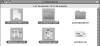
Figure 56 When you select multiple items, the status bar indicates the number of items selected.
- When the status bar is displayed, it appears in all Finder windows.
- As shown in Figure 55, the path bar shows the complete path to the window or a single item selected within it.
)
)
)
To hide the status bar
Choose View > Hide Status Bar. The status bar disappears.
Or
Choose View > Hide Path Bar. The path bar disappears.