Dreamweaver CS5.5 Studio Techniques: Progressive Enhancement with HTML5 and CSS3
From the book
From the book
From the book
When we treat them as if they were what they should be, we improve them as far as they can be improved.
—Goethe
Back in the 1990s, it was common for the front page of a website to inform visitors that it was “best viewed” in a particular browser. Designers often gave up trying to reconcile incompatible differences between Internet Explorer (IE) and Netscape. If you weren’t using the recommended browser, that was just your hard luck. When IE eventually emerged as the victor in the browser wars, many designers breathed a sigh of relief and designed exclusively for IE. But if you weren’t using IE—and many weren’t—it was still your hard luck. A more enlightened approach known as graceful degradation emerged with the web standards movement in the first decade of the new century. If a feature couldn’t be supported by a particular browser—usually Netscape 4—a fallback solution prevented the design from breaking completely.
In more recent times, leading designers have turned this idea on its head, arguing that you shouldn’t need to wait for the majority of browsers to implement a feature before using it. They advocate progressive enhancement—building a website that works satisfactorily in all current browsers and then adding features to improve the experience for visitors using more advanced browsers. Visitors using earlier browsers get a satisfactory experience; when they upgrade, they automatically see the improved features.
In this chapter, you’ll learn how to apply progressive enhancement to a website for a fictitious hotel. In the next chapter, I’ll show you how to adapt it for display in mobile phones and tablets through the use of media queries.
Improving an Existing Site
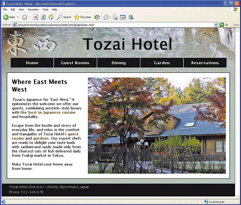
The Tozai Hotel site has been designed using an XHTML 1.0 Strict DOCTYPE. The main pages look identical in all current browsers. Figure 2.1 shows index.html in IE 6.
)
Figure 2.1 The basic design looks satisfactory in IE 6.
There’s just one minor exception. The styles for the inquiry form in reservations.html include the following rules:
select + label, input + label {
    padding-left: 10px;
}
input[type=submit] {
    margin-left: 135px;
}
The first rule uses the adjacent sibling selector to add 10 pixels of padding to the left of <label> tags that immediately follow a <select> or <input> element. The second rule uses an attribute selector (see Table 1.1) to add a 135-pixel margin to the left of the submit button. The result is a neatly aligned form in all modern browsers (Figure 2.2).
)
Figure 2.2 In modern browsers, the form elements are neatly aligned.
IE didn’t support adjacent sibling or attribute selectors until IE 7. As a result, the form is not so neatly aligned in IE 6 (Figure 2.3). Also, the word Guests appears in a different color, because it’s the <legend> element of a <fieldset> surrounding the input fields for adults and children. These minor differences don’t affect the usability of the form and can be ignored for a browser with a small and declining market share.
)
Figure 2.3 IE 6 doesn’t recognize all the CSS styles, which results in a less pleasing but still usable layout.
In this chapter, you’ll make the following enhancements to the site:
- Convert from XHTML 1.0 to HTML5
- Add accessibility attributes to key elements
- Use an embedded font for headings
- Enhance the design with CSS rounded corners and drop shadows
- Add HTML5 form elements and attributes
- Use jQuery to improve the date pickers
- Validate the finished pages
Converting to HTML5
As mentioned in Chapter 1, all that’s needed to convert a page to HTML5 is to replace the existing DOCTYPE declaration with the case-insensitive new one:
<!DOCTYPE HTML>
Because the pages in the Tozai Hotel site were created with an XHTML 1.0 Strict DOCTYPE, tags that don’t have a corresponding closing tag, such as <img> and <link>, have a forward slash before the closing angle bracket like this:
<link href=”styles/tozai.css” rel=”stylesheet”type="text/css" />
To ease the transition between XHTML 1.0 and HTML5, the closing slash is permitted, but it’s no longer required. It was added to XHTML solely to conform to the rules of XML. Dreamweaver CS5.5 makes it easy to switch the DOCTYPE and strip out unnecessary code by choosing File > Convert > HTML5.
Another change you need to make when converting to HTML5 concerns the use of bold text and italics. For many years, it was considered best practice to use <strong> instead of <b> for bold text and <em> instead of <i> for italics. The idea was to handle all presentational aspects of a web page through CSS. The <b> and <i> tags were considered presentational, whereas <strong> and <em> were said to be related to the document’s structure.
Although well intentioned, this practice frequently made little sense and simply replaced <b> and <i> with longer equivalents. In addition, it resulted in screen readers for the blind giving unnecessary emphasis to words styled in bold or italics. HTML5 has redefined the meanings of these tags to clarify their use, as summarized in Table 2.1.
Table 2.1 HTML5 Tags for Bold, Italics, and Emphasis
|
Tag |
Meaning |
<b> |
A span of text stylistically offset from the surrounding text in bold type without conveying extra importance, for example, keywords in a document or product names in a review. |
<i> |
A span of text that needs to be offset from the surrounding text in italics, such as a technical term, foreign language expression, thought, or ship’s name. |
<strong> |
Indicates strong importance, for example, <strong>Warning!</strong>. The level of importance can be increased by nesting <strong> tags like this: <strong><strong>Very severe warning!</strong></strong>. |
<em> |
Indicates that the word(s) should be emphasized if spoken aloud. Like <strong>, the level of emphasis can be increased by nesting <em> tags. |
By default, Dreamweaver uses <strong> and <em> for bold and italic type. If you’re using an HTML5 DOCTYPE, you should change this setting in the Preferences panel.
To convert a page to HTML5 and change how bold text and italics are handled:
- Open index.html in the Document window, and choose File > Convert > HTML5. This changes the DOCTYPE and strips out all closing slashes.
- Open the Preferences panel by choosing Edit > Preferences (Dreamweaver > Preferences on a Mac).
- Select the General category from the list on the left of the panel, and deselect the check box labeled Use <strong> and <em> in place of <b> and <i>.
- Click OK to close the Preferences panel.
- With index.html still in the Document window, switch to Split view by clicking the Split button in the Document toolbar or choosing View > Code and Design.
- In Design view, double-click Tozai in the first paragraph to select the whole word. In Code view, the highlighted word is wrapped in <em> tags. Tozai is a foreign word, so it needs to be offset without giving it emphasis. The <em> tags need to be replaced with <i> tags.
- Make sure the Property inspector
is in HTML mode with the
 button
selected, and click the
button
selected, and click the  button
to remove the italics and the <em> tags.
button
to remove the italics and the <em> tags. - Click the button
again. This restores the italics,
but this time the word is wrapped
in <i> tags (Figure
2.4).
- With the word and its surrounding <i> tags still selected, open the Tag Inspector panel, expand the Language category, and click in the field next to the lang attribute. Choose ja from the list of values to indicate the language used is Japanese.
- Repeat steps 6–9 with the other foreign words (sashimi and sushi in the second paragraph).
- Convert dining.html, garden.html, reservations.html, and rooms.html to HTML5, and change the <em> tags to <i> tags in dining.html.
- Choose File > Save All.
)
Figure 2.4 The <i> tags offset the foreign word without giving it emphasis.
Alternatively, position the insertion point just before the closing bracket of the opening <i> tag, and press Enter/Return. Select lang from the code hints list, and then select ja.
Using <strong> and <em> tags
Resetting the Dreamweaver preferences
to use <b> and <i> doesn’t
prevent you from using <strong> and <em> where
appropriate. Instead of using
the  and buttons
in the Property inspector in HTML
mode, use the Text category of
the Insert panel, which has separate
options for each tag (Figure
2.5).
and buttons
in the Property inspector in HTML
mode, use the Text category of
the Insert panel, which has separate
options for each tag (Figure
2.5).
)
Figure 2.5 The <strong> and <em> tags can be inserted through the Insert panel.
Alternatively, select the text in Design view, right-click, and choose Wrap Tag from the context menu. Then type either strong or em.
TIP
The and buttons
in the Property inspector can
be used to remove <strong>, <em>, <b>,
and <i> tags that
you don’t want regardless
of the Preferences setting. However,
make sure the button
is selected on the left of the
Property inspector. If the  button
is selected instead, you’ll
be prompted to create a style
rule. An alternative way to remove
unwanted tags is to select the
element in the Tag selector at
the bottom of the Document window,
right-click, and choose Remove
Tag.
button
is selected instead, you’ll
be prompted to create a style
rule. An alternative way to remove
unwanted tags is to select the
element in the Tag selector at
the bottom of the Document window,
right-click, and choose Remove
Tag.
Improving Accessibility with ARIA Roles
Until IE 8 and earlier disappear from the scene, using HTML5 semantic tags, such as <header> and <nav>, will remain problematic unless you wrap them in <div> tags (see “Supporting HTML5 Semantic Tags” in Chapter 1). An alternative worth considering is to mark up your pages with universally supported HTML elements, such as <div> and <ul>, and to indicate their meaning by adding the WAI-ARIA role attribute.
The role attribute has been adopted by HTML5, and it’s understood by many screen readers. So, it provides a useful transition until such time as the new semantic tags are fully supported. The attribute has a large number of possible values (for a full list, see http://www.w3.org/TR/wai-aria/roles#role_definitions). Table 2.2 lists the equivalent role attributes for the main HTML5 semantic elements. Where multiple values are shown, the primary one is listed first.
Table 2.2 WAI-ARIA Roles for HTML5 Semantic Elements
|
HTML5 Element |
WAI-ARIA Role |
<article> |
article |
<aside> |
note, complementary, search |
<footer> |
contentinfo |
<header> |
banner(see note) |
<nav> |
navigation |
<section> |
region, contentinfo, main, search |
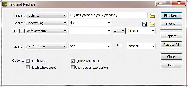
Unfortunately, code hints in Dreamweaver CS5.5 don’t support the role attribute. You need to edit the code manually. However, rather than accessing individual tags to add ARIA roles, it’s more efficient to use Dreamweaver’s Find and Replace dialog box.
- Press Ctrl+F/Command+F or choose Edit > Find and Replace to open the dialog box. It doesn’t matter whether you have any documents open.
- Select Folder from the “Find
in” list,
and click the
 icon
on the right of the text
field to select the folder
that contains your working copies
of the Tozai Hotel site files.
icon
on the right of the text
field to select the folder
that contains your working copies
of the Tozai Hotel site files. - Select Specific Tag from the Search list, and set the field on the right to “div.”
- If necessary, click the plus button to display the next option, and set it to With Attribute. Set the values of the three options to “id”, “=”, and “header” respectively.
- If other search options are visible, click the minus button to remove them from the dialog box.
- Set Action to Set Attribute.
- Type role in the next field, and banner in the To field.
- Check that the settings in the Find and Replace dialog box look like Figure 2.6, and click Replace All.
- If the files aren’t currently open, Dreamweaver warns you that the operation can’t be undone. Click Yes to confirm you want to proceed.
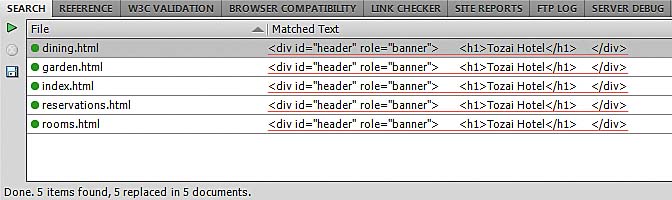
- Dreamweaver displays the results in the Search tab of the Results panel (Figure 2.7). It should confirm that five items were affected.
- Click the right-facing green arrow at the top left of the Results panel to reopen the Find and Replace dialog box.
- The main content in index.html is in a <div> with the ID hero. In rooms.html, it’s in a <div> with the class content-wide. In both pages, the main content stretches the full width of the page.
- After making the changes, close the Results panel by right-clicking the gray area to the right of the tabs and choosing Close Tab Group. Alternatively, collapse it by pressing F7.
)
Figure 2.6 Using Find and Replace is a quick way to add the role attribute to multiple pages.
)
Figure 2.7 The Results panel displays the affected tags.
In the other three pages, the main content is in a <div> with the class content-medium. These pages also have a sidebar, which is a <div> with the class aside.
Add the role attribute to these sections using the settings in Table 2.3.
Table 2.3 Find and Replace Settings for ARIA Roles
|
Specific Tag |
With Attribute |
To |
ul |
id = nav |
navigation |
div |
id = hero |
main |
div |
class = content-wide |
main |
div |
class = content-medium |
main |
div |
class = aside |
complementary |
div |
id = footer |
contentinfo |
Embedding a Font with @font-face
Greater font choices in web pages have been a long time coming. Believe it or not, but IE has supported embedded fonts since the release of IE 4 in 1997, and @font-face was part of the original CSS2 proposals in 1998. But a combination of technical and licensing problems prevented widespread use of embedded fonts. Now they’re truly back on the agenda.
The W3C has published a proposed new standard called Web Open Font Format (WOFF). It has received the backing of many font foundries and is supported in Firefox 3.6, IE 9, and Chrome 5. It’s not available in Safari 5 but is expected to be supported in later releases.
WOFF is relatively new but has enjoyed a rapid rate of adoption, leading to the prospect of a standard, unified format for embedded fonts. That still leaves the problem of earlier browsers. Prior to IE 9, IE used a proprietary format called Embedded Open Type (EOT). Opera and Safari currently support TrueType (TTF) and OpenType (OTF).
One solution is to use an online font library service, such as Typekit (http://typekit.com). Instead of storing the font files on your web server, they’re downloaded from the font library’s content distribution network. The download script detects the correct format to serve the browser, and the library handles all licensing issues on your behalf. A disadvantage—at least in the case of Typekit—is that it doesn’t work if JavaScript is disabled in the browser. Some free options are available, but you normally have to pay, and the pricing model varies from company to company.
Another solution is to use WOFF only and specify several web-safe fonts as backup. You should always specify fallback fonts anyway in case the embedded fonts can’t be downloaded. However, for the most reliable cross-browser support, it’s best to offer the font files in multiple formats and let the browser choose.
To demonstrate the use of @font-face in Dreamweaver CS5.5, I have chosen a free font called Calluna Regular, which was created by the Dutch font designer Jos Buivenga. The following instructions describe how to obtain the font and embed it with @font-face:
- Go to http://www.fontspring.com/fonts/exljbris/calluna, scroll down to Calluna Regular, and click Add to Cart.
- Go to the checkout. If you haven’t used fontspring.com before, you will be asked to create an account.
- Click the download link, and save the ZIP file to your local hard disk when prompted.
- Unzip the contents of the file to a new folder. It should contain a folder called web fonts, plus a copy of the license and a file called Calluna-Regular.otf. This last file is for desktop use. It should not be used in your website.
- Inside the web fonts folder is another called calluna_regular_macroman, which contains the following files:
- Create a folder called fonts in your working copy of the Tozai Hotel site, and copy the four files from the calluna_regular_macroman folder into the new folder.
- Insert the following @font-face rule at the top of styles/tozai.css:
- Now that CallunaRegular has been defined with @font-face, you can use it in font-family property declarations like any other font. Add the following style rule to tozai.css immediately after the @font-face declaration:
- Save tozai.css, and open one of the HTML pages in the Document window. Activate Live view to see how the font in the headings changes from a heavy sans-serif (Figure 2.8) to a more delicate serif (Figure 2.9).
One of the conditions of the web font license is that you must put a link to http://www.exljbris.nl on your site. Alternatively, you can add a notice to your style sheet crediting the creator of the font.
Calluna-regular-webfont.eot
Calluna-regular-webfont.svg
Calluna-regular-webfont.ttf
Calluna-regular-webfont.woff
These files contain the Calluna Regular font in the various formats needed to support all browsers.
@charset “utf-8”;
@font-face {
    /* A font by Jos Buivenga (exljbris) ->
        http://www.exljbris.com */
    font-family: ‘CallunaRegular’;
    src: url(‘../fonts/Calluna-Regular-
         webfont.eot’) format(‘eot’);
    src: url(‘../fonts/Calluna-Regular-
         webfont.eot?iefix’) format(‘eot’),
        url(‘../fonts/Calluna-Regular-
         webfont.woff’) format(‘woff’),
        url(‘../fonts/Calluna-Regular-
         webfont.ttf’)  format(‘truetype’),
        url(‘../fonts/Calluna-Regular-
         webfont.svg#webfontrsodunSr’)
         format('svg');
}
body {
This adds the credit to the font designer, as required by the license, declares CallunaRegular as a font-family property, and then tells the browser where to find the font files. For an explanation of the syntax, see http://www.fontspring.com/blog/further-hardening-of-the- bulletproof-syntax.
The value after the hash sign for the .svg file comes from the stylesheet.css file in the calluna_regular_macroman folder. It might be different in the version that you download, so check the value.
    h1, h2, h3 {
        font-family: CallunaRegular, “Palatino
         Linotype", "Book Antiqua", Palatino,
         serif;
    }
)
Figure 2.8 Design view displays the headings using the computer’s installed font.
)
Figure 2.9 Live view uses the embedded font defined by the @font-face rule.
Adding a Drop Shadow to Text
The text-shadow property adds a drop shadow to text without the need for graphics. It’s not supported by IE, but IE simply ignores it and renders the text as normal.
The text-shadow property usually takes a space-separated list of four values:
- The horizontal distance of the shadow from the text
- The vertical distance from the text
- The amount of blur
- The color of the shadow
The first three values can be expressed in pixels, ems, or any other measurement valid in CSS. The first two values can be positive or negative: Positive values position the shadow to the right and down; negative values move it to the left and up. The third value cannot be negative, although it can be 0, or omitted.
To simplify the application of text-shadow, Dreamweaver CS5.5 provides a subpanel of the CSS Styles panel, which works in conjunction with Live view.
To add a drop shadow to the headings:
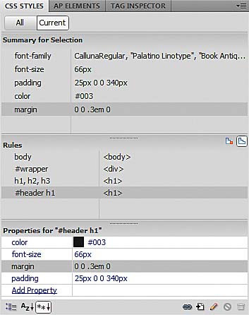
- With one of the Tozai Hotel pages open in the Document window, click anywhere in the text of the <h1> heading, and open the CSS Styles panel. If it’s not already selected, click the Current button at the top left of the panel to display the properties for #header h1 (Figure 2.10).
- Activate Live view.
- Click the Add Property link at the bottom of the Properties pane in the CSS Styles panel, and select text-shadow from the list.
- Click the
 icon
displayed to the right of
the property name to open
the subpanel where you set
the text-shadow values.
icon
displayed to the right of
the property name to open
the subpanel where you set
the text-shadow values. - Set X-Offset, Y-Offset, and Blur radius to 3px each. You won’t see any change in Live view until you set the value for Color.
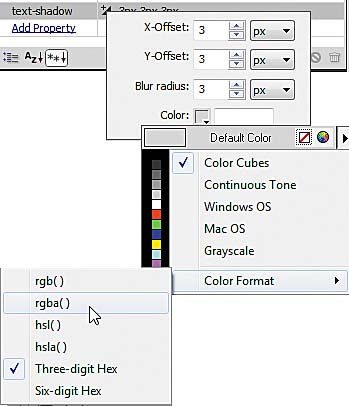
- Click the color box at the bottom of the subpanel to open the color picker. Then click the right-facing arrow at the top right of the color picker, and choose Color Format > rgba() (Figure 2.11).
- Use the eyedropper tool to select black, and click away from the color picker to close it. Live view displays a drop shadow on the main heading, but the effect of the opaque black shadow is rather overpowering (Figure 2.12).
- In the Properties pane of the CSS Styles panel, click the field that displays the text-shadow setting to edit it, and change the final rgba() value from 1 (opaque) to 0.25 (25 percent opacity) like this:
- Press Enter/Return to save the change. Live view updates the drop shadow, which now looks subtler (Figure 2.13).
- If you’re not happy
with the drop shadow, you
can adjust the settings by
clicking the icon
to reopen the subpanel. Live
view automatically updates
with each change. There’s
no need to close the subpanel
to see the effect. If you decide
to change the color, Dreamweaver
remembers your choice of
color format.
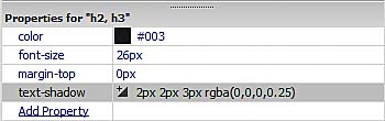
- With Live view still active, click the heading of the page’s main content or of a sidebar to select the properties for the h2, h3 style rule in the Properties pane of the CSS Styles panel.
- Repeat steps 4–9 to add the text-shadow property, setting X-Offset and Y-Offset to 2px, and Blur radius to 3px (Figure 2.14).
)
Figure 2.10 The Properties pane of the CSS Styles panel shows the styles for the main heading.
)
Figure 2.11 Change the color format for the drop shadow to rgba().
)
Figure 2.12 Using opaque black produces an overpowering drop shadow.
3px 3px 3px rgba(0,0,0,0.25)
)
Figure 2.13 Reducing the opacity of the drop shadow results in a subtler effect.
)
Figure 2.14 The drop shadow offset for the other headings is smaller.
Adding Shadows to Page Elements
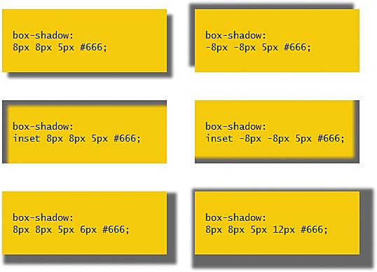
The property that adds a drop shadow to elements other than text is box-shadow. It works almost identically to text-shadow, but the shadow can be inset instead of extend- ing beyond the element. The Dreamweaver box-shadow subpanel also allows you to define how far the shadow spreads in all directions.
Figure 2.15 demonstrates how box-shadow works. The examples in the top row display the shadow outside the element. Using negative offset values in the example on the right casts the shadow to the left and up. The examples in the middle row use the same offsets and blur radius, but the inset keyword puts the shadow inside the element.
)
Figure 2.15 Examples of box-shadow effects.
The examples in the bottom row add a value for spread, which affects all four directions after the horizontal and vertical offsets have been applied. In the example on the left, the spread (6px) is smaller than the horizontal and vertical offsets (8px). As a result, the spread to the left and top remains hidden behind the element. The spread in the example on the right is greater than the offsets, so a small part of the shadow appears to the left and top, but the main shadow extends to the right and down.
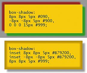
You’re not limited to a single shadow. You can apply complex shadow effects by listing a comma-separated list of shadow values as shown in Figure 2.16. The top example applies red and green shadows on opposite sides, followed by a gray shadow with no offsets or blur but a 15-pixel spread. The shadows are stacked with each successive one displayed behind its predecessors. The bottom example applies two inset shadows, followed by an external drop shadow.
)
Figure 2.16 Multiple shadows can be applied as a comma-separated list.
Using the box-shadow subpanel is very similar to adding text-shadow, but it involves several extra steps, because browser support for box-shadow hasn’t reached the same level of stability.
To add drop shadows on page elements:
- Open one of the following pages in the Tozai Hotel site—dining.html, garden.html, or rooms.html—and deactivate Live view, if necessary.
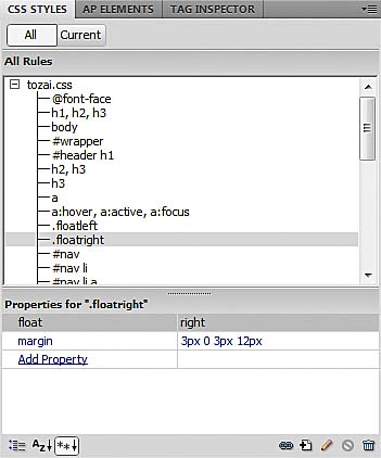
- In the CSS Styles panel, click the All button at the top left of the panel, and select .floatright in the All Rules pane (Figure 2.17).
- Click the New Style Rule icon
 at
the bottom right of the CSS
Styles panel to open the
New CSS Rule dialog box.
at
the bottom right of the CSS
Styles panel to open the
New CSS Rule dialog box. - Use the following settings:
- Selector Type: Compound
- Selector Name: .floatleft, .floatright
- Rule Definition: tozai.css
- Click OK to open the CSS Rule Definition dialog box.
- The box-shadow property is not supported by the CSS Rule Definition dialog box, so click OK to close it and create an empty style rule.
- Check that the new
style rule is selected in
the All Rules pane, and click
the
 icon
at the bottom left of the
CSS Styles panel to switch the
Properties pane to Category
view.
icon
at the bottom left of the
CSS Styles panel to switch the
Properties pane to Category
view. - Activate Live view, and make sure you can see one of the inline images in the Document window.
- In the Properties pane of the CSS Styles panel, expand the Webkit category, and locate -webkit-box-shadow.
- Click the icon
next to the property name,
and use the following settings:
- Inset: Deselected
- X-Offset: 3px
- Y-Offset: 3px
- Blur radius: 5px
- Spread: Leave blank
- Color: #999
- Click away from the subpanel to close it. The inline images should now have a subtle drop shadow that makes them stand out from the page (Figure 2.18).
- The vendor-specific property has done the trick in Dreamweaver, Safari, and Chrome, but it won’t work in IE 9 or Firefox. You need to expand the style rule to work cross-browser.
Selecting a rule in the All Rules pane before creating a new style rule tells Dreamweaver to insert the new rule immediately after the selected one. This helps keep your style sheet logically organized and easier to maintain.
)
Figure 2.17 Selecting one of the classes used for images in the CSS Styles panel.
This creates a group selector for the floatleft and floatright classes. All images in the site, apart from background images, use one of these classes. So, this new style rule will affect all inline images.
)
Figure 2.18 The box-shadow property adds a subtle drop shadow.
Select the .floatleft, .floatright rule in the All Rules pane, right-click, and choose Go to Code. This opens tozai.css in Split view with the insertion point inside the style definition. Edit the rule to look like this:
    .floatleft, .floatright {
        -webkit-box-shadow: 3px 3px 5px #999;
        -moz-box-shadow: 3px 3px 5px #999;
        box-shadow: 3px 3px 5px #999;
    }
The values for each property are the same, so the quick way is to copy and paste the -webkit-box-shadow declaration twice, and then edit the property name. Make sure the standard property (without prefix) comes last.
If you would like further practice applying drop shadows, add them to the navigation menu by selecting the #nav li a rule and amending it like this:
#nav li a {
    display: block;
    width: 160px;
    padding: 10px;
    text-align: center;
    text-decoration: none;
    color: #FFF;
    background-color: #003;
    -webkit-box-shadow: 2px 2px 3px #999;
    -moz-box-shadow: 2px 2px 3px #999;
    box-shadow: 2px 2px 3px #999;
}
Also add a drop shadow to the main content and sidebar containers by selecting the .content-wide, .content-medium, .aside rule and amending it like this:
.content-wide, .content-medium, .aside {
    background-color: #fff;
    padding: 20px;
    margin: 20px;
    font-size: 14px;
    -webkit-box-shadow: 3px 3px 5px 2px #999;
    -moz-box-shadow: 3px 3px 5px 2px #999;
    box-shadow: 3px 3px 5px 2px #999;
}
Adding Rounded Corners
The CSS3 border-radius property creates rounded corners in seconds—no more fiddling about with images and nested elements. In spite of its name, the element doesn’t need a border to use border-radius. A really cool feature is that it clips background images, so they share the same rounded edge.
Although you can control each corner individually, there are some inconsistencies between browsers; however, applying the same value to each corner is widely supported.
To apply equally rounded corners to a page element:
- Open dining.html, garden.html, or reservations.html in the Tozai Hotel site, and activate Live view.
- Open the CSS Styles panel with the All button at the top left selected.
- If necessary, click the
 icon
at the bottom of the panel
(it’s
the third from the left)
to display only set properties
in the Properties pane.
icon
at the bottom of the panel
(it’s
the third from the left)
to display only set properties
in the Properties pane. - Select the .content-wide, .content-medium, .aside rule in the All Rules pane, and click the Add Property link in the Properties pane.
- Choose border-radius from the list of properties.
- Click the icon
next to the property name.
- Make sure the “Same for all” check box is selected, and set Top Left to 18px. Live view should immediately refresh to display the rounded corners (Figure 2.19).
- Click away from the subpanel to close it.
- Although Dreamweaver supports the standard border- radius property, it’s wise to use the vendor-specific prefixes as well, so right-click the style rule in the All Rules pane, and choose Go to Code.
- Amend the style rule like this:
)
Figure 2.19 The border-radius property creates rounded corners in seconds.
    .content-wide, .content-medium, .aside {
        background-color: #fff;
        padding: 20px;
        margin: 20px;
        font-size: 14px;
        -webkit-box-shadow: 3px 3px 5px 2px #999;
        -moz-box-shadow: 3px 3px 5px 2px #999;
        box-shadow: 3px 3px 5px 2px #999;
        -webkit-border-radius: 18px;
        -moz-border-radius: 18px;
        border-radius: 18px;
    }
Add rounded corners to the navigation menu by amending the #nav li a rule like this:
#nav li a {
    display: block;
    width: 160px;
    padding: 10px;
    text-align: center;
    text-decoration: none;
    color: #FFF;
    background-color: #003;
    -webkit-box-shadow: 2px 2px 3px #999;
    -moz-box-shadow: 2px 2px 3px #999;
    box-shadow: 2px 2px 3px #999;
    -webkit-border-radius: 8px;
    -moz-border-radius: 8px;
    border-radius: 8px;
}
Also add rounded corners to the main content of index.html by amending the #hero rule like this:
#hero {
    background-color: #FFF;
    background-image: url(../images/exterior.jpg);
    background-repeat: no-repeat;
    background-position: 340px center;
    width: 896px;
    padding: 20px;
    margin: 20px;
    border: #003 solid 2px;
    height: 404px;
    min-height: 404px;
    -webkit-border-radius: 15px;
    -moz-border-radius: 15px;
    border-radius: 15px;
}
Improving Forms with HTML5 Features
HTML5 heralds a quiet revolution in the way you create online forms. What’s revolutionary is that HTML5 offers a wide range of new input elements, such as date pickers and number steppers. In addition, when browsers implement all the new features, they will automatically validate user input before submitting the form. No need for JavaScript validation anymore.
The reason it’s quiet is because the overwhelming majority of new features use the <input> tag. By default, browsers display a single-line text input field if the type attribute is missing or if they don’t recognize the attribute’s value. This means you can use the new features now. Existing browsers display them as ordinary text fields. Table 2.4 describes the new <input> type attributes defined by HTML5.
Table 2.4 New Type Attributes for <input> Elements
|
Type |
Description |
color |
Color picker |
|
|
Single-line text field for email address or list of addresses |
number |
Single-line text field or number stepper |
range |
Slider control for numeric value (exact value unimportant) |
search |
Search field |
tel |
Single-line text field for phone number |
url |
Single-line text field for URL |
datetime |
Date and time picker with time zone set to UTC |
date |
Date picker |
month |
Date picker for year and month only |
week |
Date picker for year and week number only |
time |
Time picker |
datetime-local |
Date and time picker for local time zone |
Another new type of form input is a <datalist> element, which associates a list of options with a text input field. It’s very similar to a <select> menu but is more versatile, as described in the following section.
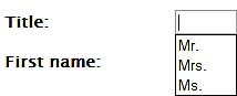
Creating an editable drop-down menu
A <select> menu provides users with a list of options to choose from. It works fine when there’s a fixed range of options, but there’s often a need to supply a text field for users to enter a different value. The <datalist> element avoids this problem by displaying a preset list of options but allowing the user to enter a custom option. Figure 2.20 shows how it works. The <datalist> offers the preset options of Mr., Mrs., and Ms. but allows the user to type in another value, such as Dr.
)
Figure 2.20 The <datalist> element creates an editable <select> menu.
Thanks to some clever experimentation by Jeremy Keith, it’s possible to incorporate a <datalist> into a form so that it works seamlessly in browsers that support it and provides an elegant fallback for browsers that don’t.
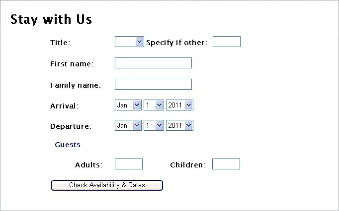
The form in reservations.html in the Tozai Hotel site contains a <select> menu for the user’s title with the options Mr., Mrs., Ms., and Other. Next to the menu is a text input field for users to type a value if they choose Other (Figure 2.21).
)
Figure 2.21 Normally, a separate text input field is needed for user input.
The code for the two form elements looks like this:
<label for=”title”>Title: </label>
    <select name=”title” id=”title”>
        <option> </option>
        <option>Mr.</option>
        <option>Mrs.</option>
        <option>Ms.</option>
        <option>Other</option>
    </select>
<label for=”other”>Specify if other:</label>
<input name=”other” class=”narrowField” id=”other”>
Notice that the <option> elements don’t contain a value attribute. When you omit this attribute, the browser automatically submits the value between the opening and closing tags of the selected item.
You need to edit the code manually, but Dreamweaver CS5.5 helps with code hints for <datalist>. The following instructions explain the process:
- On a new line between the first <label> element and the opening <select> tag, create the opening <datalist> tag and give it an ID like this:
- Delete the ID from the opening <select> tag. Only the name attribute is required.
- Set an explicit value attribute for the Mr. option:
- Do the same for the Mrs. and Ms. options but not for Other.
- Replace the <label> tags around “Specify with other” with <span> tags.
- Change the name and id attributes of the <input> element to match the name of the <select> element (title).
- Add list=”titlelist” to the <input> tag. This identifies the <datalist> options as belonging to this field.
<datalist id=”titlelist”>
The ID associates the <datalist> with the text input field.
<option value=”Mr.”>Mr.</option>
The finished code looks like this (with the changes highlighted):
    <label for=”title”>Title: </label>
        <datalist id=”titlelist”>
            <select name=”title”>
                <option> </option>
                <option value=”Mr.”>Mr.</option>
                <option value=”Mrs.”>Mrs.</option>
                <option value=”Ms.”>Ms.</option>
                <option>Other</option>
            </select>
            <span>If other, please specify:</span>
        </datalist>
    <input name=”title” class=”narrowField”
     id=”title” list="titlelist">
On its own, a <datalist> consists only of the <option> elements. It’s linked to an <input> element through the list attribute, which is set to the <datalist> ID. According to the HTML5 specification, the <datalist> must be hidden by the browser. What’s clever about Jeremy Keith’s solution is that it borrows the <option> elements of the <select> menu for the <datalist>. If a browser recognizes the <datalist> element, it hides the <select> menu but uses its <option> tags. The <datalist> ignores <option> elements that don’t have an explicit value attribute. Browsers that don’t recognize <datalist> ignore the tag and display the <select> menu instead. Everyone’s happy!
In step 5, you replaced the <label> tags with <span> tags, so the adjacent sibling style rule needs to be amended like this to maintain the padding in browsers that don’t yet support <datalist>:
select + label, input + label, select + span {
	padding-left: 10px;
}
To fix a problem with WebKit browsers, you also need to add the following style rule to the style sheet:
datalist {
    display: inline-block;
}
Using HTML5 attributes with form elements
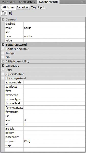
In addition to the new values for the type attribute, HTML5 introduces new attributes, such as autofocus and placeholder to improve usability, and required to aid validation. To add or change any of these attributes, use the code hints in Code view, or select the <input> element in Design view and use the Tag Inspector panel. Figure 2.22 shows changes made to the Adult <input> tag, setting type to number, min to 1, and max to 4, and turning on the required attribute.
)
Figure 2.22 The Tag Inspector panel provides access to HTML5 form attributes.
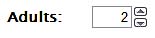
In browsers that support the number type, the input field is displayed as a number stepper (Figure 2.23). If the min and max attributes are set, the number stepper limits values to that range. Opera allows you to type in a number directly but displays an alert when you submit the form with an out-of-range value (Figure 2.24).
)
Figure 2.23 HTML5-compliant browsers display number input fields as number steppers.
)
Figure 2.24 Opera automatically displays an error message for out-of-range values.
Choosing a foolproof date picker
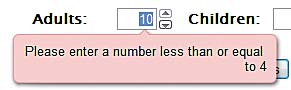
Inputting dates is a minefield. Europeans write dates in the order date, month, year. Chinese and Japanese reverse the order: year, month, date. Americans use the format month, date, year. Even if you can force users to input dates in a particular order, there’s always a danger of choosing an invalid date, such as September 31. HTML5 seeks to solve this problem with the date type. Opera has pioneered the way by automatically displaying a date picker when you click in a date field (Figure 2.25).
)
Figure 2.25 Opera’s date picker is automatic—no coding is required.
Chrome 9 offers a different solution—a date field that acts like a number stepper. However, users are in for a shock if you don’t also set the min attribute to a recent date. Figure 2.26 shows what happens when the user first clicks the stepper arrow. To get to today’s date, you would need to click more than 730,000 times!
)
Figure 2.26 Chrome’s date stepper goes back in the mists of time.
You can avoid this problem by setting a min value using the yyyy-mm-dd format. For example, the following code starts the date stepper at February 7, 2011:
<input name=”date” type=”date” min=”2011-02-07”>
That’s still not much use if you want users to enter their date of birth. Until there’s reliable cross-browser support for the date type, you need an alternative solution. One that I experimented with for this book was using <select> elements for the year and month, combined with a text input field for the date. I then used jQuery to hide the year and month menus, and displayed a jQuery UI Datepicker widget (http://jqueryui.com/demos/datepicker) when the focus was in the date field. A browser with JavaScript enabled would use the widget. Otherwise, the user would fill in separate fields for each date part.
It worked beautifully—until I tested it on several mobile devices. Figure 2.27 shows what happened on an iPod touch. Triggering the widget also popped up the mobile keyboard, cluttering the screen and making it very difficult to use.
)
Figure 2.27 Selecting the date field brings up both the widget and the mobile keyboard.
To prevent the mobile keyboard from appearing, I used jQuery to make the date field read-only. However, tests on a BlackBerry Torch revealed that the widget didn’t always render correctly. With browser sniffing, I was able to restrict making the field read-only on iOS and Android, but that meant that BlackBerry users still had to dismiss the mobile keyboard to access the widget.
In the end, I decided that the most reliable cross-browser solution was to create three <select> menus, one each for the month, date, and year. When JavaScript is disabled, the values default to January 1, 2011. However, if JavaScript is enabled in the browser, a jQuery script initializes the arrival and departure dates to today and tomorrow, respectively. The script automatically resets the number of days in the date <select> menu to match the month, taking leap year into account when the month is February. It also prevents the user from setting dates in the past or setting a departure date that isn’t at least one day after arrival.
It’s a long script, so I have broken it into sections to explain how it works. Add the following code just before the closing </body> tag in reservations.html.
<script type=”text/javascript” src=”js/
This includes the jQuery core library into the page, and creates a <script> block with a jQuery document-ready handler, which runs automatically as soon as the page loads. Apart from declaring a single variable, the document-ready handler doesn’t yet do anything. The series of comments outlines the structure of the script. Each of the following sections needs to be added under the appropriate comment.
The first section is a function that creates a JavaScript object with properties that store a reference to each of the <select> menus in the page using jQuery selectors. It looks like this:
// create object for select menus
function initMenus() {
    var menus = {};
    menus.arr_month = $(‘#arrival_month’);
    menus.arr_date = $(‘#arrival_date’);
    menus.arr_year = $(‘#arrival_year’);
    menus.dep_month = $(‘#departure_month’);
    menus.dep_date = $(‘#departure_date’);
    menus.dep_year = $(‘#departure_year’);
    return menus;
}
This function is used to store an object in dateParts, which is passed as an argument to subsequent functions. Each property name consists of arr_ or dep_ followed by the date part. This naming convention is designed so that the same functions can be used to set the arrival and departure dates.
The next part of the script is a function that sets all parts of a specific date. It looks like this:
// set all parts of a specific date
function setValues(dateParts, menu, theDate) {
    // advance date by one day for departure menu
    if (menu == ‘dep’) {
        theDate = getNextDay(theDate);
    }
    // get the individual date parts
    var m = theDate.getMonth() + 1,
        d = theDate.getDate(),
        y = theDate.getFullYear(),
        today = new Date();
    // adjust options for date and year menus
    populateDate(dateParts, menu, m, y);
    populateYear(dateParts, menu,
     today.getFullYear());
    // set the values for each select menu
    dateParts[menu + '_month'].val(m);
    dateParts[menu + '_date'].val(d);
    dateParts[menu + '_year'].val(y);
}
The setValues() function takes three arguments:
- The dateParts object containing references to the <select> menus
- A string (‘arr’ or ‘dep’) identifying whether to set the arrival or departure date
- A JavaScript Date object representing the date to be set
When the page first loads, the arrival date is set to the current date, and the departure is set to the following day. So, if the value of menu is ‘dep’, the Date object in theDate is advanced by one day by a function called getNextDay(), which is defined shortly.
The function then uses standard JavaScript Date methods to assign the date part values to local variables. JavaScript counts months from zero, so 1 is added to the value assigned to m.
To prevent incorrect dates from being selected, the function calls two other functions, populateDate() and populateYear(), to adjust the values displayed by the date and year <select> menus. These functions are described later.
Finally, setValues() uses the jQuery val() method to set the values of the <select> menus, using square bracket notation to access the appropriate properties of the dateParts object. For example, if ‘arr’ is passed as the second argument to setValues(), the last three lines of the function equate to this:
dateParts[‘arr_month’].val(m);
dateParts[‘arr_date’].val(d);
dateParts[‘arr_year’].val(y);
This is the equivalent of using the following dot notation to access the object’s properties:
dateParts.arr_month.val(m);
dateParts.arr_date.val(d);
dateParts.arr_year.val(y);
The getNextDay() function is defined next. It takes a Date object as its sole argument, and returns a new Date object for the following day by adding the number of milliseconds in 24 hours to the current value. The code looks like this:
// return Date object for next day
function getNextDay(date) {
    return new Date(date.getTime() +
     (1000*60*60*24));
}
The next two functions adjust the values in the year and date <select> menus, taking into account the number of days in a month and whether it’s a leap year. The code looks like this:
// limit year to current and following years
function populateYear(dateParts, menu, yr) {
    dateParts[menu + ‘_year’].html(‘<option>’ + yr
     + '</option>' +
    '<option>' + (yr + 1) + '</option>');
}


// adjust date options according to month
function populateDate(dateParts, menu, mon, yr) {
    var len = getNumDays(mon, yr);
    var html = ‘’;
    for (var i = 1; i <= len; i+=1) {
        html += ‘<option>’ + i + ‘</option>’;
    }
    dateParts[menu + ‘_date’].html(html);
}
Both functions use the jQuery html() method to generate a new set of <option> elements to replace the existing ones. The populateYear() function limits the years displayed to the current and following years. The populateDate() function takes both the year and month among its arguments, because February has 28 or 29 days depending on whether it’s a leap year. The calculation regarding the number of days to display is carried out by getNumDays(), which is defined next.
// return number of days in selected month
function getNumDays(mon, yr) {
    var num_days = 31;
    if (mon == 4 || mon == 6 || mon == 9 ||
     mon == 11) {
        num_days = 30;
    } else if (mon == 2) {
        // if leap year, Feb has 29 days
        if (yr % 400 == 0 ||
          (yr % 4 == 0 && yr % 100 != 0)) {
            num_days = 29;
        } else {
            num_days = 28;
        }
    }
    return num_days;
}
The getNumDays() function takes two arguments: a month and a year. Most months have 31 days, so that’s set as the default value of the local variable num_days. If the month is April, June, September, or November, the value of num_days is changed to 30. The else if clause checks if the month is February and calculates the correct number of days.
The nested conditional statement uses modulo division to calculate whether it’s a leap year. Leap years occur every four years on years wholly divisible by 4. The exception is that years divisible by 100 are not leap years unless they are also divisible by 400.
The main part of this script is the change handler function bound to all six <select> menus. It looks like this:
// change handler for select menus
function resetDates(e) {
    // find out whether arrival or departure
    // was changed, and get its value
    var dateParts = e.data.dateParts,
        menu = e.data.menu,
        m = dateParts[menu + ‘_month’].val(),
        d = dateParts[menu + ‘_date’].val(),
        y = dateParts[menu + ‘_year’].val(),
        num_days = getNumDays(m, y),
        today = new Date(),
        selected, arrival, departure;
    // make sure date menu displays
    // correct number of days
    populateDate(dateParts, menu, m, y);
    // if the month contains fewer days than
    // currently selected value, reset date
    // menu to last day of month
    d = (d <= num_days) ? d : num_days;
    dateParts[menu + ‘_date’].val(d);
    // create Date objects for selected dates
    selected = new Date(y, m-1, d);
    arrival = new Date(dateParts.arr_year.val(),
                  dateParts.arr_month.val()-1,
                  dateParts.arr_date.val());
    departure = new Date(dateParts.dep_year.val(),
                    dateParts.dep_month.val()-1,
                    dateParts.dep_date.val());
    // if changes were made to arrival date
    if (menu == ‘arr’) {
        // if the arrival earlier than today,
        // reset to today’s date
        if (selected < today) {
            setValues(dateParts, ‘arr’, today);
            setValues(dateParts, ‘dep’, today);
        }
        if (departure <= selected) {
            // set departure date to following day
            setValues(dateParts, ‘dep’, arrival);
        }
    } else {
        // if selected departure is today or
        // earlier, reset both dates to default
        if (selected <= today) {
            setValues(dateParts, ‘arr’, today);
            setValues(dateParts, ‘dep’, today);
        } else if (selected <= arrival) {
            // if selected departure date is same
            // as arrival date or earlier, reset
            // departure to one day after arrival
            setValues(dateParts, ‘dep’, arrival);
        }
    }
}
The resetDates() function is bound to each <select> menu using the jQuery change() method. The function takes as its only argument the event object triggered by a change in the value of the <select> menu to which the function is bound. To allow you to pass other values to an event-handler function, jQuery creates a data property on the event object. You’ll see how to pass these values shortly, but you retrieve them from the data property through dot notation like this:
var dateParts = e.data.dateParts,
    menu = e.data.menu, // more definitions
This gives you access to the dateParts object and the string identifying whether the value that has changed belongs to the arrival or departure date. With this information, the resetDates() function gets the current values for each part of the affected date and calculates the correct number of days in the month. The populateDate() function resets the <option> tags for the date menu. But before you can set the value of the date part, you need to find out if the current value exceeds the number of days in the month. For example, if the original date is January 31 and you change the month to September, you end up with an invalid date. So, the following line uses the ternary operator to reset d to num_days if the month is shorter:
d = (d <= num_days) ? d : num_days;
If d is less than or equal to num_days, its original value is preserved.
 if (d <= num_days) {
    d = d;
} else {
    d = num_days;
}
The jQuery val() method then sets the date menu to the correct value, and three Date objects are created. The first of these Date objects, selected, represents the complete value of the date that has just been changed. The other two Date objects represent the arrival and departure dates, respectively. The rest of the function consists of a series of conditional statements that prevent the arrival date from being earlier than the current date, and ensuring that the departure date is at least one day after the arrival date.
Finally, add the code to run the script:
  // run the script
  dateParts = initMenus();
  // set initial menu values to today and tomorrow
  setValues(dateParts, ‘arr’, new Date());
  setValues(dateParts, ‘dep’, new Date());

  // bind the resetDates function as the onchange
  //event handler to each select menu
  $(‘#arrival_date, #arrival_month, #arrival_year’)
      .change({dateParts: dateParts, menu: ‘arr’},
       resetDates);
  $('#departure_date, #departure_month,
   #departure_year')
      .change({dateParts: dateParts, menu: 'dep'},
       resetDates);
});
This initializes the menus and sets the arrival and departure dates to today and tomorrow, respectively. The resetDates() function is then bound to each select menu as its onchange event handler. The first argument to the jQuery change() method is an object literal containing the values to be passed to the resetDates() function. In both cases, the dateParts object is assigned to a property of the same name. The menu property for the arrival date menus is set to ‘arr’, and for the departure date, it’s set to ‘dep’. As you saw earlier, you access these values in resetDates() through the data property of the event object.
Prior to version 1.4.3, the jQuery change() method does not support passing an object literal as an argument. If you’re using an earlier version of jQuery, you must use the bind() method like this:
$(‘#arrival_date, #arrival_month, #arrival_year’)
    .bind(‘change’, {dateParts: dateParts, menu:
     'arr'}, resetDates);
$('#departure_date, #departure_month,
 #departure_year')
    .bind(‘change’, {dateParts: dateParts, menu:
     'dep'}, resetDates);
Even with all the comments, the script is a lightweight 5 KB. Contrast that with the jQuery UI Datepicker widget, which is approximately 115 KB and consists of 16 files. For desktop use, the widget is excellent. But for a site likely to be accessed on mobile devices, the smaller the file size, the better.
Validating the Adapted Pages
Dreamweaver CS5.5 restores the option to validate your pages within the Document window. However, instead of relying on its own validating tool, Dreamweaver now uploads your files to the W3C validator.
To validate a page:
- In the Document window, open one of the pages you have edited.
- Make sure you’re connected to the Internet, and choose File > Validate > Validate Current Document (W3C).
- Dreamweaver connects to the W3C and displays the results in the W3C Validation tab of the Results panel (Figure 2.28).
- To test other pages, open the page first in the Document window. You can then click the right-facing triangle at the top left of the Results panel, and choose Validate Current Document (W3C).
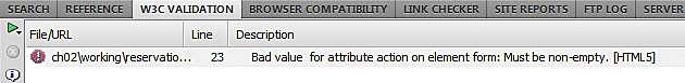
- Test reservations.html. As Figure 2.29 shows, it fails validation because HTML5 doesn’t permit an empty value for the action attribute in the opening <form> tag.
- Double-click the error report or right-click and choose Go to Line from the context menu. This takes you to the line that needs to be edited.
- Delete action=””, save the page, and revalidate it. This time it passes without errors.
Dreamweaver displays an alert telling you that it will send the document to the W3C validation service. If you don’t want to see this every time you validate a document, select the “Don’t show this dialog again” check box.
)
Figure 2.28 Confirmation that the edited page is valid HTML5.
)
Figure 2.29 HTML5 doesn’t allow the form action attribute to be empty.