This chapter is from the book
This chapter is from the book
This chapter is from the book
Interactivity and Digital Overlays
Many of the interactive features for tablet apps are added to your InDesign documents using the Folio Overlays panel. These elements are called overlays because when you create a folio, all the non-interactive elements in your layout are flattened to a JPEG, PNG, or PDF file, depending on the settings you use; the interactive elements sit on top of that, as an overlay.
)
One of the nice things about overlays is that they are maintained in both a horizontal and a vertical orientation, with no special action required on your part. As long as the same name is used for objects in each layout, the overlay will be consistent. For example, that means that if you are viewing the second slide in a slideshow in one orientation, the same slide is displayed when the user rotates the tablet.
Some of the interactivity that you can add to DPS apps is created using InDesign’s native interactive features (discussed in Chapter 2), which can be used in PDFs as well as DPS apps. But most of these elements require some additional settings in the Folio Overlays panel, because of characteristics that are unique to tablets. For example, when you have a hyperlink to a website, you need to indicate whether the page will open directly within the tablet app or in the tablet’s browser app.
Other interactive elements are unique to tablet apps, and these elements are added using the Folio Overlays panel. We’ll discuss each of these in detail later in this section.
Native interactive features supported
Most, but not all, of InDesign’s native interactive features are supported by DPS. The following table shows which native InDesign interactive features are supported and which are not.
|
Feature |
Supported by DPS |
Not Supported by DPS |
|
Animations |
Not supported directly; animations must be converted to HTML5 and placed back in the InDesign file |
|
|
Hyperlinks |
URL, email, Page, and Navto only |
Text anchors and Shared Destination hyperlinks |
|
Buttons |
On Release event only; Go To First/Last page, Go To URL, Go To Page, Go To Previous/Next State, and Go To State actions only |
On Click and On Rollover events; Go To Destination, Go To Next/Previous Page, and Show/Hide Button actions |
|
Forms |
|
Not supported |
|
Audio |
MP3 files |
|
|
Video |
MP4 files with h.264 encoding |
|
|
Bookmarks |
|
Not supported |
|
Cross-References |
|
Not supported |
|
Page Transitions |
|
Not supported |
The Folio Overlays panel extends the native features it supports by allowing you to add elements that are unique to tablet apps. But the panel also adds overlays that provide additional interactive features to DPS apps, including the following:
- Image sequencing
- Panoramas
- Web views
- Pan and zoom on images
- Scrollable frames
These features are created entirely using the Folio Overlays panel and, usually, a set of external files.
Folio Overlays panel basics
The Folio Overlays panel is essential to adding much of the interactivity to DPS apps. After you install the DPS tools from the Folio Builder panel, you can find the Folio Overlays panel under the Window menu.
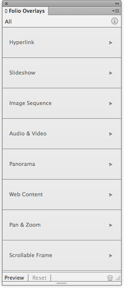
The Folio Overlays panel lets you access all of the interactive features you can modify or create for DPS apps.
Think of the Folio Overlays panel as your hub for adding interactivity to your DPS apps. It provides important tools for creating engaging experiences for your publication’s readers, and previewing your work as you go along, either using the desktop Content Viewer or directly on your iPad.
Creating links with buttons and hyperlinks
Both buttons and hyperlinks play an important role in providing interactivity to DPS tablet apps. They provide navigation, allow us to play videos and sounds, click through slideshows, and link us to the outside world.
When to use buttons vs. hyperlinks
Because both buttons and hyperlinks have similar linking functionality, it can sometimes be confusing to know when to use a button rather than a hyperlink. But they each have unique characteristics that when understood make it easy to choose the right feature for the job.
For one thing, only entire objects or frames can be made into a button; you can’t select text within a frame and set a button, you can only set a hyperlink. That makes hyperlinks the only choice when you need to link selected text within a frame.
On the other hand, buttons are the only choice when you want the appearance of your link to change when it’s tapped. Buttons have appearance options for Normal, Rollover, and Click, but only Normal and Click appearances are utilized by DPS. Only buttons let you jump to an object state, which is useful for slideshows, remote rollovers, or button “hot spots.”
You can use either buttons or hyperlinks for similar kinds of links:
- To link to websites
- To link to other pages or articles
- To send email
- To link to other content
Creating buttons for DPS apps
Creating a button for a DPS folio is the same as creating a button in InDesign for any other type of use, such as for a PDF file. However, there are certain events and actions that do not work in DPS apps and cannot be used. In fact, the only button event that is supported by DPS is On Release or Tap.
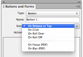
The only button event supported in DPS is On Release or Tap. The others have no effect when exported to a DPS folio.
There are also certain button actions that are not supported in DPS folios, including Go To Destination, Go To Next/Previous Page, and Show/Hide Buttons And Forms. None of the PDF Only actions are supported.
DPS supports the following button actions for hyperlinks:
- Go To First/Last Page
- Go To Page
- Go To URL
- Sound
- Video
DPS supports the following button actions for object states:
- Go To Next/Previous State
- Go To State
These actions are supported by DPS with no additional settings required. But whether you use buttons or hyperlinks, you must use the Folio Overlays panel to set how URL hyperlinks behave.
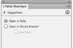
Use the Hyperlink settings to specify whether a link opens in the app (folio) or in a browser.
Panel settings
Open in Folio: By default, a website will open in the app, in an in-app browser, where all links on the website are fully functional. With this option, the user never leaves the app. To return to the app, the user simply taps the Done button in the upper-left corner of the screen.
Open in Device Browser: Choose this option if you want the user to be taken to the device’s browser app, such as Safari on the iPad, when a link is tapped. With this option selected, the user will exit the app and go to the external browser. Always choose this option for email links, because you always want the user’s email client to open to send a pre-addressed email.
Select the Ask First check box to specify that a prompt will appear, requesting permission to exit the app. It’s usually a good idea to specify this prompt, so the user knows what’s about to happen. Once the user is in the browser app, the DPS app has been completely exited and the app has to be re-opened.
Jump to another article
To create a hyperlink to jump to another article in your folio, use the navto:// syntax. Then specify the name of the article as it appears in the Folio Builder panel, not as it appears in the Article Properties dialog box. (Both are discussed in detail later in this chapter.) Add a page number if you wish to link to a specific page in the article. When you’re linking to a specific page in an article, keep in mind that the first page in the document is counted as page 0 (zero). So, for example, if you specify #3 in the URL, the link will jump to page 4. A typical URL to link to another article in your folio might be something like navto://articlename#3.
Creating slideshows with object states
Slideshows are just one of the many interactive elements that can be made using object states. In DPS apps, slideshows can be navigated by using buttons or by using tablet actions (such as Tap or Swipe) that are specified in the Slideshow section of the Folio Overlays panel.
As discussed in Chapter 2, you make an object state, also known as a multi-state object or MSO, by combining multiple objects into one. Select the objects—whether several images or a series of images grouped with text—and align them on top of each other using the alignment icons in the Control panel. Then in the Object States panel, click New, which groups the objects into a new object state.
)
To allow the user to view the slideshow by tapping buttons that access a specific state or by browsing slide by slide, set the buttons to the Next/Previous State action. Or, you can allow the user to view a slideshow without any buttons by selecting the appropriate settings in the Slideshow section of the Folio Overlays panel.
Panel settings
Auto Play: As soon as the user turns to the page, the slideshow will play; this is also known as “play on page load.” If you select this setting, you can set a delay in the time it takes to play.
Tap to Play/Pause: The slideshow will play when the user taps the top image or state. If you select this option, it’s a good idea to give some kind of visual cue, such as an icon or text, that clearly indicates that the slideshow should be tapped to see the action, since the user otherwise just sees the static image of the first slide.
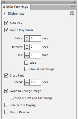
Use the Slideshow section of the Folio Overlays panel to specify settings for your slideshow.
Delay: If Auto Play is selected, you can specify a delay in the time between when the user turns the page and when the slideshow starts to play. You can specify from 0 (zero) seconds to 60 seconds. It’s usually a good idea to set a small delay so the page elements have time to fully load before the slideshow starts to play.
Interval: If Auto Play or Tap to Play/Pause is selected, you can specify the amount of time each slide displays. The allowable range is 0.125 seconds to 60 seconds.
Play-Time: If Auto Play or Tap to Play/Pause is selected, you can specify how many times the slideshow plays. This option is not available when Loop is selected.
Loop: If Auto Play or Tap to Play/Pause is selected, selecting Loop will cause the slideshow to play continuously until the user double-taps the slideshow or turns the page. Many electronic document designers decry Loop as a distraction.
Stop at Last Image: If Auto Play or Tap to Play/Pause is selected, this setting will stop the slideshow at the last slide.
Cross Fade: This setting provides a transition fade to the next slide. The default time for the transition is .5 seconds, but you can specify any value from 0.125 seconds to 60 seconds. This applies to slideshows advanced manually or with Auto Play or Tap to Play/Pause selected.
Swipe to Change Image: This setting lets the user swipe from slide to slide.
Stop at First/Last Image: When Swipe to Change Image is selected, use this setting to specify that the slideshow stop on the first or last slide.
Hide Before Playing: If this setting is selected, the slideshow is hidden until it is triggered, either by user action or by other settings in the Folio Overlays panel.
Play in Reverse: Just like it sounds, selecting this option causes the slideshow to play backwards.
Creating remote rollovers with object states
Object states are used frequently in DPS apps because you can do so many different things with them. One common use of objects states is to create what is sometimes referred to as a “remote rollover.”
Remote rollover usually refers to an effect where the user rolls over one part of a page onscreen and a change occurs in a remote (unconnected) part of the page. On tablets, there is no rollover state, so in this case it refers to when the user taps one part of the screen and a change occurs in another part of the screen. Remote rollovers can be created using an object state and buttons that go to specific states in the object state.
In this example, the user taps any one of four buttons to display a different yoga pose, along with how-to instructions.
)
- The first step is to create each object state. A yoga pose image is positioned next to the text frame containing its instructions, and then the two are grouped.
- Once all four images are grouped with their instructions, the four groups are then aligned on top of each other and converted to an object state using the Object States panel.
- Next, the four buttons are created. Each button has a different image for the Normal and Click appearances. See Chapter 2 for information about using external graphics for button appearances.
- For each button, the event is set to On Release or Tap and the action is set to Go To <the appropriate> State.
)
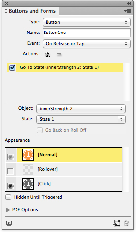
Each button is targeted to a specific state in the object state to create the remote rollover effect.
This technique offers a lot of flexibility, and with a little imagination and creativity you can produce a variety of engaging experiences for your users. You’ll see this technique used in many of today’s tablet publications.
Image sequencing
Image sequencing allows you to combine many images into a continuous series that can be stepped through by the user. It is particularly useful for creating a rotating 360° view of images or a time-lapse series of images. Image sequencing is one of the interactive features that are unique to DPS, and it uses the Folio Overlays panel rather than the File > Place command to import the images used.
There are a variety of ways to create source images. One way is to use Adobe Photoshop Extended to export an image sequence of a video, whether a 3D object or a scene. Open the movie in Photoshop Extended, and use the File > Export command. Choose Render Video and change the settings in the dialog box as needed.
)
You can also use Adobe Flash Professional or Adobe After Effects to export frames from an animation or a video. And, of course, you can use any 3D authoring application to generate images.
Images should be saved in JPEG format, or PNG if you wish to include transparency. InDesign won’t compress the files in any way, so for JPEG files, use medium compression to keep your folio size down.
The files should be named with sequential ascending suffixes, such as image01.jpg, image02.jpg, image03.jpg, and so on. You also need to make the images the same pixel size as they will appear on the tablet; for example, 568 × 320 pixels.
Combine all your images in a folder that will be just for these assets. You’ll point to this folder to create the overlay.
)
The next step is to create a container frame in your InDesign layout and decide on the poster image you want to display. This will be the image the user sees when turning to the page. You can set the first image in the sequence as the poster, or you can use File > Place to insert an image that’s not in the sequence as the poster.
If you want the first image in the sequence to be the poster, you can draw a frame of any size, because when you load the images the frame will automatically be re-sized to fit the content. If you want some other image to be the poster, place an image into a frame that is the exact size of the images in your sequence.
To import the images, select the container frame, and in the Image Sequence section of the Folio Overlays panel, click the Load Images folder icon at the top. Locate the folder containing the image assets.
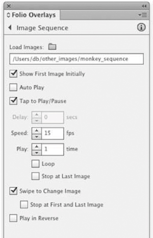
Use the Image Sequence controls to load your images and to specify settings such as Auto Play and Swipe to Change Image.
Panel settings
Show First Image Initially: This setting will use the first image in the sequence as the poster and will re-size the selected frame to fit the image.
Auto Play: This will cause the image sequence to begin playing on page load.
Tap to Play/Pause: This setting will allow the user to tap the image sequence to begin playing; a second tap will pause it.
Delay: If you set the image sequence to Auto Play, this setting lets you set a delay before it starts playing. It’s a good idea to set a short delay to give the page time to fully load before the image sequence starts to play.
Speed: This allows you to set the number of frames per second at which the sequence will play. It should not exceed the frame rate at which your images were sequenced.
Play: This setting lets you specify how many times you want the sequence to play.
Loop: This setting causes the sequence to loop, or play continuously, until stopped by a user action, such as a tap or a page turn.
Stop at Last Image: If Auto Play or Tap to Play/Pause is selected, this setting will stop the slideshow at the last slide.
Swipe to Change Image: This setting allows the user to swipe the image and move the images as slowly or quickly as desired, essentially allowing the user to step through the sequence.
Stop at First and Last Image: When Swipe to Change Image is selected, selecting this setting will stop the sequence at the first image and the last image. If this setting is deselected, the user can spin the image sequence continuously.
Play in Reverse: This setting will play the image sequence in reverse.
Working with audio overlays
You can include both audio and video files in DPS apps. Some of the properties for audio and video are set in the Media panel, as discussed in Chapter 2, and others are set in the Folio Overlays panel.
In order to include audio files in your DPS app, use the File > Place command to position an audio file in your InDesign layout. For DPS apps, the audio file must be in the MP3 format.
Next, you may optionally use the Media panel. You can use the Media panel to set the file to Play on Page Load, which automatically turns on the audio Auto Play option in the Audio & Video section of the Folio Overlays panel. You can also use the Media panel to set a simple poster for your video, but if you want a controller image for play and pause, for example, use the Folio Overlays panel, as discussed in the next section. Frankly, unless you want to set a single image for a poster, there is no particular reason to use the Media panel.
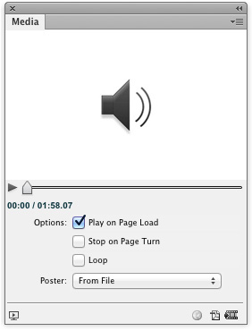
Some settings for audio can be controlled from the Media panel.
Next, you can set the audio file to play when the user turns to the page, or you can create buttons that the user can tap to play, pause, or stop the video. These options are discussed in more detail in Chapter 2. Alternatively, you can use controller files instead of buttons to allow the user to play or pause the sound file, as discussed in the next section.
Working with controller files
One of the interesting things you can do with the Folio Overlays panel is to set images to control the audio playback. You can create either a simple controller or a progressive controller, which shows the progress of the audio as it plays.
For a simple controller, you need only two files. However, they must have very specific names. Name the files with a _pause or _play suffix, such as audio_play.png and audio_pause.png. Add these two images to an assets folder that contains no other files.
)
Next, load the images by clicking the Controller Files folder icon in the Folio Overlays panel. Point to a folder that contains only the controller images. To use the audio_play.png image as the poster image, select the Show First Image Initially check box.
For a progressive controller, the images must be named in a very specific sequence that includes an increasing number, such as audio01_play.png, audio01_pause.png, followed by audio02_play.png, audio02_pause.png. As the audio plays, the images will be shown in a sequence that displays a visual of the audio progress. The total number of play files you use will be divided equally by the length of the audio. For example, if your audio is 30 seconds and you want the image bar to progress every second, create a total of 30 files, named audio_play01.png to audio_play30.png, with their corollary pause versions.
)
It’s also a good idea to create the images in the exact pixel size they’ll appear in; scaling them up will cause pixelation, and scaling them down will make the file size larger than it needs to be. Use PNG or JPEG images with medium compression to best balance image quality and file size.
Because it can take quite a bit of time to create the images for a progressive controller (unless you automate the process; see the sidebar on the next page), it’s a good idea to decide on a controller look that you want to use throughout your app publications. It can be very time consuming to change them all with each new issue.
Other panel settings
Auto Play: This setting is the same as Play on Page Load in the Media panel. It causes the sound to play when the user turns to that page.
Delay: If you set Auto Play in the Folio Overlays panel or Play on Page Load in the Media panel, only the Folio Overlays panel allows you to set a [delay] before the audio plays. It’s usually a good idea to set a brief delay, even .125 seconds, so that the audio does not start playing before the page loads.
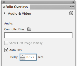
Use the Folio Overlays panel to set a delay on Auto Play, which helps prevent the audio file from playing before the page is fully loaded.
Working with video overlays
It’s easy to include video files in DPS apps. As with audio files, choose the File > Place command to position a video file in your layout. For DPS apps, it’s usually best to use a video file in MP4 format with H.264 encoding, which is compatible with Apple iTunes. Some of the settings for video will be set in the Media panel (see Chapter 2), and others will be set in the Folio Overlays panel.
It’s most efficient to use a video that is the exact proportion and size in pixels as it will appear when played. For full-screen videos, make the width the number of pixels of the device you’re targeting; for the iPad and iPad 2, for example, make the video 1024 pixels wide.
After you place the video, select it and open the Media panel. Select the Play on Page Load check box. This automatically turns on the video Auto Play option in the Audio & Video section of the Folio Overlays panel. You can also use the Media panel to set a poster for your video: None, Standard, a frame from the video, or an image file. The Loop option is not honored in DPS at this time.
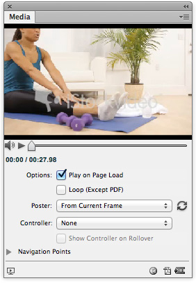
Many of the settings for video files are controlled in the Media panel, which is used in conjunction with the Folio Overlays panel to specify the appearance of your video.
You can use the Media panel to set the appearance of the controller for the video, with controls for play, pause, and volume. You can also create buttons with actions assigned that play or pause the video, as described in Chapter 2.
The Folio Overlays panel options are a little different than those in the Media panel. Both panels are used to control how video behaves in your DPS app. The Folio Overlays panel includes three options for controlling video behavior.
Panel settings
Auto Play: While setting Play on Page Load in the Media panel sets Auto Play in the Folio Overlays panel, and vice versa, it’s only in the Folio Overlays panel that you can set a Delay before the video plays. It’s a good idea to set a brief delay, even .125 seconds, so that the video does not start playing before the page fully loads.
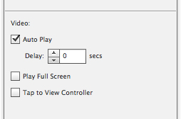
With these settings for video files, you can set a delay or specify whether the movie takes up the full screen when it plays.
Play Full Screen: This setting lets you specify that the video play in full-screen mode, whether via Auto Play or a tap on the screen. To return to the page after the video plays, the user taps the Done button in the upper-left corner of the screen.
Tap to View Controller: Setting this causes the controller to display when the user taps the video poster.
If you want to put an icon or other visual cue on top of the video file, simply place the icon on top of the video. When the user taps the video, the video, which is in a overlay, will move above the icon image and cover it while it is playing. When it is done, it will revert to the first frame of the video, with the icon image on top.
)
Creating panoramas
Panoramas let you put the user “inside” a locale and experience it as though the scene were viewed from a fixed location, looking around in all directions. For example, you could be inside a car and look around 360° or zoom in on the dashboard.
To create a panorama, you need six images that represent the six interior surfaces of a cube. If you have an existing panorama photo or image, convert it to six images. You can use Photoshop to stitch images together to create the initial panorama. Then you can convert the panorama to the required six images using a third-party utility such as Pano2VR, which is available in Apple’s App Store.
)
Source files must be in JPEG or PNG format. Source files are not compressed by InDesign in any way, so to keep file sizes reasonable, use JPEG files with medium compression. The size of the panorama on the DPS page is determined by the first image, and the closer you can make the source images to their final sizes, the more efficient your final file size will be.
The six files must be named with ascending numbers, such as pan01.jpg, pan02.jpg, pan03.jpg, and so on. Copy all six images into their own folder, with no other files.
To import the images, click the Load Images folder icon in the Panorama section of the Folio Overlays panel and point to the folder containing the images. By default, the first image in the sequence will be used as the poster. Once this image is on the page, you can resize it as you would any graphic. However, as mentioned, it’s best if the image is already sized.
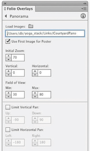
Panorama images are imported using the Folio Overlays panel. The panel also includes settings for controlling what the user sees in the panorama.
Panel settings
Use First Image for Poster: Selected by default. If you wish to use another image for the poster, choose File > Place to position it in the frame that will contain the six images.
Initial Zoom: This sets the initial zoom of the images when the user taps the panorama. Use a setting between the minimum zoom (30 percent) and the maximum zoom (80 percent).
Vertical/Horizontal: This lets you specify values that determine which area of the panorama is initially displayed. For Vertical, you can specify a value from –90 (tilted all the way up) to 90 (tilted all the way down). For Horizontal, specify a value from –180 (rotated all the way left) to 180 (rotated all the way right). The default of 0 (zero) sets the first image to display initially.
Field of View: This setting relates to how much the user can zoom in or zoom out, not to rotation.
Limit Vertical Pan: This setting limits the vertical tilt of the panorama. If you don’t want users to be able to tilt through the image until it’s upside down, set it to at least –1 and 1.
Limit Horizontal Pan: This limits how far the user can view the panorama to the left and the right.
Web Content overlays
Web Content overlays allow users of your app to access all the resources of the web. Web Content overlays can be used for websites, RSS and Twitter feeds, or local HTML files.
To create an overlay to a website, first draw a frame of the dimensions and location of the desired view area. If you want to display a poster before the website displays, place an image in the view area frame; if you want the website to display when the page loads, leave the view area frame empty. The user’s computer must have an Internet connection in order for the webpage to load.
)
Type the URL of the website into the panel. Remember, since your viewers will be using an iPad, you’ll want to send them to the mobile version of the website (if there is one); for example, http://mobile.twitter.com/username.
If you want to display a local HTML page, draw an empty frame or a frame with a placed poster image for the viewing area. In the Web Content section of the Folio Overlays panel, click the URL or File folder icon and browse to the HTML file. The HTML file should be in its own folder, along with any resources, including images or scripts, that the HTML file refers to.
You can use this feature to display things like a Google map or Twitter widgets. Copy the code from the Google or Twitter page, save it in a file, and point to the file in the Folio Overlays panel.
A local HTML file should be in a folder with any assets or scripts the file refers to.
As shown in the table on page 131, InDesign animations are not currently supported in DPS. Animations in DPS can play only if they are converted to HTML5 files. You can start with InDesign’s native animation features, discussed in Chapter 2, but then you must convert them HTML5 files.
One way to do this is to export your InDesign animations as Flash files (FLA format) and convert them using Adobe’s experimental application Wallaby, available from Adobe Labs (http://labs.adobe.com/technologies/wallaby/). Watch a video overview of this process on Adobe TV, at http://adobe.ly/jWXPD8.
- Alternatively, you can create the animations in Adobe’s Edge software and save them to HTML5 in Edge’s OAM file format.
- Once the files have been converted to HTML5, the Web Content overlay option is used to display and play the animation.
Panel settings
Once you’ve set the URL or local file that the user will view in the view area frame, several settings can be adjusted in the Web Content overlay:
Auto Play: This setting will cause the webpage to load when the user turns to the page, without any tap necessary. You can also set a delay; it’s a good idea to set a small delay so the page doesn’t load before the rest of the app page appears.
Transparent Background: Select this option to set that the transparent background in a webpage be preserved. If this option is deselected, the web content background is used.
Allow User Interaction: This option lets the children play; that is, it lets the user interact with the displayed webpage, allowing them, for example, to click links and go to another page.
Scale Content to Fit: This option will cause the webpage to fit to the dimensions of the view area frame that you created. Be sure the frame is large enough that the webpage is still readable when it’s inside the frame. If you do not select this option, the webpage will be displayed at actual size and will be cut off if the frame is not large enough to view the page, and in most cases users will need to scroll in both directions to view the page.
Pan & Zoom overlays
Pan & Zoom overlays allow your users to explore an image beyond what is displayed in the static view. Specifically, it makes a large image available in a small view area, allowing the user to tap the image and then pinch to zoom in or out, and move to parts of the image that are not seen in the static view.
To create an image for Pan & Zoom, make sure the image has the exact dimensions you want to use. For example, if you want users to be able to pan a 1024 × 1024 pixel image in a 300 × 300 pixel view area, create a PNG or JPEG image that is 1024 × 1024 pixels in 72 dpi. You can do this using Photoshop or Illustrator: Choose File > Save for Web & Devices, then specify the dimensions.
Draw a frame that will define the dimensions of the view area, and then place the image inside the frame. The image should be larger than the view area frame. Position the image so the view area contains the appropriate part of the image. Try to select a focal point or some part of the image that is interesting on its own. The image in the view area will essentially become the poster image.
)
Once the image is positioned, select the image, including the view area frame. Use the Pan & Zoom section of the Folio Overlays panel to turn Pan & Zoom on.
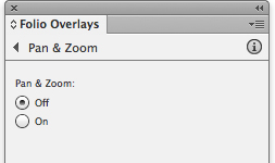
The Pan & Zoom settings simply allow you to turn Pan & Zoom on or off for a selected image.
With Pan & Zoom, it’s particularly important to let the user know that the images are not static images. Clear instructions or icons should be included on the page.
Once the user taps an image, the image can be scrolled or panned. The user can also pinch the image to see it reduced in the view area and visible in its entirety.

In this example, all three images are set to Pan & Zoom, and each image has been pinched and zoomed out to show the entire image.
Scrollable frames
Scrollable frames are unique to tablet apps. They allow the user to view more content on the same page by scrolling that content within a fixed area. Scrollable frames can contain text, images, other overlays, or any combination of content.
Scrollable frames are created using a container frame and a content frame. The content is positioned in the container frame using the Edit > Paste Into command.
For example, to create a scrollable text frame, place the text you wish to scroll in its own frame on the page. Draw another frame that is the size of the area you wish to be visible.
)
Next, position the content frame so it displays the part of the text that you want to be visible when the page opens, and position it where you want it to appear in the container frame. Select the content frame, and use Edit > Cut to move it to the clipboard. Select the container frame, and use Edit > Paste Into to position the content frame inside the container frame. You can adjust the size of the container frame, which determines how much of the content frame will display before the text scrolls.
)
Now you’re ready to select the container frame, with the content inside, and use the Scrollable Frame section of the Folio Overlays panel to change settings for the behavior of the content.
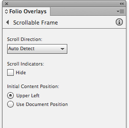
The Scrollable Frame section of the Folio Overlays panel with default settings.
Panel settings
Scroll Direction: These settings determine the scrolling action of the enabled frames. Auto Detect determines the scroll direction based on the height and width of the container frame and content frame. For example, if the heights of the frames are the same but the widths are different, the content scrolls only horizontally. To make sure that the content scrolls in only one direction—even if the container frame is narrower and shorter than the content frame—choose Horizontal or Vertical. Choosing the Horizontal & Vertical option allows the content to scroll in both directions, assuming the content frame is larger than the container frame.
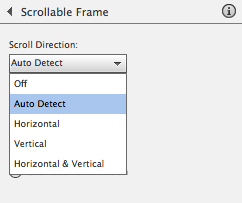
The direction options for scrollable frames.
Scroll Indicators: Select Hide if you don’t want scroll bars displayed as the user scrolls the content.
Initial Content Position: Use this setting to determine the initial position of the content on the page. Select Upper Left to align the content frame to the upper-left corner of the container frame as the initial view. Select Use Document Position to use the location of the content frame as the initial view.
The “sliding drawer” effect
Because scrollable frames can have any kind of content, you can do all sorts of fun things with them. One of our favorite tricks is to make a sliding drawer, or pull tab, effect. This lets you make tabs that users can drag out to reveal additional content. The following steps show just one example of the kinds of things that can be created using this general technique. It has the advantage, too, of allowing you to include more content in the relatively small amount of screen real estate available on tablets.
Create and group the objects that will make up the tab content. In this example, we have the tab graphic, some text, and an image.
- Draw the container frame. Since our tab will pull out from the right side of the page, the height of the container frame should be the same as, or a little greater than, the content group. With a typical scrollable frame, at this point the content group would be cut and pasted into the container frame. But if we do that, the tab will not have a pullout effect. There just won’t be that much room for the content to slide back and forth.
The trick to this technique is to draw an invisible rectangle that is positioned so that when it is grouped with the other content, the tab sits in just the right location in the container frame. This is illustrated on the following page.
Group the rectangle with the other content, then select Edit > Cut to move it to the clipboard. Select the container frame and choose Edit > Paste Into to create the scrollable frame. You can click the content group and position it as needed once it’s pasted into the container frame. If the invisible rectangle is not in the correct position, double-click it to select it within the group and move it to the appropriate location.
- In the Folio Overlays panel, choose Horizontal from the Scroll Direction menu. And finally, select the Hide check box so that a scroll bar doesn’t appear when the user slides the tab out.
)
)
)
)