- Browser Support
- CSS Animations
- The @Keyframes Rule
- animation-* Properties
- Animation Events
- Transition or Animation
- Summary
This chapter is from the book
This chapter is from the book
This chapter is from the book
animation-* Properties
CSS animations offer eight different properties for controlling an animation. Some are comparable to similarly named transition-* properties, and some will be new.
animation-name Property
The animation-name property defines a comma-separated list of animations to apply to the given selector. It’s similar to the transition-property in that it ultimately defines the properties that are animated. With the transition-property, those properties are explicitly named. With the animation-name, an @keyframes rule is explicitly named, and that rule contains the properties that will be animated.
-webkit-animation-name: slide, drop;
        animation-name: slide, drop;
Each animation-name in the list should match a specific @keyframes rule.
@-webkit-keyframes slide {
   properties: values;
}

@keyframes slide {
   properties: values;
}

@-webkit-keyframes drop {
   properties: values;
}

@keyframes drop {
   properties: values;
}
If there’s no match in keyframe name (identifier), the animation won’t run. In addition to the identifier of an @keyframes rule, a value of none is also valid. When the none keyword value is used, no animation runs. You can use none to override an animation that’s inherited from a parent element.
-webkit-animation-name: none;
        animation-name: none;
@keyframes change the value of CSS properties. If multiple animations try to change the value of the same property on an element, the animation closest to the last name in the animation-name list controls the property values.
If multiple animation-names are listed and one is removed, it stops running, but the other listed animations continue.
Every listed animation-name should have a corresponding value for any other animation-* properties. If there are too many values in an animation-* property, any leftover values are ignored. If there aren’t enough values, the list of values will be repeated until there are enough to match.
Animations are applied to elements with an animation-name value that matches the name of an @keyframes rule. Once applied, the animation runs. It runs once the page loads unless it’s been applied to a trigger, such as :hover. Once started, an animation continues to run until it finishes or the animation-name value is removed, such as removing the :hover on the animating element.
An animation ends based on some combination of the animation-duration, animation-iteration-count, and animation-fill mode properties. You can also end an animation by setting the animated element’s display property to none. This also ends any animations running on descendant elements.
Changing the value of an animation element’s display property to something other than none immediately starts that animation. It also starts any animations applied to descendants of the parent element. Changing the value of display is one more way you can turn on and off an animation.
The values in each keyframe in an @keyframes rule are held as a snapshot when the animation starts. Changing the intrinsic property on an element with an animation running has no effect. The values in the animation are in control until the animation stops.
animation-duration Property
The animation-duration property defines how long an animation lasts during one cycle of the animation. It’s similar to the transition-duration property and takes a time value in seconds (s) or milliseconds (ms).
-webkit-animation-duration: 10s;
   animation-duration: 10s;
Like transition-duration, the default value is 0s, which is why elements don’t animate automatically even when they’re animatable. Technically, they are animating, but everything happens in an instant.
Note that animation-duration is the length of one full cycle of the animation. It’s not the length of each keyframe in the @keyframes rule. For example, if you set an animation-duration of 10s and have the following @keyframes rule
@Keyframes duration {

    0% {
          property: value;
    }

    50% {
          property: value;
    }

    100% {
          property: value;
    }
}
the animation will take 10 seconds to get from 0 percent to 100 percent, and not 10 seconds to go from 0 percent to 50 percent and then 10 seconds more from 50 percent to 100 percent.
Similarly, when an animation is set to loop multiple times, the animation-duration is the time it takes to complete one loop or cycle.
animation-timing-function Property
The animation-timing-function property describes an acceleration curve for each keyframe in a single animation cycle. It’s similar to the transition-timing-function. You can use any of the keyword timing functions or create one of your own.
animation-timing-function: step-start;
animation-timing-function: step-end;
animation-timing-function: steps();
animation-timing-function: ease;
animation-timing-function: linear;
animation-timing-function: ease-in;
animation-timing-function: ease-out;
animation-timing-function: ease-in-out;
animation-timing-function: cubic-bezier();
Note that the animation-timing-function applies between keyframes and not over the entire animation cycle. This means if you have keyframes at 0%, 50%, and 100% and an animation-timing-function of ease-in, the animation eases into each of the three keyframes in the @keyframes rule and not just once at the beginning of the animation.
Let’s try an example to see this more clearly (EXAMPLE 4.3).
Add a div with a class of box to your HTML.
<div class="box"></div>
Give the .box class dimensions and a background-color.
.box {
    width: 200px;
    height: 200px;
    background-color: #393;
}
Add an animation to the .box div using the individual animation-* properties.
.box {
    -webkit-animation-name: slide;
            animation-name: slide;

    -webkit-animation-duration: 5s;
            animation-duration: 5s;

    -webkit-animation-timing-function: ease-in;
            animation-timing-function: ease-in;
}
Finally add an @keyframes rule to your CSS.
@-webkit-keyframes slide {

    0% {
        -webkit-transform: translate(0px, 0px);
            -ms-transform: translate(0px, 0px);
                transform: translate(0px, 0px);
    }

    25% {
        -webkit-transform: translate(150px, 0px);
            -ms-transform: translate(150px, 0px);
                transform: translate(150px, 0px);
    }

    50% {
        -webkit-transform: translate(300px, 0px);
            -ms-transform: translate(300px, 0px);
                transform: translate(300px, 0px);
    }

    75% {
        -webkit-transform: translate(450px, 0px);
            -ms-transform: translate(450px, 0px);
                transform: translate(450px, 0px);
    }

    100% {
        -webkit-transform: translate(600px, 0px);
            -ms-transform: translate(600px, 0px);
                transform: translate(600px, 0px);
    }
}

@keyframes slide {

    0% {
        -webkit-transform: translate(0px, 0px);
            -ms-transform: translate(0px, 0px);
                transform: translate(0px, 0px);
    }

    25% {
        -webkit-transform: translate(150px, 0px);
            -ms-transform: translate(150px, 0px);
                transform: translate(150px, 0px);
    }

    50% {
        -webkit-transform: translate(300px, 0px);
            -ms-transform: translate(300px, 0px);
                transform: translate(300px, 0px);
    }

    75% {
        -webkit-transform: translate(450px, 0px);
            -ms-transform: translate(450px, 0px);
                transform: translate(450px, 0px);
    }

    100% {
        -webkit-transform: translate(600px, 0px);
            -ms-transform: translate(600px, 0px);
                transform: translate(600px, 0px);
    }

}
This code adds five keyframes to the @keyframes rule. This should make it easier to see that the ease-in timing function is running between each keyframe and not once over the entire animation cycle.
Load your page in a browser, and observe the timing curve between keyframes (FIGURE 4.4).
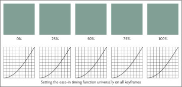
FIGURE 4.4 Animation timing functions
You can override the timing function inside each of the keyframes. When a timing function is applied inside a keyframe, it’s instructing the animation to use that function moving from the keyframe with the timing function applied to the next one (EXAMPLE 4.4).
Replace your @keyframes slide rule from Example 4.3 with the following rule. Changes in the code are highlighted.
@-webkit-keyframes slide { 0% { -webkit-transform: translate(0px, 0px); -ms-transform: translate(0px, 0px); transform: translate(0px, 0px); } 25% { -webkit-transform: translate(150px, 0px); -ms-transform: translate(150px, 0px); transform: translate(150px, 0px);-webkit-animation-timing-function: linear;animation-timing-function: linear;} 50% { -webkit-transform: translate(300px, 0px); -ms-transform: translate(300px, 0px); transform: translate(300px, 0px); } 75% { -webkit-transform: translate(450px, 0px); -ms-transform: translate(450px, 0px); transform: translate(450px, 0px);-webkit-animation-timing-function: linear;animation-timing-function: linear;} 100% { -webkit-transform: translate(100px, 0px); -ms-transform: translate(100px, 0px); transform: translate(100px, 0px); } } @keyframes slide { 0% { -webkit-transform: translate(0px, 0px); -ms-transform: translate(0px, 0px); transform: translate(0px, 0px); } 25% { -webkit-transform: translate(150px, 0px); -ms-transform: translate(150px, 0px); transform: translate(150px, 0px);-webkit-animation-timing-function: linear;animation-timing-function: linear;} 50% { -webkit-transform: translate(300px, 0px); -ms-transform: translate(300px, 0px); transform: translate(300px, 0px); } 75% { -webkit-transform: translate(450px, 0px); -ms-transform: translate(450px, 0px); transform: translate(450px, 0px);-webkit-animation-timing-function: linear;animation-timing-function: linear;} 100% { -webkit-transform: translate(100px, 0px); -ms-transform: translate(100px, 0px); transform: translate(100px, 0px); } }In this code, you override the ease-in timing function on two of the keyframes.
Reload your page, and observe the difference in the acceleration curve between keyframes (FIGURE 4.5).
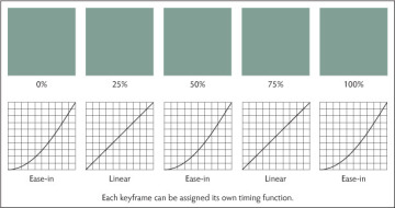
FIGURE 4.5 Animation timing functions on keyframes
)
)
The way timing functions work over keyframes and the ability to override them on a specific keyframe is powerful and perhaps a bit scary. You have great control over how your animation accelerates, but you also have the responsibility to exercise that control. Having an animation ease in between every keyframe is probably not what you want.
animation-iteration-count Property
Transitions run once when triggered and run once in reverse when the trigger is removed. Animations can run as many times as you want. The animation-iteration-count property defines how many times an animation runs, and it takes as a value any number or the keyword infinite. The latter sets your animation to run in an endless loop.
-webkit-animation-iteration-count: 3;
        animation-iteration-count: 3;

-webkit-animation-iteration-count: infinite;
        animation-iteration-count: infinite;
You’ve already seen the animation-iteration-count in action in Example 4.1, although that example used the animation shorthand to set all the values. Because you might be getting tired of sliding boxes and because the rest of the examples in this chapter are variations of that same sliding box, let’s do something different here (EXAMPLE 4.5).
Start by adding a div with a class of box to your HTML.
<div class="box"></div>
Instead of giving dimensions and a background-color to the .box div, set the dimensions to 0px, and add a border with different colors for each side. Finally, give the border a radius of 50%.
.box {
    width: 0px;
    height: 0px;
    border-width: 100px;
    border-style: solid;;
    border-color: #393 #933 #399 #993;
    border-radius: 50%;
}
Load your page.
A circle appears with four pie wedges, each a different color.
Add the following animation-* properties to .box. Note that you’ll be rotating the .box div this time instead of moving it.
.box {
    -webkit-animation-name: rotate;
            animation-name: rotate;

    -webkit-animation-duration: 4s;
            animation-duration: 4s;

    -webkit-animation-timing-function: linear;
            animation-timing-function: linear;

    -webkit-animation-iteration-count: 3;
            animation-iteration-count: 3;
}
Create the rotate @keyframes rules to rotate the .box div.
@-webkit-keyframes rotate {

    0% {
        -webkit-transform: rotate(0deg);
            -ms-transform: rotate(0deg);
                transform: rotate(0deg);
    }

    25% {
        -webkit-transform: rotate(90deg);
            -ms-transform: rotate(90deg);
                transform: rotate(90deg);
    }

    50% {
        -webkit-transform: rotate(180deg);
            -ms-transform: rotate(180deg);
                transform: rotate(180deg);
    }

    75% {
        -webkit-transform: rotate(270deg);
            -ms-transform: rotate(270deg);
                transform: rotate(270deg);
    }

    100% {
        -webkit-transform: rotate(360deg);
            -ms-transform: rotate(360deg);
                transform: rotate(360deg);
    }

}

@keyframes rotate {

    0% {
        -webkit-transform: rotate(0deg);
            -ms-transform: rotate(0deg);
                transform: rotate(0deg);
    }

    25% {
        -webkit-transform: rotate(90deg);
            -ms-transform: rotate(90deg);
                transform: rotate(90deg);
    }

    50% {
        -webkit-transform: rotate(180deg);
            -ms-transform: rotate(180deg);
                transform: rotate(180deg);
    }

    75% {
        -webkit-transform: rotate(270deg);
            -ms-transform: rotate(270deg);
                transform: rotate(270deg);
    }

    100% {
        -webkit-transform: rotate(360deg);
            -ms-transform: rotate(360deg);
                transform: rotate(360deg);
    }

}
Load your code in a browser.
The circular .box div rotates around its center.
If you followed the colors in the example for the borders, the green wedge should start at the top. Each time the green wedge is back at the top is one iteration or one animation cycle (FIGURE 4.6).
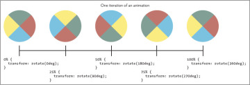
FIGURE 4.6 Animation iteration count
)
animation-direction Property
Another new property is the animation-direction property, which defines whether an animation runs forward or in reverse on some or all of its cycles. The animation-direction property takes one of four values:
- normal specifies that all iterations of the animation are played as specified.
- reverse specifies that all iterations of the animation are played in the reverse direction as specified.
- alternate causes the cycles to alternate between normal and reverse with normal for the first cycle and all odd iteration counts. Even counts are reversed.
alternate-reverse causes the cycles to alternate between normal and reverse with reverse for the first cycle and all odd iteration counts. Even counts are normal.
-webkit-animation-direction: normal;
        animation-direction: normal;

-webkit-animation-direction: alternate-reverse;
        animation-direction: alternate-reverse;
When the animation plays in reverse, the timing functions also run in reverse—for example, ease-in runs as ease-out.
Until now, the sliding box you’ve been working with slides to the right and then instantly returns to its initial location. The jump is more than a little jarring. The alternate and alternate-reverse values can remove the jump. Instead, the box continues to slide right and left until the animation stops.
Let’s go back to the sliding .box div you’ve used through most of this chapter (EXAMPLE 4.6).
Start by adding a div with a class of box to your HTML.
<div class="box"></div>
Give the .box div dimensions and a background color.
.box {
    width: 200px;
    height: 200px;
    background-color: #393;
}
Add the animation-* properties to .box. Additions to the code are highlighted.
.box { -webkit-animation-name: slide; animation-name: slide; -webkit-animation-duration: 5s; animation-duration: 5s; -webkit-animation-timing-function: linear; animation-timing-function: linear; -webkit-animation-iteration-count: 3; animation-iteration-count: 3;-webkit-animation-direction: reverse;animation-direction: reverse;}Notice the reverse direction.
Create the slide keyframe.
@-webkit-keyframes slide {

    to {
        -webkit-transform: translate(600px, 0px);
            -ms-transform: translate(600px, 0px);
                transform: translate(600px, 0px);
    }

}

@keyframes slide {

    to {
        -webkit-transform: translate(600px, 0px);
            -ms-transform: translate(600px, 0px);
                transform: translate(600px, 0px);
    }
}
Load your page.
First it jumps 600 pixels to the right (so fast that you might not see the .box on the left before the jump), and then it slides back to its initial location and repeats the sequence three times.
Change the value for the animation-direction in step 3 to alternate (EXAMPLE 4.7).
-webkit-animation-direction: alternate;
        animation-direction: alternate;
Reload your page, and observe the difference (FIGURE 4.7).
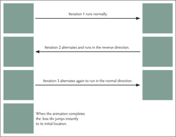
FIGURE 4.7 Animation direction
Now the .box div slides back and forth between the initial and ending states. This makes for a much smoother overall animation. Experiment with the normal and alternate-reverse values.
)
animation-play-state Property
By default, your animations run as soon as the animation-name property is assigned. You can change that behavior with the animation-play-state property, which defines whether an animation is running or paused.
-webkit-animation-play-state: running;
        animation-play-state: running;

-webkit-animation-play-state: paused;
        animation-play-state: paused;
The default value, as you would likely guess, is running. If you change the value to paused, the animation stops where it is until the animation-play-state is changed again to running. When paused, the animation displays whatever state the animation was in at that moment. When the animation is resumed, it restarts from the state it was paused in.
Let’s make one addition to Example 4.7 (EXAMPLE 4.8).
Add the animation-play-state property to the .box div from the previous example. Additions to the code are highlighted.
.box { -webkit-animation-name: slide; animation-name: slide; -webkit-animation-duration: 5s; animation-duration: 5s; -webkit-animation-timing-function: linear; animation-timing-function: linear; -webkit-animation-iteration-count: 3; animation-iteration-count: 3; -webkit-animation-direction: alternate; animation-direction: alternate;-webkit-animation-play-state: paused;animation-play-state: paused;}Reload your page.
Unlike previous examples, this time the animation doesn’t run when the page is finished loading. To run the animation, you need to change animation-play-state to running and reload the page.
This isn’t particularly useful if you have to reload the page after changing the animation-play-state property, but it becomes much more useful when changing properties via JavaScript or some other trigger.
Let’s modify the example to add triggers.
Modify your HTML to include play and pause buttons.
<div class="container">
    <div class="box" id="box"></div>
    <button id="play">Play</button>
    <button id="pause">Pause</button>
</div>
The buttons get ids so your JavaScript code has something to hook into. Notice that the code adds an id of box to the .box div.
The buttons need some styling.
Add the following to your CSS:
button {
    padding: 0.5em 1em;
    border: 1px solid #999;
    border-radius: 5%;
    margin-top: 3em;
}
Nothing special. Just a little style to make your buttons look “buttony.” Now let’s add some JavaScript so the buttons do something.
Add the following code in the head of your document between <script></script> tags.
<script>
var init = function() {

    var box = document.getElementById('box');
    var play = document.getElementById('play');
    var pause = document.getElementById('pause');
    document.getElementById('play').addEventListener( 'click', function(){
        box.style.webkitAnimationPlayState = "running";
        box.style.animationPlayState = "running";
    }, false);

    document.getElementById('pause').addEventListener( 'click', function(){
        box.style.webkitAnimationPlayState = "paused";
        box.style.animationPlayState = "paused";
    }, false);

};

window.addEventListener('DOMContentLoaded', init, false);
</script>
Hopefully, the script looks somewhat familiar. The last line of code listens for the page to load and then calls the init function.
Inside the function, you first get hooks to each button and the .box div and set them to appropriately named variables. Next you add event listeners to each button, and if a button is clicked, you set the value of animationPlayState to either running or paused, depending on which button was clicked.
Reload your page one more time.
You should see the new play and pause buttons. The green box sits in the top-left corner until you click the Play button to start the animation. Once the box begins moving, you can click the Pause button to stop the animation. Clicking Play starts the animation again from the point at which it was stopped.
animation-delay Property
The animation-delay property defines when an animation starts. It works the same way the transition-delay property works. Like transition-delay, values are in units of time and can be positive, 0, or negative.
-webkit-animation-delay: 2s;
        animation-delay: 2s;

-webkit-animation-delay: 0s;
        animation-delay: 0s;

-webkit-animation-delay: -2s;
        animation-delay: -2s;
A positive value delays the animation until some point in the future. A value of 0 (the default) starts the animation instantly. A negative value appears to start the animation in the past. It starts instantly, but at a point in the middle of the animation. The delay works as an offset.
Let’s continue to build on Example 4.8.
Add an animation-delay to the .box div. Additions to the code are highlighted (EXAMPLE 4.9).
.box { -webkit-animation-name: slide; animation-name: slide; -webkit-animation-duration: 5s; animation-duration: 5s; -webkit-animation-timing-function: linear; animation-timing-function: linear; -webkit-animation-iteration-count: 3; animation-iteration-count: 3; -webkit-animation-direction: alternate; animation-direction: alternate; -webkit-animation-play-state: running; animation-play-state: running;-webkit-animation-delay: 2s;animation-delay: 2s;}Reload your page.
The animation does nothing for 2 seconds and then slides back and forth like before (FIGURE 4.8). Try using some negative values, and observe the difference.
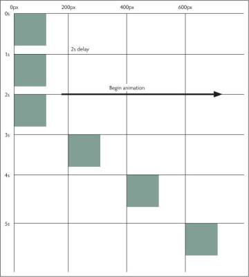
FIGURE 4.8 Animation delay
)
animation-fill-mode Property
You probably had an idea what each animation-* property did before I told you. Some were familiar after working through transitions, and the property names give a pretty good clue about what the others do.
The animation-fill-mode property is probably not intuitive to you. You might be thinking about background colors filling your element or something like that. The animation-fill-mode property actually defines what values are applied by an animation outside of its execution time.
By default, an animation affects property values only while it’s running. This is why the example animations you’ve been working with often jump back to the initial state when the animation stops. Whatever values are set in each keyframe are the ones used for a property until either the next keyframe changes it or the animation stops playing. When the animation stops, the CSS property values are whatever values were set intrinsically on the element.
The animation-fill-mode property overrides this behavior. It takes four keyword values.
animation-fill-mode: none | forwards | backwards | both
- none is the default, and it doesn’t apply any property values in the animation outside the animation’s execution.
- backwards applies the property values defined in the first keyframe that starts the first iteration to the period defined by animation-delay. The values come from either the 0% (from) or 100% (to) keyframes, depending on the value of the animation-direction property.
- forwards applies the property values after the animation stops. If the animation-iteration-count value is greater than 0, the values applied are those at the end of the last completed iteration. If the count value equals 0, the values applied are those that start the first iteration.
- both does what you might expect and applies both the forwards and backwards values to the animation-fill-mode property.
Once again let’s expand the example we’ve been working with.
Add an animation-fill-mode to the .box div. Additions to the code are highlighted. Note that the iteration-count changes to 1 (EXAMPLE 4.10).
.box { -webkit-animation-name: slide; animation-name: slide; -webkit-animation-duration: 5s; animation-duration: 5s; -webkit-animation-timing-function: linear; animation-timing-function: linear; -webkit-animation-iteration-count: 1; animation-iteration-count: 1; -webkit-animation-direction: alternate; animation-direction: alternate; -webkit-animation-play-state: running; animation-play-state: running; -webkit-animation-delay: 2s; animation-delay: 2s;-webkit-animation-fill-mode: forwards;animation-fill-mode: forwards;}Load the page in a browser.
As before, the green box slides to the right when the animation begins. However, now when it stops it doesn’t jump back to its initial state. Setting the animation-fill-mode to forwards allows the .box div to hold the final state in the animation after the animation completes (FIGURE 4.9).
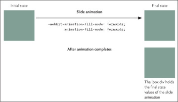
FIGURE 4.9 Animation fill mode
Experiment with the different animation-fill-mode values to observe what each does. Change some of the other animation-* property values in combination with the animation-fill-mode property as well.
For example, use either of the reverse values on the animation-direction and then use forwards on the animation-fill-mode.
animation-direction: alternate-reverse;
animation-fill-mode: backwards;
Or add a 0% (or from) keyframe in the @keyframes rule so the .box begins the animation in a different location.
0% {
    -webkit-transform: translate(75px, 0px);
        -ms-transform: translate(75px, 0px);
            transform: translate(75px, 0px);
}
)
Make sure there’s a positive animation-delay, and set animation-fill-mode to backwards.
animation-fill-mode: backwards;
For both changes, observe where the .box div is located before and after the animation as well as during the animation-delay.
animation Shorthand Property
You can also use the animation shorthand property to set everything at once. You saw this in the first example in this chapter.
animation: animation-property animation-duration animation-timing-function animation-delay animation-iteration-count animation-direction animation-fill-mode animation-play-state;
If you replace each of the properties with a value, you get something like this:
animation: slide 2s ease 0.5s 2 reverse both running;
To add multiple animations, you separate each definition with a comma like this:
animation: slide 2s ease 0.5s 2 reverse both running, bounce 5s ease-in-out 0 3 alternate forwards paused;
Note that the comma occurs between the full definition for each animation. There are two definitions in this line of code, so a single comma between them is all you need.
As with transitions, order is important. Just as with the transition shorthand, the first time value is assigned to the animation-duration property, and the second time value is assigned to the animation-delay property.