- Getting started
- Creating a new Web site
- Adding files to the Web site
- Creating a component to be used as a navigation bar
- Adding a layout grid
- Aligning and distributing multiple objects
- Adding text using a table
- Creating a custom color palette and adding color to text
- Specifying keywords
- Adding a component to an existing Web page
- Updating the custom color palette
- Designing a Web page using floating boxes
- Editing a component
- Previewing in GoLive
- Review questions
- Review answers
This chapter is from the book
This chapter is from the book
This chapter is from the book
Aligning and distributing multiple objects
Now that you've added all of the images, you're ready to align and distribute them. You'll align the tops of the three images for the navigation bar using the Align palette.
To display the Align palette, choose Window > Align.
The toolbar lets you align objects relative to a layout grid, while the Align palette lets you align and distribute objects relative to each other or their parent.
Click the Items In Stock image to select it. Then Shift-click the Repairs image and the Appraisals image to add them to the selection.
In the Align palette, click the Vertical Align Top button (
 ) under Align Objects. (If
the tops of the selected objects are already aligned, this button is dimmed.)
) under Align Objects. (If
the tops of the selected objects are already aligned, this button is dimmed.)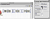 The tops of the selected images are aligned.
With the three images still selected, click the Vertical Align Top button (
 ) under Align to Parent.
The three images are aligned with the top of the layout grid.
Choose Window > Align to close the Align palette.
Now you'll move the three images together using a keyboard shortcut.
Click away from the three images to deselect them, and select only the Items In Stock image on the page. Then hold down Ctrl+Alt (Windows) or Option (Mac OS), and press the Left Arrow key until the image moves no further.
Select only the Repairs image on the page, and use the same method to move it to the left until it moves no further. Then select only the Appraisals image, and move it to the left until it moves no further.
The selected objects are moved horizontally on the page so that their edges touch each other.
NOTE
By default, a layout grid has options set to snap objects to the grid. To move a selected object 16 pixels (the default spacing between the horizontal and vertical lines of the grid), press an arrow key. To move a selected object 1 pixel, hold down Ctrl+Alt (Windows) or Option (Mac OS), and press an arrow key.
When you have finished placing objects on a grid, it's a good idea to optimize the grid, which you'll do now. Optimizing a grid reduces its size, so that it takes up less space on the page.
Click the layout grid to select it. Then click Optimize in the Layout Grid Inspector.
 Optimized layout grid
For the purposes of this lesson, you won't add navigation links to the images. You'll add these links later in Lesson 5, "Creating Navigational Links."
Choose File > Save to save navbar.html. Then choose File > Close to close it.
)
)
)
Designing the home page
Now that you have finished creating the component for a navigation bar, you're ready to design the home page for the Web site. The home page will provide information that introduces users to Gage Vintage Guitars. First you'll open the home page and change its title.
In the Files tab of the site window, double-click index.html to open it.
Change the title of the page to Gage Vintage Guitars. Select the default title next to the Page icon (
 ) in the upper
left corner of the document window, and enter the new title.
) in the upper
left corner of the document window, and enter the new title.
Applying a background image
You can apply an image or color to the background of your page to visually enhance it. You can also apply an image or color to the background of a container on the page, such as a layout grid. When choosing an image for the page background, keep in mind that GoLive and browsers treat the image as a tile that's repeated to cover the page.
Now you'll add a background image to the home page. First you'll preview the image using the File Inspector.
In the Files tab of the site window, select the wood.gif file in the images folder.
Click the Content tab of the File Inspector, and notice that a preview of wood.gif appears.
Click the Page icon (
 ) in the upper left corner of the document
window, so that the Inspector changes to the Page Inspector.
) in the upper left corner of the document
window, so that the Inspector changes to the Page Inspector.In the Page tab of the Page Inspector, select (or check) the Image option under Background.
Drag from the Point and Shoot button (
 ) in the Page Inspector
to wood.gif in the images folder within the site window.
) in the Page Inspector
to wood.gif in the images folder within the site window. Specifying image to tile for page's background
 Result
The image of the wood is tiled to cover the page.
Choose File > Save to save your work.
The Inspector changes to the File Inspector and displays detailed information about the selected file.
Now you'll use the wood.gif file to add a background image to the page.
)
)
Adding a component using a placeholder
Now you'll add the navigation bar to the home page using the component that you created earlier in this lesson. First you'll add a component placeholder to the page, and then you'll link the placeholder to a file in the site's Components folder.
 Drag the Component icon from the Smart set (
 ) in the Objects
palette to the upper left corner of the page.
) in the Objects
palette to the upper left corner of the page.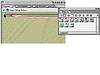 Adding component placeholder to page
A component placeholder is added to the page.
Select the component placeholder, and the Inspector changes to the Component Inspector. Drag from the Point and Shoot button (
 ) in the
Component Inspector to navbar.html in the Components folder in the site window.
(Remember that the Components folder is displayed in the Extras tab in the right
pane of the site window.)
) in the
Component Inspector to navbar.html in the Components folder in the site window.
(Remember that the Components folder is displayed in the Extras tab in the right
pane of the site window.)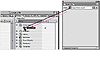
The navigation bar is added to the top of the page.
Choose File > Save to save the home page.
)
)
Adding text using layout text boxes
When you add text to a page using layout text boxes on a layout grid, you can easily rearrange the location of the text by moving or aligning the boxes. You can also add images and other objects to layout text boxes, so that you can align objects within the text or wrap text around objects.
Now you'll add text to the home page using layout text boxes on a layout grid. First you'll add a layout grid to the page.
 Drag the Layout Grid icon from the Basic set (
 ) in the Objects
palette to the empty area below the component on the page.
) in the Objects
palette to the empty area below the component on the page.Now you'll specify a width and height for the grid.
In the Layout Grid Inspector, enter 600 for Width, press Tab to jump to the next text box, and enter 300 for Height. Press Enter or Return.
Now you're ready to add the first layout text box to the layout grid. You'll use this box to add a main heading to the page.
 Drag the Layout Text Box icon from the Basic set in the Objects
palette to the upper center area of the layout grid.
Drag the Layout Text Box icon from the Basic set in the Objects
palette to the upper center area of the layout grid.A layout text box is added to the grid. If needed, you can adjust the position of the box by moving the pointer to an edge of the box so that it turns into a hand, and then dragging the box.
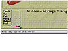
Click inside the layout text box to create an insertion point, and type Welcome to Gage Vintage Guitars. Then choose Header 1 from the Paragraph Format menu on the toolbar.
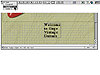 Text in layout text box, reformatted as Header 1
You can use the toolbar to position selected objects precisely on a layout grid. Now you'll use the toolbar to reposition the layout text box.
Click an edge of the layout text box to select it. Be sure to select the layout text box and not the layout grid box.
On the toolbar, enter 179 in the Horizontal Position text box, press Tab to jump to the next text box, and enter 0 in the Vertical Position text box. Press Enter or Return.
The layout text box is repositioned 179 pixels from the left edge of the layout grid and 0 pixels from the top of the grid.
You can also use the toolbar to resize a selected object. Now you'll use the toolbar to resize the layout text box.
On the toolbar, enter 400 in the Width text box, press Tab to jump to the next text box, and enter 80 in the Height text box. Press Enter or Return.
NOTE
If the values used in this section don't work on your system, you can adjust them as necessary. Use the values given as a guide.
 Entering values to reposition and resize selected object
The layout text box is resized to 400 pixels in width and 80 pixels in height.
NOTE
In a browser, a layout text box automatically adjusts its size in relation to its content, which resizes according to the platform that the browser is using (for example, to accommodate fonts that appear larger in Windows and smaller in Mac OS). This can affect the size of the layout grid, as well as the position of other items on the layout grid, altering the intended design. So that text size appears more consistently across platforms, you can assign a pixel size definition for all text using a cascading style sheet.
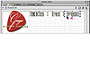
Now you'll add a second layout text box to the layout grid. You'll use this box to add a subheading to the page.
Drag the Layout Text Box icon from the Basic set in the Objects palette to the upper left area of the grid.
Click inside the second layout text box to create an insertion point, and type Check Out This Week's Hottest Buy! Then drag to select the text that you just typed, click the Bold button (
 ) on the toolbar,
and choose 4 from the Font Size menu on the toolbar.
) on the toolbar,
and choose 4 from the Font Size menu on the toolbar.To resize the second layout text box, click an edge of the box to select it, and drag one of its handles.
 Resizing layout text box by dragging its handles
Choose File > Save to save index.html.
)
)
After applying individual HTML attributes to text using the toolbar, you can save them as a group in the HTML Style palette, and then use the palette to reapply the group of attributes to other text in your site (see Lesson 4, "Working with Text and Tables," for more information). You can also use cascading style sheets to define text formatting once and then instruct browsers to reuse the definitions whenever text on a page refers to them (see Lesson 12, "Using Cascading Style Sheets," for more information).
)