This chapter is from the book
This chapter is from the book
This chapter is from the book
Paragraph Formatting
What makes a paragraph a paragraph? InDesign's definition is simple—a paragraph is any string of characters that ends with a carriage return. When you apply paragraph formatting, the formatting applies to all of the characters in the paragraph. Paragraph alignment, indents, tabs, spacing, and hyphenation settings are all examples of paragraph formatting.
You don't have to select all of the text in a paragraph to apply paragraph formatting—all you need to do is click the Type tool in the paragraph. To select more than one paragraph, drag the cursor through the paragraphs you want to format. The selection doesn't have to include all of the text in the paragraphs, it only has to touch each paragraph.
If what you're trying to do, however, is apply character formatting (such as font or point size) to all of the characters in the paragraph, you should quadruple-click (or triple-click, if you've turned off the Triple Click to Select a Line option in the Type pane of the Preferences dialog box) the paragraph with the Type tool—that way, you'll select all of the characters, including the invisible carriage return character. (Note that you can force a line break without creating a new paragraph—called a "soft return"—by typing Shift-Return/Shift-Enter.)
You can find all of InDesign's paragraph formatting features in the Paragraph panel. To display the Paragraph panel, press Command-Option-T/Ctrl-Alt-T. These features are duplicated in the Control panel—if the Control panel is displaying character formatting, then click the panel's Paragraph Formatting Controls button or press Command-Option-7/Ctrl-Alt-7 to switch to paragraph formatting.
Alignment
Click the alignment buttons at the top of the Paragraph panel or in the Control panel to set the alignment of the selected paragraphs (see Figure 4-31).
)
Figure 4-31 Paragraph Alignment
InDesign supports the usual set of paragraph alignments—left aligned (also known as "rag right"), right aligned (also known as "rag left"), centered, and justified, but also adds a couple of variations on the justified alignment you might not be familiar with.
In addition to the standard "justified" alignment, which treats the last line of the paragraph as if it were left aligned, InDesign offers the force justified, right justified, and center justified alignments. These each tell InDesign to treat the last line of the paragraph differently. When you force justify the text, the last line is spread out all the way to the right margin, even if it's only a single word. In some cases, when the Paragraph Composer is turned on (see "Multi-line Composition," later in this chapter), turning on force justify actually reflows the paragraph significantly.
Right justified and center justified treat the last line as right aligned and center aligned, respectively. In the old days of typesetting, these alignments were known as "quad right" and "quad center."
Finally, the Align Towards Spine and Align Away from Spine options. The former aligns the text to the spine and leaves the outside of the text ragged; the latter does the opposite.
Indents
Paragraphs can be indented using the Left Indent and Right Indent fields in the Paragraph or Control panel (see Figure 4-32). You can enter values from zero (0) to 720 picas in these fields, but you can't enter negative numbers to make the edges of the paragraph "hang" outside the edges of the column or text frame.
)
Figure 4-32 Paragraph Indents
Note that the left and right indents are always added to the text inset, as specified in the Text Frame Options dialog box. If you have a left inset of 6 points and a left indent of 12 points, then the left edge of the paragraph will sit 18 points from the edge of the frame.
There are also two special indents, called First Line Left Indent and Last Line Right Indent. The first applies to the first line of the paragraph alone—the value you enter in the First Line Left Indent field sets the distance between the first line indent and the left indent. The First Line indent may be positive or negative, but cannot be a negative number greater than the left indent (see Figure 4-33). You should never create an indent by typing five spaces at the beginning of a paragraph to indent; instead, use First Line indent.
)
Figure 4-33 First Line Indent
How large your First Line indent should be depends on your design and on the typeface you're working with. Typically, the larger the x-height of the font, the larger first-line indent you should use. Book designers often use a one- or two-em indent, so in an 11-point type, the indent might be 11 or 22 points.
The Last Line Right Indent lets you set the position for the last line of text in a paragraph. The most common use for this is to apply a large Right Indent and then a negative Last Line Right Indent (so that the last line sticks out past the rest of the paragraph, as in many menu designs). Another use might be to set the position of the final line when using Justify All Lines (forced justification).
To change an indent value, select a paragraph and then do one of the following things:
- Display the Paragraph or Control panel, then enter a value in the First Line Left Indent, Left Indent, Right Indent, and/or the Last Line Right Indent fields (see Figure 4-34).
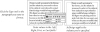
Figure 4-34 Setting an Indent
- Display the Tabs panel (press Command-Shift-T/Ctrl-Shift-T), and drag one of the indent icons (see Figure 4-35).
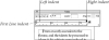
Figure 4-35 Indents on the Tabs Panel
)
)
Creating a Hanging Indent
A hanging indent is one in which the first line of a paragraph "sticks out" to the left of the rest of the paragraph—often used in numbered or bulleted lists. Use hanging indents, rather than breaking and indenting each line using carriage returns and tabs—you'll thank yourself for it later, when you need to edit the text or change the width of the text block.
There are two basic methods for creating a hanging indent. First, you can apply a positive Left Indent and a negative First Line Left Indent with either the Tabs panel (see Figure 4-36) or the Paragraph or Control panel. Either way, there's no need to set a tab stop because InDesign assumes the left indent is the first tab stop.
)
Figure 4-36 Setting a Hanging Indent
Here's another way to create a hanging indent: First, type the text you want to "hang," followed by a tab character. Then, with the text cursor immediately after the tab character, press Command-\ or Ctrl-\ (backslash). This is the keyboard shortcut for the Indent to Here character (you can also get this character from the Other submenu in the Insert Special Character submenu, in either the Type menu or the context menu). This invisible character causes the rest of the lines in a paragraph to indent to this place. If you want to delete it, you can place the cursor after it (since it's invisible and has no width, you might have to use the arrow keys to position it) and then press Delete.
While the Indent to Here character is easy to type, we like using the negative First Line indent trick more because we can use it in a paragraph style.
Tabs
A classic Ole anecdote: "Whiz! Clunk. Whiz! Clunk. Ding! My father brought home a large, black typewriter—a machine so antiquated that even his school district (he was a high school math teacher) didn't want it anymore. It was a behemoth, a leviathan among typewriters. I couldn't lift it, and typing a letter took the entire strength of my seven-year-old arm.
"My brother and I were fascinated by the movement of the carriage. For one thing, the spring that pulled it was massive—probably capable of launching a small aircraft—so pressing the Tab key was, by itself, pretty exciting. But what really caught our attention were the tabs themselves: thick slabs of metal you 'set' by pushing them into the teeth of a bar set below the carriage. With each press of the Tab key, the carriage would leap to the right—then a protruding part would slam into one of the tabs. Bam! Unstoppable force meets immovable object. The rear of the typewriter would jump half an inch to the right. This was cool."
Tabs, Mice, and History. Tabs come to desktop typesetting from typewriters, by way of word processing (with a stopover along the way at the Linotype machine). They solve a problem that didn't exist in hand-set metal type—namely, how do you position characters at precise locations in a line of type when you can't simply slide them into place with your finger?
There are two methods of controlling the horizontal position of text in a line. First, you can use space characters—word spaces, thin spaces, en spaces, and em spaces. This method places characters at relative positions in the line—where they appear depends on the width of the spaces and of the other characters in the line. Tabs, by contrast, provide absolute position on the line—a tab stop set at 6 picas will remain at that position, regardless of the text content of the line.
Before we go any further, we'd better make sure we're using the same terminology. Tab stops are formatting attributes of paragraphs. Tab characters are what InDesign enters in a line of text when you press the Tab key. Tab characters push text around in a line; tab stops determine the effect of the tab characters. Each tab stop has a position (relative to the left edge of the text frame), an alignment (which specifies the composition of the text following a tab character), and, potentially, a leader (a tab leader is a series of repeated characters spanning the distance from beginning of the tab character to the beginning of the following text). Put tab stops and tab characters together, and you get tabs, the feature.
A Little Tab Dogma. Look. We try to be reasonable. We try not to insist that everyone work the way that we do, or that our way of doing things is necessarily the best way (in fact, we sometimes know it's not). But tabs are different—if you don't do it our way, you'll be causing yourself needless pain. Let's review the rules:
- Use tabs, not spaces, to move text to a specific position in a line of text.
- Use a First Line indent, not a tab, when you want to indent the first line of a paragraph.
- Do not force lines to break by entering tab characters (or multiple tab characters) at the end of a line! If you do, you'll find tab characters creeping back into the text as editing changes force text recomposition. To break a line without entering a carriage return, use the "soft return" (press Shift-Return/Shift-Enter).
- Don't use multiple tab characters when you can use a single tab character and an appropriately positioned tab stop. While there are some cases where you'll have to break this rule, putting two or more tab characters in a row should be the exception.
Types of Tab Stops
InDesign features four types of tab stop (see Figure 4-37).
)
Figure 4-37 Tab Stop Alignment
Left, Right, and Centered Tab Stops. InDesign's left, right, and centered tab stops are the same as the basic tab stops you'll find in any word processor.
- Left tab stops push text following a tab character to a specific horizontal location in a column, and then align the text to the left of the tab stop position.
- Right tab stops push text to a location and then align the text to the right of the tab stop position.
- Centered tab stops center a line of text at the point at which you've set the tab stop.
Decimal Tab Stops. Decimal tab stops push text following a tab character so that any decimal point you've entered in the text aligns with the point at which you set the tab stop.
Actually, the Decimal tab stop is an "align to any character you want" tab stop. Type the character you're trying to align in the Align On field of the Tabs panel. For example, lets say you have a column of item numbers, some with asterisks. You can make the asterisks hang out to the right by typing an asterisk character in the Align On field. If the Align On character doesn't appear in the paragraph, InDesign treats the decimal tab stop as a right tab stop.
Setting Tab Stops
To set a tab stop, follow these steps (see Figure 4-38).
)
Figure 4-38 Setting a Tab Stop
- If you haven't already entered tab characters in the text, enter them.
- Select the paragraph(s) you want to format.
- Display the Tabs panel (press Command-Shift-T/Ctrl-Shift-T), then click the Magnet button to snap the Tabs panel into position at the top of the text frame (if possible).
Click in the tab ruler and drag. As you drag, the X field shows you the position of the tab icon (relative to the left edge of the text frame). Then click one of the tab stop alignment buttons to determine the type of the tab stop.
If you want to add a tab leader, enter one or two leader characters in the Leader field in the Tabs panel (if you can't see this field, you'll need to increase the width of the panel).
You can also add a tab stop at a specific location on the tab ruler. To do this, enter the position you want in the X field in the Tabs panel and then press Enter. InDesign adds the tab stop. The new tab stop uses the current tab stop alignment, or you can click on a different one to change it.
Removing Tab Stops. To remove a tab stop, drag the tab stop icon off the tab ruler. Note that this doesn't remove any tab characters you've typed in your text, though it does make them behave differently (because you've taken away their tab stop).
Editing Tab Stops. To change a tab stop's position, drag the tab stop on the tab ruler (see Figure 4-39). Alternatively, you can select the tab stop (click on it), then enter a new value in the X field or give it a leader. Don't forget that if you want to move the tab stop by a specific amount, you can add a + or – character after the value that appears in the X field and then type the amount you want to move it ("+14mm").
)
Figure 4-39 Editing a Tab Stop
To change a tab stop's alignment (from left to decimal, for instance), select the tab stop on the tab ruler and then click the tab stop button corresponding to the alignment you want. Or you can Option/Alt-click on the tab stop to rotate through the alignment types.
Repeating Tab Stops. To create a series of tab stops spaced an equal distance apart, select a tab stop on the tab ruler and choose Repeat Tab from the Tabs panel menu (see Figure 4-40). InDesign repeats the tab across the width of the current column. The distance between the new tab stops is equal to the distance between the tab stop you selected and the previous tab stop (or indent) in the column. InDesign also deletes all the tab stops that were already to the right of the tab stop you clicked (which can be frustrating if you've placed tab stops there and weren't expecting them to disappear).
)
Figure 4-40 Repeating a Tab Stop
Working with Tab Leaders. A tab leader is a series of repeated characters that fill the area taken up by the tab character (see Figure 4-41). The most common tab leader character is a period—think of all of the "dot" leaders you've seen in tables of contents.
)
Figure 4-41 Applying a Tab Leader
Characters in a tab leader are not spaced in the same fashion as other characters—if they were, the characters in tab leaders on successive lines would not align with each other. That would be ugly. Instead, characters in a tab leader are monospaced—positioned as if on an invisible grid. This means you'll see different amounts of space between the last character of text preceding a tab leader and the first tab leader. It's a small price to pay.
In InDesign, you can format the characters in a tab leader by selecting the tab character and applying formatting, just as you would any other character. For instance, dotted tab leaders typically look like a bunch of periods. To make them look more like traditional dot leaders, add a space after the period (in the Leader field), then select the tab character and reduce its size slightly.
Right-aligned Tabs. Setting a tab stop precisely at the right margin can be a bother; it's an even bigger bother when your art director says, "make that column narrower." Instead of using tab stops, try using a right-aligned tab character, which you can enter by pressing Shift-Tab (or add with the Insert Special Character submenu in the Type menu). The text that follows the right-aligned tab character always aligns with the right margin, even when you change the right indent or the width of the text frame.
The right aligned tab picks up the tab leader settings from the last tab stop in the line.
Adding Space Before and After Paragraphs
When you want to add extra space between paragraphs, don't use carriage returns (not even one). If you do, you're certain to end up with unwanted carriage returns at the tops of text frames when text recomposes due to editing or formatting changes. Instead of typing carriage returns, use the Space Before and Space After fields in the Paragraph or Control panel. When you add space using these controls, InDesign removes the space when the paragraph falls at the top of a text frame (see Figure 4-42). If you need to add space before a paragraph at the top of a text frame, use First Baseline offset (see Chapter 3, "Text").
)
Figure 4-42 Space Before and Space After
In addition, adding an exact amount of space is easier when you use the Paragraph or Control panel. Want to add four picas of vertical space above the paragraph? Enter it in the Space Before field. There's no need to guess how many carriage returns it would take to make up that vertical distance.
Align to Grid
When you have more than one column of text on a page, it's important that the baselines of the text line up across the columns. The idea is that the leading should be consistent with an underlying "leading grid"—an invisible set of rules for where the baselines of text should lay. Many designers even work with leading grids on pages with a single column.
Unfortunately, in most page designs, you'll find elements that have to have leading values that differ from the leading applied to the body text. Inline graphics, paragraph rules, and headings are all examples of the sort of elements we're talking about. When one of these elements appears in a column of text, the leading of the lines in that column gets thrown off.
You need a way to compensate for leading variations inside a column of text. "Leading creep," the misalignment of baselines in adjacent text columns, is one of the hallmarks of amateur typesetting, so you want to avoid it.
While you could adjust the space above and below such intrusions to compensate, there's an easier way: use InDesign's Align to Baseline Grid command. Select a paragraph and click the Align to Baseline Grid button in the Paragraph panel, and InDesign forces the baselines of the lines in the paragraph onto the baseline grid (see Figure 4-43). You can change the leading and position of the document baseline grid in the Grids pane of the Preferences dialog box. To see this grid, select Show Baseline Grid from the Grids & Guides submenu, under the View menu.
)
Figure 4-43 Align to Grid
Frame-based Baseline Grids. The baseline grid can also be calculated for individual text frames. To activate a custom baseline grid, select the text frame and press Command-B/Ctrl-B to display the Text Frame Options dialog box. Click the Baseline Options tab, and then turn on the Use Custom Baseline Grid option. Use the controls to set up your custom baseline grid (see Figure 4-44). When you specify a custom grid, the Align to Grid option aligns the text baselines with the baseline grid applied to the text frame, rather than to the document baseline grid.
)
Figure 4-44 Custom Basline Grid
Why We Rarely Use Align to Baseline. While there's no doubt that a careful study and practice of baseline grids can make your documents better looking, we rarely use the Align to Baseline Grid feature. The reason: you can get the same result by making sure your leading, Space Before, and Space After always add up to an even multiple of the leading value.
For example, if your body text has 15-point leading, then make sure your headings also have 15- or 30-point leading. If you use Space Before or Space After, make sure those values are set to a multiple of 15, such as: 15, 30, or 45 points. Finally, snap the tops of your frame to the baseline grid and set the First Baseline setting to Leading, and you can't go wrong.
Only Align First Line to Grid. Often, sidebars in magazines or newsletters are set in a different font and leading than the main body text, and they're placed in their own text frame. You can make the first baseline of that sidebar align with the leading grid by using the Only Align First Line to Grid feature. This forces the first line of a selected paragraph to snap to the baseline grid, but then leaves the rest of the paragraph alone. To align the first baseline of a paragraph to the baseline grid, first align the whole paragraph to the baseline grid and then choose Only Align First Line to Grid from the Paragraph or Control panel menu.
Drop Caps
Drop caps are a paragraph-level attribute in InDesign (as they are in QuarkXPress). To apply a drop cap to a paragraph, enter a value in the Number of Lines field of the Paragraph or Control panel (this sets both the baseline shift and the point size of the drop cap). To apply the drop cap formatting to more than one character, enter a number in the Number of Characters field. InDesign enlarges the characters you specified and shifts their baseline down according to the value you entered in the Number of Lines field (see Figure 4-45).
)
Figure 4-45 Drop Caps
You can also make an initial cap that drops down and raises up by selecting the drop cap character (or characters) and increasing the point size. To add or remove space between the drop cap and the characters that follow it, place the cursor after the drop cap and adjust the Kerning value (see "Kerning," earlier in this chapter). The only good way to get your text to follow the shape of a drop cap ("A" or "W," for example) is to convert the character to an outline and either place that outline as frame outside the text frame or as an anchored frame with text wrap.
If you find yourself often applying character formatting to your drop caps—changing size, font, color, etc.—then you should create a new character style that reflects that formatting, choose Drop Caps and Nested Styles from the Control panel menu (or press Command-Option-R/Ctrl-Alt-R), and choose your character style from the Character Style pop-up menu. Of course, you can also define this as part of your paragraph style (see "Styles," later in this chapter).
The Drop Caps and Nested Styles dialog box also offers two other drop cap options: Align Left Edge and Scale Descenders. The former moves the drop cap so that its left edge is placed exactly at the left edge of the left indent—this tends to be more important with very large drop caps. The latter only takes effect when the drop cap has a descender (for example, the letter "Q" or a lower-case "p"); the whole drop cap is cleverly scaled so that the descender avoids the line below.
Type in the Margin. In InDesign, the edges of text frames are usually inviolable (apart from the adjustments applied by optical margin alignment). There's no margin release (anybody still remember typewriters?), no handy command for moving one line a bit over the edge. Or is there? Instead of a single-character drop cap, specify a two-character drop cap. Add a space to the left of the first character in the paragraph—if your paragraph is justified, this should be a space that doesn't get wider, such as an en space (Command-Shift-N/Ctrl-Shift-N). Place the cursor between the space and the drop cap and apply negative kerning until the left edge of the character moves outside of the text frame. Note, also, that using optical margin alignment may provide the effect you're looking for without all of the extra work.
Nested Styles
When we look at the formatting in our documents, we see patterns. In this book, for example, a paragraph containing a run-in heading starts with our "run-in heading" character style and then reverts to the formatting of our body text. A period separates the heading from the body text. To apply this formatting, we have to select the first sentence and apply the character style. Wouldn't it be nice if we could tell our page-layout application to apply that pattern for us?
With InDesign's nested styles, we can do just that. Nested styles give you a way to automatically apply character formatting to portions of a paragraph—the first character, the first sentence, or just the third word. Nested styles rely on you first creating a character style; we discuss how to do this later in this chapter. You might want to skip forward, read that section, and then return to this explanation.
Nested styles are perfect for automatically applying a style to a drop cap, a run-in heading (where the first sentence is styled differently from the rest of the paragraph), or any structured paragraph. Catalogs, for example, often have structured paragraphs—such as a paragraph that contains an item number followed by a title, followed by a description, followed by a price. With nested styles, you can tell InDesign to apply a different character style to each element.
You can apply a nested style as local formatting, but it's generally better to define a nested style as part of a paragraph style. To apply a nested style to one or more selected paragraphs in a story, choose Drop Caps and Nested Styles from the Paragraph or Control panel menu (or press Command-Option-R/Ctrl-Alt-R). We'll discuss how to define a paragraph style later in this chapter.
The Drop Caps and Nested Styles dialog box contains two sections: formatting for drop caps and formatting for paragraphs.
Drop Caps. Earlier in this chapter, we discussed the process of applying a drop cap to paragraph—the Drop Caps section of this dialog box is an alternate way to do the same thing.
Many designs specify that the first line of text following a drop cap be formatted a particular way—small caps are quite commonly used. With nested styles, you can accomplish this easily by adding a forced line break, as shown in Figure 4-46.
)
Figure 4-46 Drop Caps and Nested Styles
Nested Styles. The Nested Styles section is where you build a set of rules for InDesign to follow while formatting a paragraph. Here's how you make a nested style (see Figure 4-47).
)
)
Figure 4-47 Applying Nested Styles
- Display the Drop Cap and Nested Style dialog box (choose Drop Caps and Nested Styles from the Paragraph panel menu or the Control panel menu). Click the New Nested Style button.
- Select the character style you want to apply from the first pop-up menu. Of course, you have to have defined at least one character style for this to work.
- To activate the second option, click the word "through." Select either "up to" or "through" from this pop-up menu. Choose "through" if you want to apply the style up to and including a given character, or "up to" to apply the style to the text but not to the delimiting character.
- Click the setting in the third column to change it from "1" to some other number, if necessary. If you want to apply your character style "up to the third word," for example, you would change this number to "3."
- Click the last column to activate the pop-up menu, then enter a delimiter character (or choose one from the pop-up menu). To apply the style up to the first en space in the paragraph, for example, choose En Spaces from the pop-up menu. You can enter any character you want into this field—including many of the find/change metacharacters.
- If you want another style to follow the one you just made, start at Step 1 again. You can also repeat one or more rules by choosing Repeat from the first pop-up menu, creating a loop.
End Nested Style Here. What if you want to apply a character style to some portion of your paragraph, but there's no obvious "stopping point" you can target? For example, each paragraph may require the style up to a different point. No problem: Just choose End Nested Style Character from the last pop-up menu in Step 5, above. Then place the text cursor at that point in the paragraph and choose End Nested Style Here from the Other submenu in the Insert Special Character submenu (under the Type or context menu). This is an invisible character, so it won't reflow your text. If a paragraph doesn't contain one of these special characters, InDesign applies the character style you specify to the entire paragraph.
Multi-Line Composition
Composition—the method our desktop publishing program uses to fit text into a line—isn't glamorous. It's not going to be the focus of any glossy magazine advertisement. In fact, most people never consciously notice good or bad composition. We are convinced, however, that readers perceive the difference between well spaced and poorly spaced text. Good spacing not only improves readability, it also conveys an aura of quality to the publication or organization. In short, it's worth caring about.
There are four basic ways to fit text onto a line:
- Controlling the spacing between the letters.
- Controlling the spacing between the words.
- Adjusting the size of the characters themselves.
- Breaking the words at line endings by hyphenating.
If you're serious about type, you already know that a large part of your typesetting time is spent fixing bad line breaks and lines with poor word and letter spacing. In our experience, fully one third of our typesetting and production time in QuarkXPress or other programs is spent "walking the lines"—fixing spacing problems.
Other desktop publishing programs use a "single line composer" to compose lines of text. As the program arranges the characters on each line, it only considers the spacing of that line, which means that adjacent lines may have dramatically different spacing. The greater the variation of letter and word spacing among lines in a paragraph, the harder it is to read (and the less appealing it is to look at).
InDesign, however, has both a single-line composer and a multi-line composer, which can examine an entire paragraph's worth of lines at a time.
How does it work? The multi-line composer (called Adobe Paragraph Composer) creates a list of possible line break points in the lines it examines. It then ranks the different sets of possible break points, considering the effect of each break point on spacing and hyphenation. Finally, it chooses the best of the alternatives. You'd think that this would take a lot of time—but it doesn't. When you use the default settings, you get composition speed that's equal to that of a single-line composition system, and you get better-looking text (see Figure 4-48).
)
Figure 4-48 Multi-Line Composition
Multi-line composition takes some getting used to because characters preceding the cursor will sometimes move as you enter or edit text—something you won't see in most page layout, word processing, or illustration programs. You really can't be certain of the position of the line breaks in a paragraph until you've entered the last word in the paragraph. Luckily, it doesn't take long to adjust to this behavior—especially when the results are so much better than what you're accustomed to.
In some rare cases you might want or need to turn the Adobe Paragraph Composer off and exercise manual control over the line breaks in a paragraph—when lines absolutely must break a particular way. Also, single-line composition is faster than multi-line, so if quality isn't an issue, you might consider turning it off.
Multi-line composition is on by default; to use the single-line composition method, select a paragraph and choose Adobe Single-line Composer from the Paragraph or Control panel menu (or in the Justification dialog box). To turn multi-line composition back on again for the paragraph, choose Adobe Paragraph Composer.
(If you used InDesign 1.5, you might be looking for the Multi-line Composer controls in the Preferences dialog box. They're not there—Adobe took them out in version 2.)
Hyphenation Controls
If you're tired of having your favorite page layout program hyphenate the word "image" after the "m," you'll like InDesign's hyphenation controls. To set the hyphenation options for a paragraph, choose Hyphenation from the Paragraph or Control panel's menu. InDesign displays the Hyphenation dialog box (see Figure 4-49). QuarkXPress users are used to having both hyphenation and justification settings in one dialog box; in InDesign they're broken into two. Also, in QuarkXPress, you have to make and save an H&J setting first, and then apply it to a paragraph. In InDesign, you select a paragraph and change its hyphenation and justification settings.
)
Figure 4-49 Hyphenation Settings Dialog Box
The first checkbox in the Hyphenation Settings dialog box, simply labeled Hyphenate, controls whether the selected paragraph or paragraphs will be hyphenated. This is identical to turning on and off the Hyphenate checkbox in the Paragraph panel. Then there are seven other controls that determine the hyphenation rules.
Words with at Least. You can direct InDesign's hyphenation system to leave short words alone using the Words with at Least option. If you don't want words like "many" to hyphenate, you can set this to 5 or higher.
After First. The value you enter here sets the minimum size, in characters, of the word fragment preceding a hyphen. Many typesetters dislike two-letter fragments, so they increase this value to three.
Before Last. The value you enter here sets the minimum size, in characters, of the word fragment following a hyphen. Some people don't mind if the "ly" in "truly" sits all by itself on a line. You care about type, so you set this to at least three.
Hyphen Limit. You can limit the number of consecutive hyphens you'll allow to appear at the left edge of a column of text using the Hyphen Limit field. Enter a value greater than one to allow consecutive hyphens.
Hyphenation Zone. Another way to limit the number of hyphens in a paragraph is the Hyphenation Zone setting. The idea is that there is an invisible zone along the right margin of each paragraph. If InDesign is trying to break a word at the end of a line, it looks to see where the hyphenation zone is. If the word before the potentially hyphenated word falls inside the zone, then InDesign just gives up and pushes the word onto the next line (without hyphenating it). If the previous word does not fall into the zone, then InDesign will hyphenate the word.
That's the concept, at least. As it turns out, InDesign's composition algorithms are complex enough that the hyphenation zone is often overridden by other factors, especially when using the Paragraph Composer. In addition, the Hyphenation Zone setting doesn't have any effect at all on justified text. In general, for non-justified text, larger amounts mean fewer hyphens but more variation in line lengths ("rag").
Hyphenation Slider. Someone, somewhere must have complained that InDesign's hyphenation controls weren't flexible enough, because those wacky engineers at Adobe have added the Hyphenation Slider to the Hyphenation Settings dialog box. We're sure there's a lot of math behind what this slider is doing, but all you really need to know is that you can move the slider back and forth between Better Spacing and Fewer Hyphens to get a more pleasing appearance (turn on preview to see the effect of the slider).
This control is called "Nigel" because it goes all the way to eleven.
Hyphenate Capitalized Words. To prevent capitalized words (i.e., proper names) from hyphenating, turn off this option.
Hyphenate Last Words. We pride ourselves on having open minds and strong stomachs, but there are few things more nauseating than the last word of a paragraph being hyphenated, leaving a little runt on the last line. We won't say that it's impossible to avoid it entirely, but you should at least turn off the Hyphenate Last Words checkbox, so that it won't happen automatically.
Hyphenate Across Columns. Our generous, kind, and patient publisher asks little from us (besides the best book we can muster), but they do ask one thing: Please don't allow words to hyphenate from one page to another. In older editions, we had to proof each page manually. Now we simply turn off the Hyphenate Across Columns checkbox in our body text paragraph style. Note that this stops hyphenation across all columns, even from one column in a multi-column text frame to the next. By the way, we have seen this control fail, so it appears that InDesign considers it a request rather than a rule; it tries not to hyphenate across a column, but it will if it thinks it needs to.
Discretionary Hyphens. There's another way to control hyphenation: Use a discretionary hyphen character. When you type a discretionary hyphen (Command-Shift-hyphen/Ctrl-Shift-hyphen) in a word, you're telling InDesign that you wouldn't mind if the word hyphenates here. This doesn't force the program to hyphenate the word at that point; it just gives it the option. This is much better than typing a regular hyphen because if (or when) your text reflows, you won't be stuck with hyphens littered in the middles of your paragraphs—the discretionary hyphen "disappears" when it's not needed. Another way to get a discretionary hyphen is to use the Insert Special Character submenu (in the Type menu or the context-sensitive menu).
By the way, longtime QuarkXPress users know that in that program you can place a discretionary hyphen before a word to make it not break. That's also true in InDesign, but, if you want a word (or phrase) not to hyphenate, select the text and turn on the No Break option in the Character panel's menu. If it's a word that you think should never be hyphenated, or should always be hyphenated differently than InDesign thinks, you can add it to your user dictionary (see "Adding Words to the User Dictionary" in Chapter 3, "Text").
Controlling Word and Letter Spacing
When InDesign composes the text in your publications, it does so by following the spacing rules you've laid down using the controls in the Justification dialog box (choose Justification from the Paragraph panel menu or press Command-Option-Shift-J/Ctrl-Alt-Shift-J to display the dialog box; see Figure 4-50). Contrary to popular opinion, this dialog box controls all text composition, not only that of justified text.
)
Figure 4-50 Justification Dialog Box
This dialog box offers six controls: Word Spacing, Letter Spacing, Glyph Scaling, Auto Leading, Single Word Justification, and Composer. The important thing to remember is that you will never find a set of spacing values that will work for all fonts, point sizes, and line lengths. In addition, the text that you are typesetting plays a role. Spacing settings that work for one writer's copy may not work for copy composed by a different author, even when the typesetting specifications are exactly the same. You just have to experiment to discover the settings that work best for you and your publications.
InDesign's default settings give you a reasonable starting point. The spacing values encourage wide word spacing over narrow word spacing, and attempt to discourage letter spacing.
Word Spacing. You can adjust the amount of space InDesign places between words by changing the Minimum, Desired, and Maximum percentages. In non-justified text, only the Desired value matters. In InDesign, the values in the word spacing fields are percentages of the standard word space (the width of the space is defined by the font's designer, and is stored in the font). The defaults tend to encourage wide word spacing over narrow word spacing in justified text.
Letter Spacing. You can adjust the amount of space the program places between each character in your paragraphs by changing the Minimum, Desired, and Maximum percentages. Again, in text that isn't justified, only the Desired value makes a difference. Note that these percentages represent the amount of variation from a standard spacing unit—the "spaceband" defined in the font. By default, the percentages are all set to zero, which discourages adjusting letter spacing at all.
Glyph Scaling. QuarkXPress and PageMaker both allow you to set the letterspacing and wordspacing values. The Glyph Scaling option, however, is something new, different, and, potentially, more than a little strange.
When you enter anything other than 100% in any of the Glyph Scaling fields, you give InDesign permission to horizontally scale the characters in the paragraph to make them fit. Ole and David disagree on the suitability of this feature: Ole (a type purist) is opposed to distorting character shapes (though his opposition doesn't extend to Multiple Master typefaces, which are designed to be squashed and stretched). David, on the other hand, is a realist and insists that no one (not even Ole) can see the difference when you allow InDesign to glyph scale plus or minus one percent (and sometimes even two). The benefit of allowing a small amount of scaling is huge, especially in magazines, newspapers, and any other publication with narrow column widths.
Of course, you can also enter larger values to use Glyph Scaling as a wacky design effect, but you'll have to endure the scowls of virtually everyone (see Figure 4-51).
)
Figure 4-51 Glyph Scaling
Auto Leading. The Auto Leading feature is easy: This controls how InDesign calculates the leading of characters that have a leading of Auto (see "Leading," earlier in this chapter, for why we almost never use Auto leading). This control is here, rather than in one of the Preferences dialog boxes, because the base autoleading percentage is a property of individual paragraphs (unlike QuarkXPress, where the autoleading percentage is set at the document level).
Single Word Justification. What do you want InDesign to do when a word in the middle of a paragraph is so long (or a column so narrow) that only that one word fits on the line? If the line isn't justified, it's no big deal. But if the line is justified, do you want InDesign to add letterspacing to spread the word out across the line? Or make it flush left, flush right, or centered? That's what the Single Word Justification pop-up menu controls.
Composer. Earlier in this chapter, we discussed the Paragraph Composer and how it's different from the Single Line composer. Here's one more place you can specify which InDesign should use.
Balance Ragged Lines
Sometimes headlines or headings are way out of balance—and we don't just mean the political slant. We mean that the lines are of wildly varying length. The first line fills the column; the second line contains a single short word. This is, at best, unsightly; at worst, it makes the text hard to read.
InDesign's Balance Ragged Lines feature can help you make the line widths in a paragraph more even. To do this, choose Balance Ragged Lines from the Paragraph panel or Control panel menu. (Note that this feature only works on non-justified paragraphs.) Take a look at Figure 4-52 to see the effect of Balance Ragged Lines.
)
Figure 4-52 Balancing Ragged Lines
If the last line of the paragraph is significantly narrower than the other lines, the program breaks the text so that the last line is wider.
Balance Ragged Lines generally produces an inverted pyramid shape—that is, the first line is longer than the second line, the third line is shorter than the second line, and so on. This matches Ole's expectations, but is the opposite of what David expects.
Highlighting Typographic Problems
InDesign can "flag" text composition problems—cases where the program has had to break your rules for composing text, or where substituted fonts appear in your publication. Open the Preferences dialog box, choose the Composition pane, then turn on the options in the Highlight section of the Composition Preferences dialog box. Lines in which InDesign has had to violate composition rules you've established (using the Justification and Keep Options dialog boxes) are highlighted in yellow; substituted fonts are highlighted in pink (see Figure 4-53). We usually work with these turned on so we can quickly identify "problem" lines.
)
Figure 4-53 Highlighting Loose and Tight Lines
Paragraph Keep Options
A widow is the last line of a paragraph that winds up all by itself at the top of a column or page. An orphan is the first line of a paragraph that lands all by itself at the bottom of a column or page. Widows and orphans are the bane of a typesetter's existence.
Designers sometimes also refer to the single-word last line of a paragraph as either a widow or an orphan. To avoid the confusion, we often just use the word runt.
All typographic widows and orphans are bad, but certain kinds are really bad—for example, a widow line that consists of only one word, or even the last part of a hyphenated word. Another related typographic horror is the heading that stands alone with its following paragraph on the next page.
Fortunately, InDesign has a set of controls that can easily prevent widows and orphans from sneaking into your document. These controls—along with a setting that lets you force a paragraph to begin at a particular place—live in the Keep Options dialog box, which you can find by selecting Keep Options from the Paragraph panel's menu, or by pressing Command-Option-K/Ctrl-Alt-K (see Figure 4-54). There are three parts to this dialog box: Keep with Next, Keep Lines Together, and Start Paragraph.
)
Figure 4-54 Keep Options
Keep with Next. The Keep with Next Lines feature helps you ensure that headings and the paragraphs that follow them are kept together. If the paragraph is pushed onto a new column, a new page, or below an obstructing object, the heading follows. It's rare that we need to type more than 1 in the Lines field.
Keep Lines Together. The Keep Lines Together feature is the primary control over widows and orphans. When you turn on the Keep Lines Together checkbox and choose All Lines in Paragraph, InDesign won't break the paragraph across column or pages. For example, if a paragraph spans across two pages, enabling All Lines In Paragraph results in that entire paragraph being pushed onto the next page to keep it together.
You can control the number of lines that should be kept together at the beginning and end of the paragraph by choosing At Start/End of Paragraph. The value you type in the Start field determines the minimum number of lines that InDesign allows at the beginning of a paragraph. For example, a Start value of 2 means that if at least two lines of that paragraph cannot be placed on the page, then the entire paragraph is pushed over to the next page. The value specified in the End field determines the minimum number of lines that InDesign lets fall alone at the top of a column or after an obstruction. Setting both Start and End to 2 means you'll never get a widow or orphan.
Start Paragraph. Use the options on the Start Paragraph pop-up menu to force a column or page break before your selected paragraph. For example, if you always want a particular paragraph to sit at the top of a page, select the paragraph and choose On Next Page from the Start Paragraph pop-up menu. The options are: Anywhere (this is the default value for paragraphs), In Next Column, In Next Frame, On Next Page, On Next Odd Page, and On Next Even Page.
Note that you can also get a similar effect by choosing an item from the Insert Break Character submenu in the Type menu (or the context-sensitive menu). The Start Paragraph feature is better, however, because you can use it in a definition of a paragraph style (see "Styles," later in this chapter).