- What Is Raw Format?
- The Camera Raw 5.0 Dialog
- Adjusting Multiple Images
- Finishing Touches
- The Next Step
This chapter is from the book
This chapter is from the book
This chapter is from the book
The Camera Raw 5.0 Dialog
Let's start with a brief overview of the layout of the Camera Raw 5.0 dialog (Figure 4.1), and then we'll dive deeper and look at each specific setting.
)
Figure 4.1 The Camera Raw 5.0 dialog opens when you load a raw image in Photoshop.
Across the top of the dialog are a set of tools and rotation icons:
- Zoom and Hand tools. The Zoom and Hand tools navigate around the image, like elsewhere in Photoshop, but I find the following keyboard shortcuts to be more efficient: Hold down Command/Ctrl and press the plus (+) or minus (-) key to zoom in or out on the image, and hold down the spacebar to make the Hand tool active temporarily. The current magnification is indicated just below the image.
- Eyedropper tools. Next to the navigation tools are two eyedropper tools. The left eyedropper (White Balance) works much like the middle eyedropper in both the Levels and Curves dialogs. The right eyedropper (Color Sampler) causes RGB readouts to appear above the image preview, much like what you'd get in the Info panel. (We talked about the Info panel and the eyedropper tools in Chapter 1, "Tools and Panels Primer.") You'll see how to use the White Balance tool shortly, when we start looking at the features that appear on the right side of the Camera Raw dialog.
-
Crop and Straighten tools. Next to the eyedropper tools are the Crop and Straighten tools. After choosing the Crop tool, you can click and drag across an image to control how much of the image will appear when it's opened in Photoshop (Figure 4.2). Clicking and holding on the Crop tool presents a menu of preset width/height ratios and an option for a custom size (Figure 4.3). Choosing Custom allows you to enter a precise width and height, such as 8 x 10 inches (Figure 4.4). After you choose a preset or custom crop setting, the cropping rectangle becomes constrained when dragging over the image.
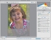
Figure 4.2 The cropping rectangle indicates which portion of the image will appear when it's opened.
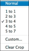
Figure 4.3 Click and hold the Crop tool to access this menu.
If an image is crooked, click the Straighten tool and then click and drag across any straight line that should be horizontal or vertical in the image, such as the horizon line (Figure 4.5). Release the mouse button to display a cropping rectangle that reflects how the image will be rotated when it's opened in Photoshop (Figure 4.6). You can then press the Enter/Return key to confirm the cropped and rotated version, or simply click the Open Image button at the bottom of the Camera Raw 5.0 dialog to see the cropped and straightened image in Photoshop (Figure 4.7).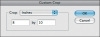
Figure 4.4 Clicking the Crop tool and choosing Custom allows you to enter a precise image size.
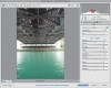
Figure 4.5 An image that could benefit from using the Straighten tool.
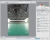
Figure 4.6 Straightening the image in the Camera Raw 5.0 dialog.
Figure 4.7 The adjusted image, opened in Photoshop. (Looks like we need to do a bit more straightening.)
-
Spot Removal and Red Eye Removal tools. Next to the Crop and Straighten tools are the Spot Removal and Red Eye Removal tools. The Spot Removal tool lets you perform adjustments similar to those you can do in Photoshop using the Healing Brush and Clone Stamp tools (Figure 4.8). The options allow you to choose from Heal or Clone. When set to Heal, the correction works similarly to the Healing Brush tool in Photoshop, except that you "stamp" your adjustments: After copying the data from the source location to the destination, Photoshop blends the copied pixels with the surrounding areas to make a cleaner patch. If you set the menu to Clone, the pixels are copied without any blending.
Figure 4.8 Use the Spot Removal tool to remove spots, such as sensor dust.
The Spot Removal tool is not intended for any complex retouching or fancy effects. Rather, these tools provide a simple way to handle sensor dust and scanning artifacts that need to be removed.
We've all seen red-eye, the demonic look that can show up in people's eyes when the light from a camera's flash bounces off their retinas. You can correct red-eye in the Camera Raw 5.0 dialog by selecting the Red Eye Removal tool and then clicking the red part of the person's pupil. The Pupil Size and Darken sliders let you refine your correction.
-
Adjustment Brush. New to Camera Raw 5.0, this tool allows you to paint exposure, either less or more on specific areas of an image. It's not exactly a dodge and burn function, but you can think of it in those terms when working with raw images. You can vary exposure throughout the image quickly and effectively (Figure 4.9). Additionally, you can paint brightness, contrast, saturation, clarity, and sharpness. Brush and feather sizes can be adjusted on the fly. Holding down the Option key lets you brush to revert the effect and allows you to tweak the Size, Feather, Flow, and Density sliders to change the brush size and behavior.
Figure 4.9 The Adjustment Brush increases or decreases exposure throughout an image.
-
Graduated Filter. Also new to Camera Raw 5.0, this handy option can help to pull the viewer's eye closer to the center of an image (Figure 4.10). But the graduated filter is more complex than just adding a gradient to the image. Figure 4.11 shows the filter applied to the top of an image, with the color set to a deep blue, and the contrast increased. The result is not so much a darker sky as a deeper, richer sky. Conversely, you can lighten areas of an image with the graduated filter by increasing exposure.
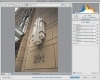
Figure 4.10 The graduated filter allows you to refocus the viewer's attention within an image.
Figure 4.11 Graduated filters are great for darkening and coloring skies.
- Camera Raw Preferences. To the right of all these adjustment tools is a button for opening the Camera Raw Preferences dialog. There are a number of settings that you can customize from the Preferences dialog.
- Rotating tools. Finally, two tools are available for rotating the image 90° to the left or right. It might be more efficient to type L or R, respectively.
-
Management controls. Further to the right at the top of the Camera Raw 5.0 dialog are two important window-management controls. When the Preview check box is turned on, the image is displayed with all of your corrections applied. Turn off the Preview check box to see your original, unaltered image. This feature provides a simple before-and-after switch that you can also access by simply pressing P.
The button on the far right side is the Toggle Full Screen Mode button, which expands the Camera Raw window to fill the full screen. In addition to displaying a larger image, Full Screen Mode hides other distracting interface elements and controls. As in Photoshop itself, you can toggle in and out of Full Screen Mode by pressing F.
-
Workflow options. Beneath the image preview are the workflow settings for the image—a line of text that indicates color space, bit depth, pixel dimensions, and resolution setting (Figure 4.12). You might notice that these settings look like a link on a Web page; sure enough, clicking the link displays the Workflow Options dialog (Figure 4.13).

Figure 4.12 You can view your image workflow, such as resolution and color space, at the bottom of the Camera Raw dialog.
Figure 4.13 Clicking the workflow settings link at the bottom of the Camera Raw dialog displays the Workflow Options dialog.
The workflow options let you specify how much information will be delivered to Photoshop when you open the image. The Space pop-up menu controls the range of colors the image is capable of using (also known as a color space). It's recommended that you set it to the same RGB working space that you'll read about in Chapter 7, "Setting Up Images for Final Output." For now, you can leave it set to Adobe RGB.
The Depth pop-up menu determines how many shades Photoshop can use between black and white. Choosing 8 Bits/Channel delivers an image that contains a maximum of 256 brightness levels, which makes for 16.7 million colors. Choosing 16 Bits/Channel delivers an image that contains a maximum of 65536 brightness levels—giving you millions of colors in the image. The problem is that 16-bit files take up twice as much space as 8-bit files on your hard drive, and neither your computer screen nor your printer is capable of reproducing more than 8 bits of information.
There's a lot of hype out there about the advantages of 16-bit files, but when it comes down to the end result, the difference between 8 and 16 bits is barely detectable (except in some circumstances, which you can read about in the sidebar). Some folks out there might try to shame you into using 16-bit mode by showing you a histogram (bar graph) that shows the difference between 8- and 16-bit results. If that ever happens to you, please ignore the bar graph and ask to see two prints side by side. If you actually see a noticeable difference between the prints, consider taking the person's advice and using 16-bit images. On the other hand, if having reasonable file sizes and a relatively fast computer are your priorities, stick with 8-bit images; your results will still look great. I suggest using 16 Bits/ Channel only when you plan to make major adjustments to the images within Photoshop, or when you really don't care how large your files become or how slowly your computer runs while you're working on an image.
The Size and Resolution settings in the Workflow Options dialog determine the physical size of the image when it's opened in Photoshop. This interpolation is discussed in the bonus video "Resolution Solutions" at www.danablan.com/photoshop.
Finally, there's that Open in Photoshop as Smart Objects check box. We'll discuss Smart Objects in detail in Chapter 10, "Collage Effects."
Once you've configured your workflow settings, click OK to return to the Camera Raw dialog.
)
)
)
)
)
)
)
)
)
)
)
)
In the upper-right corner of the Camera Raw dialog is a histogram that shows how the sliders in the dialog affect the overall tonality of the image. You just read about histograms in Chapter 3, "Layers and Curves," and this one works the same way. The histogram and its uses will be discussed further when we get to the point where we're adjusting images.
Directly beneath the histogram, Adobe has conveniently placed a simple readout that shows the f-stop, shutter speed, ISO, and focal length that were used for the image (Figure 4.14). Next to that information is an RGB readout that shows the component color values for any pixel that you mouse over, just like the Info panel does in Photoshop.
)
Figure 4.14 A handy histogram and the image's f-stop data are provided in the upper-right corner of the Camera Raw dialog.
Below these readouts are an array of sliders organized into tabs of different categories, each with its own set of controls. Let's look at these settings one at a time.
Basic Tab
The Basic tab should be your mandatory first stop in the Camera Raw dialog (Figure 4.15); all the other settings on the other tabs can be considered optional. The Basic tab is where you can change the overall tone and color of the image. It's often good to start with the White Balance setting. If the overall color temperature of your image is off, you'll have a difficult time evaluating the proper exposure, contrast, and other necessary values.
)
Figure 4.15 The Basic tab contains tools you'll use on all of your images.
White Balance
The White Balance setting allows you to shift the overall color of your image, making it feel warm, cool, or neutral. There are three ways to set the white balance of your image: by using the pop-up menu, the sliders, or (in most cases) the eyedropper tool.
The White Balance pop-up menu contains presets for different types of lighting conditions (Daylight, Cloudy, Tungsten, Fluorescent). If you know in which type of light an image was shot, choose that preset so Photoshop will correct for that particular light source. If you're not sure what the lighting conditions were when the image was shot, just click through the various options and watch the image change until you find the setting that makes the colors in the image look the best (Figures 4.16 and 4.17). If you're in a big hurry, set White Balance to Auto, and Photoshop will choose a setting that's appropriate for the lighting conditions of the image. The White Balance pop-up menu moves the Temperature and Tint sliders to preset positions. Before you start fiddling with those sliders, choose a setting on the pop-up menu to give you a good starting point, which you can then fine-tune with the sliders.
)
Figure 4.16 A raw image loaded into Camera Raw and set to a Fluorescent white balance preset makes the outdoors look too blue.
)
Figure 4.17 The image from Figure 4.16 with White Balance set to daylight.
Moving the Temperature slider to the left shifts the colors in the image toward blue; sliding it to the right shifts toward yellow. The Tint slider shifts the color in the image toward green (left) or magenta (right). The combination of these two sliders allows you to shift the image toward just about any color. For instance, if you move both the Temperature and Tint sliders to the right, you'll simultaneously shift the image toward yellow and magenta. Those two colors combined produce red, so that's the color toward which the image will shift. Moving the sliders left shifts toward both blue and green, which sends the colors toward cyan.
If you want the image to look completely neutral (not warm or cool), consider using the eyedropper tool located at upper left in the Camera Raw dialog. With the White Balance tool active, click the image, and Photoshop will figure out the proper Temperature and Tint settings to remove all the color from the area you clicked. All you have to do is find an area that shouldn't contain color and then click it (Figures 4.18 and 4.19). Just look for anything that appears to be a shade of gray in the image. It could be someone's gray sweatshirt, a wall that's painted white, a button on someone's shirt, or anything else that shouldn't contain a trace of color. Then, if the image looks too sterile, you can adjust the Temperature and Tint sliders to make the image a little warmer (move right, toward yellow and magenta) or cooler (move left, toward blue and green).
)
Figure 4.18 An outdoor image with the wrong white balance setting in the camera.
)
Figure 4.19 The image from Figure 4.18, quickly adjusted in Camera Raw.
It doesn't really matter which of the three methods you use (pop-up menu, sliders, or eyedropper); all of them manipulate the Temperature and Tint sliders to produce the final result. Your personal interpretation of how you'd like the image to look will dictate the result.
Exposure Slider
The Exposure slider controls the brightness of the brightest area of the image. As you move the Exposure slider farther to the right, more areas of the image become pure white. Be very careful; otherwise, you'll end up trashing the detail in the brightest part of the image.
There are four ways to tell if you're losing detail. The least reliable is watching the image to see whether any areas are becoming solid white or black. You often can't tell the difference between a very bright area and one that has become solid white. An alternative is to watch the histogram while adjusting the Exposure slider (Figure 4.20). If a spike appears on the right end of the histogram, you're starting to lose highlight detail.
)
Figure 4.20 The histogram in Camera Raw can let you know if the image is clipping highlights.
As you know, an image is made out of red, green, and blue light (also known as channels). If the spike is in color, you're losing detail in one or two of the three colors that make up the image, but you still have detail left in the highlights. If the spike is white, on the other hand, the highlights are becoming solid white and have no detail. A spike only matters if it shows up on the absolute right end of the histogram. A spike in the middle or near the end doesn't indicate a loss of detail. (To learn more about histograms, check out Chapter 7.) The problem with this approach is that light sources and reflections of shiny objects (such as glass, water, or metal) look better when they don't contain detail, and the histogram can't distinguish between those areas and other important parts of the image.
In the upper corners of the histogram are two small buttons, one above the right side (Highlights clipping) and one above the left (Shadows clipping). Clicking the right one toggles the highlight clipping view. When it's turned on, any areas that are losing highlight detail turn red in the Camera Raw dialog (Figure 4.21). That makes it much easier to know when and where you're starting to lose detail. The only snag is that the red overlay doesn't differentiate between losing detail in just one or two of the three colors that make up the image (in which case you still have some detail remaining) and losing detail in all three colors, which produces solid white.
)
Figure 4.21 The highlights clipping warning shows red in the image where you're losing detail.
To get the most informative and useful indication of lost detail, hold down the Option/Alt key while you move the Exposure slider. That will cause Photoshop to change the way it displays the image. In this view, areas that show up as solid white have lost all detail and will end up solid white when the image is opened in Photoshop. Areas that show up in color indicate where you're losing detail in one or two of the colors that make up the image, but the areas have not become solid white yet. Finally, areas that appear solid black have detail in all three of the colors that make up the image and are therefore not at risk.
A good approach to adjusting this slider is to move it toward the right (with Option/Alt held down) until you see the first hints of white showing up (Figure 4.22). Then back off a tiny amount and think of that as the farthest you'd want to move it (Figure 4.23)—unless the area that's becoming white is a light source or reflection of the light source, in which case forcing it to white might actually improve the look of the image. Then look at the colored areas that are showing up, and if there are areas that contain critical detail, continue to move the slider back to the left until you see only small areas of color. You shouldn't mind having large areas of color if you want the image to look really saturated, because you have to max out at least one of the colors that make up the image (red, green, and blue) in order to get a truly saturated color. Once you've found the general range that you like, release the Option/Alt key and see how this setting is affecting the brightest areas of the image, and then fine-tune if necessary. The majority of the time, you may end up leaving it at the position that was just shy of seeing solid white when you had the Option/Alt key held down.
)
Figure 4.22 Holding down the Option/Alt key while dragging the Exposure slider helps you to determine where highlight clipping occurs.
)
Figure 4.23 A little highlight clipping may be okay, depending on the image.
The Exposure setting is only used to control how bright the absolute brightest areas of the image should be. Don't try to control the overall brightness of the image with this slider. There are better ways to do that, which we'll get to in a few moments. Right now, let's talk about the Recovery slider and how it can come to the rescue when the image has clipped highlights.
Recovery Slider
One of the most important things to take away from the previous section is the understanding that highlights don't always clip in all three channels. Very often, a highlight will clip in only one or two channels, though it might appear to be completely blown out, or to have lost detail. When a highlight is only partially clipped, there's a chance that Camera Raw can use the remaining channels to rebuild the clipped channels, and thus restore detail to areas that appear to be blown out. The Recovery slider attempts to do just that.
If you have clipped highlights—as evidenced by a big spike on the right side of the histogram—try sliding the Recovery slider to the right. In Figure 4.24, the white hat is losing detail. As you slide the Recovery slider to the right, you might very well see the spike shrink and disappear, and in the image see detail appear in the blown-out highlight sections (Figure 4.25).
)
Figure 4.24 The white hat is losing detail in this image, as you can see by the spiked histogram.
)
Figure 4.25 A slight drag to the right of the Recovery slider restores detail in the hat, and the histogram no longer spikes.
Highlight recovery can work wonders, turning seemingly unusable images into well-exposed shots full of detail. It often works well in portraits where the model's skin gets a little too bright when the rest of the image is properly exposed. You can also perform highlight recovery by moving the Exposure slider to the left. This will perform the same recovery operation as the Recovery slider, but will also darken the midtones and shadows in the image. The Recovery slider constrains its effects to just the highlights in the image, which means that you won't have to do as much work later to try to restore brightness.
Fill Light Slider
Chapter 3 introduced Photoshop's Shadows/Highlights adjustment, which lets you brighten only the shadow areas of an image (or only the highlights). The Fill Light slider works just like the Shadows slider in the Shadows/Highlights dialog; slide to the right, and the shadow areas of the image brighten. It's called Fill Light here because the overall effect is very similar to what you'd see if you shined a fill light—or fired a fill flash—into the scene. Shadows under people's eyes and chins lessen, and overall contrast is reduced (Figure 4.26).
)
Figure 4.26 Using the Fill Light feature works wonders to add more light to areas that need it, such as under the brim of a hat.
The Fill Light slider lacks the refined degree of control that the Shadows/Highlights dialog provides, but having it in Camera Raw is a great convenience because it just might save you an additional processing step.
Blacks Slider
The Blacks slider controls how dark the absolute darkest areas of an image will be. It works just like the Exposure slider in that you can hold down Option/Alt to see which areas are becoming solid black (they'll look black), which areas are starting to have less detail (colored areas), and which areas haven't lost any detail (they'll look white).
The Shadows clipping button above the left side of the histogram makes areas that are losing detail appear in blue in Camera Raw. Unlike the Highlights clipping button at right above the histogram, the Shadows clipping button only indicates where an area has become solid black. It doesn't indicate areas that are losing detail in just one or two of the colors that make up the image. You may still prefer to use the Option/Alt method because you'll often want to know where you're losing detail in just one or two colors in the image. Hold down Option/Alt and move the Blacks slider until you see the first hints of pure black showing up; then back off just slightly so you don't trash the detail anywhere (Figure 4.27).
)
Figure 4.27 Hold down the Option/Alt key and move the Blacks slider to see where the pure black is within the image.
If you decide not to use the Shadows clipping warning feature when moving the Blacks slider, be sure to keep an eye on the histogram. If you see a spike on the left side, you're losing shadow detail. If the spike is white instead of a color, you're starting to get some solid black areas in the image. One quick way to make images really "pop" is to bring up the Blacks slider just to the point where the image is looking too dark and then bring the exposure up slightly to compensate, being careful not to overexpose the image. Figures 4.28 and 4.29 show an image loaded and then adjusted with Blacks and Exposure. You can use the Recovery slider to pull in detail to highlight areas.
)
Figure 4.28 An original raw image loaded into Camera Raw. Seems okay, but lacks the punch needed for a final portrait.
)
Figure 4.29 The image from Figure 4.28 with the Blacks slider raised and Exposure added to compensate.
Brightness Slider
Now that we've determined how bright the brightest areas should be and how dark the darkest areas should be, it's time to adjust the brightness levels that fall between black and white.
The Brightness slider attempts to adjust the overall brightness of the image without screwing up the brightest or darkest areas. Move the slider to the left if the image needs to be darker (Figures 4.30 and 4.31), or move it to the right to brighten the image (Figure 4.32). If you're planning to make radical changes in brightness, use Curves (see Chapter 3) after you've opened the image in Photoshop. You'll have a lot more control over the process with Curves, but it won't hurt if you make a slight tweak using the Brightness slider.
)
Figure 4.30 An original image with the brightness set to a default of 50. (©2008 Dan Ablan.)
)
Figure 4.31 The image from Figure 4.30 with the Brightness slider set all the way to the left.
)
Figure 4.32 The image from Figure 4.30 with the Brightness slider all the way to the right.
Contrast Slider
Most of the time, you should adjust the contrast of your images using Curves, which provides much more control than you'd ever get by moving a generic Contrast slider. In a hurry, though, you might limit adjustments to what's available in the Camera Raw dialog. In those instances, it's okay to settle for the generic Contrast adjustment instead of spending the time it would take to fine-tune it with Curves (Figures 4.33 and 4.34 show the kind of results you can get with a quick adjustment to the Contrast setting).
)
Figure 4.33 An original image with Contrast set to 25.
)
Figure 4.34 The image from Figure 4.33, with Contrast set to 85.
Clarity Slider
The Clarity slider can be used with a wide variety of photographs. It was devised to boost contrast at the micro level; even though it's a relatively subtle adjustment, it can add noticeable punch and crispness to images. Clarity is a unique adjustment in that it can't be reproduced in Curves, because it uses the image itself to make a mask on which to apply the midtone contrast adjustment. Tread lightly with this slider—a heavy hand can make the image look too contrasty (Figures 4.35 and 4.36).
)
Figure 4.35 An original image with Clarity set to 0. (©2008 Dan Ablan.)
)
Figure 4.36 The image from Figure 4.35 with Clarity set to 87.
Vibrance Slider
The Vibrance slider is a variation on a saturation adjustment. Rather than adjusting the saturation of the entire image, the Vibrance slider attempts to protect flesh tones. If you've ever performed a saturation boost on an image and found that skin tones ended up too red or splotchy, you'll appreciate the Vibrance slider (Figure 4.37).
)
Figure 4.37 Vibrance is a great way to boost colors in an image without oversaturing it.
Saturation Slider
You'll have much more control over your image if you adjust it in Photoshop with a Hue/Saturation adjustment. But if you're in a hurry, or you're batch-processing a large number of images using the same settings, you might decide to use the Saturation slider instead. If you have more time, test the waters with this slider and make the actual adjustments with a Hue/Saturation adjustment afterward (Figures 4.38 through 4.40).
)
Figure 4.38 An image with a -25 saturation level.
)
Figure 4.39 The image from Figure 4.38 with a 0 (default) saturation level.
)
Figure 4.40 The image from Figure 4.38 set to +50 saturation.
If you want a better idea of how the White Balance setting is affecting the colors of an image, you can temporarily pump up the saturation of the image with this slider. Then, once you like the overall color of the image, bring the Saturation slider back to zero.
Tone Curve Tab
The Tone Curve tab (Figure 4.41) works much like the Curves dialog covered in Chapter 3. The Tone Curve tab is divided into two sub-tabs: Parametric and Point, with Parametric mode as the default. Point mode is more like a normal Curves interface, so let's look at that one first.
)
Figure 4.41 The Tone Curve tab allows you to make tonal adjustments to an image.
Like the normal Curves dialog, the Tone Curve shows a histogram with an editable curve laid over it. By default, the curve includes some points that are intended to provide a medium contrast adjustment. The Tone Curve has four preset curves that you can select.
In Photoshop, you simply click the image, which causes a circle to appear on the curve. The circle indicates the area of the curve that will affect the brightness level on which you're clicking. In the Camera Raw dialog, you have to hold down the Command/Ctrl key and hover the mouse pointer over the image (without pressing the mouse button) to see the circle appear. If you click the mouse while holding down Command/Ctrl, a dot will be added where the circle appeared.
Two things to note about the Point curve: When you add a point to the curve and move it up or down, you won't see its effects until you release the mouse button; the tone curve is much more sensitive than the Photoshop Curves dialog. You'll most likely find that your curve adjustments are very small.
The Parametric curve provides a very different way of working, one that combines the power of Curves with the ease of a Levels adjustment. The Parametric tab has the same curve/histogram display, but beneath it are four sliders—Highlights, Lights, Darks, and Shadows. As you slide these sliders, the appropriate part of the curve will automatically bend and reshape to affect just the tonal range specified by the slider (Figure 4.42).
)
Figure 4.42 Sliding the Parametric sliders automatically reshapes the appropriate part of the curve.
For further refinement, you can adjust the three sliders shown at the bottom of the curve display. These change the midpoint of each of the slider ranges. For example, use the bottom sliders to specify how much adjustment you want, and then use the sliders directly beneath the curve graph to fine-tune that adjustment to a very specific part of the curve (Figure 4.43).
)
Figure 4.43 Sliding the sliders directly beneath the curve lets you adjust the midpoint of each Parametric slider.
After using the Tone Curve tab for some time, you'll probably feel that it's not as intuitive as the one built into Photoshop. You might miss the ability to use Curves combined with some of the more sophisticated features in Photoshop (adjustment layers, blending modes, layer masks, and so on), which is what really makes Curves powerful and gives you the ability to make much more precise and effective adjustments (see Chapter 3 for information on Curves, Chapter 5 for more on adjustment layers). For those reasons, you may only use the Point curve in Camera Raw when you plan on saving the image directly out of the Camera Raw dialog or when images will be used with the automated features found under the Tools menu in Adobe Bridge. For all other purposes, try to use the Curves dialog within Photoshop.
Detail Tab
Digital cameras often produce images that look a bit soft and can contain tiny specks of noise that are distracting. The Detail tab (Figure 4.44) is where you can deal with these problems and hopefully produce a sharp and noise-free image. These settings make rather subtle changes, so it's best to work with them when you're viewing the image at 100% magnification.
)
Figure 4.44 The Camera Raw Detail tab.
Sharpening
Many photographers prefer to sharpen their images as the final step before printing. Ideally, you should sharpen an image after it has been scaled down to its final size. The sharpening defaults are not set to zero, so you might want to adjust the sharpening within the Camera Raw dialog as part of your workflow.
If you're in a hurry or feeling just plain lazy, there are merits to using the Sharpening sliders. Camera Raw 5.0 has six sliders (Amount, Radius, Detail, Masking, Luminance, and Color), allowing for a great deal more control over sharpening than with previous versions. With the added controls, it might be useful to save combinations of these sliders as presets for specific image types such as portraits or landscapes. (We'll talk about the Camera Raw Presets tab later in this chapter.) In some cases, moving the sliders doesn't appear to do anything to an image. That usually happens when you're zoomed out to see the entire image. Before you start to sharpen an image, double-click the Zoom tool in the upper-left corner of the Camera Raw dialog. That will get you to 100% view, where you'll be able to see exactly what the Sharpening sliders are doing. When you're done sharpening, you can double-click the Hand tool to get back to the view that shows the entire image. I won't say much about sharpening here because Chapter 6, "Sharpening," dedicates an entire chapter to the subject.
Noise Reduction
Digital image noise comes in two flavors: luminance and chrominance, or color. The Luminance slider is designed to reduce the noise that shows up when you use high ISO settings with your digital camera. Luminance won't deal with those colorful specks you see on occasion (that's handled by Color Noise Reduction, discussed next), but it should be able to handle the dark specks that you get when you try to brighten an image that was shot in low lighting conditions. All you need to do is zoom to 100% view (double-click the Zoom tool to get there), and then experiment with the slider until the noise is minimized. Just be sure to look at the fine detail in the image to make sure that you haven't removed important detail such as freckles or skin texture.
The Color Noise Reduction slider attempts to blend in any colorful specks that appear on the image, by making them look similar to the colors that surround them. These colorful specks are often the result of shooting with high ISO settings on your digital camera. As with luminance reduction, start at 100% view and move the slider just high enough to blend the multicolored specks into your image.
Be careful with the Luminance and Color Noise Reduction sliders. Both will soften the image, which is why they're grouped in this tab with the Sharpening sliders. Be sure to toggle the Preview check box at the top of the image off and on to make sure that it's worth applying these settings. Sometimes it's better to have a noisy image that still has detail and sharpness than one with no noise that looks overly soft. Also, remember that you can always sharpen an image after you open it in Photoshop, which means that it doesn't have to remain as soft as it might appear after you apply noise reduction.
HSL / Grayscale Tab
Sometimes you may need to make color shifts and adjustments to specific parts of the color range. For these times, Camera Raw provides the options on the HSL /Grayscale tab. Like many other additions to Camera Raw, the HSL /Grayscale control was purloined from Photoshop Lightroom.
The HSL control is divided into three tabs: Hue, Saturation, and Luminance. In each tab you'll find the same selection of color ranges: reds, oranges, yellows, greens, aquas, blues, purples, and magentas. One tab doesn't override another; you can make adjustments on each tab to create a cumulative correction. You'll probably need to switch from tab to tab to make your adjustments, however. If you increase luminance, for example, very often you'll have a different impression of the hue or saturation in your image.
Hue
In the Hue tab, you can adjust the hue of each color range simply by dragging the slider to the left or right (Figure 4.45). The Hue tab doesn't let you make huge swings in hue; you can't turn reds into blues, for example. For those extreme shifts, you'll need to use the hue controls in Photoshop. The Hue tab is for making slight adjustments to remove casts or slight corrections to particular color ranges. If the reds in an image are a little too orange, for example, slide the Reds slider to the left.
)
Figure 4.45 By using the sliders in the Hue tab, you can shift the hues of specific color ranges in an image.
Saturation
The Saturation tab lets you adjust the saturation of each specific color range (Figure 4.46). You can adjust the saturation of just the red tones in the image, for example, by dragging the Reds slider back and forth. Slide to the left to desaturate a particular color range; slide right to increase the saturation.
)
Figure 4.46 The Saturation tab's sliders let you increase or decrease the saturation of specific colors.
Luminance
In the Luminance tab, you can adjust the luminance (brightness) of each color range. Sliding to the right brightens a color range; sliding to the left darkens colors.
Convert to Grayscale
Above the three tabs in the HSL / Grayscale tab is a Convert to Grayscale check box. If you select it, the three tabs disappear, replaced by a single Grayscale Mix tab (Figure 4.47). The image preview shows your new grayscale image, and the histogram changes to a single-channel histogram.
)
Figure 4.47 The Grayscale Mix sliders let you create custom grayscale conversions directly within Camera Raw.
The color sliders work much like in Hue/Saturation/ Luminance mode, but instead of altering hue they alter the shade of gray of those particular colors. So if you slide the Reds slider to the right, for example, any red tones in the image will get lighter.
By default, when you turn on the Convert to Grayscale check box, Camera Raw analyzes your images and calculates initial settings for the sliders. If you alter the sliders and want to go back to the initial conversion settings, click the Auto link. Clicking the Default link restores all sliders to their default positions. If you haven't changed them manually, all the default positions will be zero.
There's no image-quality advantage to be had by performing grayscale conversions in Camera Raw rather than in Photoshop (see Chapter 7). The advantage of grayscale conversion in Camera Raw is that, like all other Camera Raw adjustments, grayscale conversion is nondestructive, and you can batch-process it by using any of the normal batch-processing operations.
Remember that Camera Raw is a nondestructive editor. As you adjust settings, it constantly reprocesses your original raw camera data to present a new image onscreen. When you turn on the Convert to Grayscale check box in the HSL / Grayscale tab, the grayscale conversion is just another item added to the list of edits and adjustments that the software must make before it can show the final image onscreen. Even after you've told Camera Raw to convert the image to grayscale, you can continue to alter color and tone by using any of the program's controls (Figure 4.48).
)
Figure 4.48 After converting the image to grayscale, you can use the Grayscale Mix sliders to change the gray value of specific tones in the image. Shifting the Blues slider, for example, pulls out detail in the railings.
You're effectively changing the color of the image "underneath" the grayscale conversion. When you convert to grayscale, Camera Raw uses the original color values to determine a resulting grayscale value. So if you alter the color values by using any of Camera Raw's color-editing tools, the resulting gray values will change. This is yet another way that you can alter the gray values in your final image.
Split Toning Tab
Split toning allows you to apply separate toning to the shadows and highlights in your image. For each area, you can select different hue and saturation settings. Split toning works with either grayscale or color images, but you'll probably use it most often on grayscale pictures.
It doesn't matter whether you tone highlights or shadows first. For this example, start with the highlights. First, slide the Highlights Saturation to around 50 (Figure 4.49), goosing saturation because it can be difficult to see the effects of a hue choice when saturation is at zero.
)
Figure 4.49 Begin your split-toning operation by increasing the Saturation setting in the Highlights section of the Split Toning tab. (©2008 Dan Ablan.)
Next, use the Hue slider to choose the hue you want for toning, and slide the Saturation slider down to something reasonable (Figure 4.50). Then perform the same steps using the Shadows sliders, to produce the image shown in Figure 4.51.
)
Figure 4.50 After setting the Hue slider, set the Saturation slider back to something more reasonable.
)
Figure 4.51 Perform the same operation on the shadow tones in your image to complete the split toning.
The Balance slider lets you shift the highlights toning more into the shadow areas, and vice versa. This option allows you to have more or less of either type of tone.
Split toning can be applied to color images or to images on which you're performing a black-and-white conversion. As explained earlier, when you're converting to black-and-white, changes to color affect the final gray tones that Camera Raw produces. So performing a split-toning operation on an image that has a grayscale conversion applied will alter the final gray tones that Camera Raw generates.
Lens Corrections Tab
The Lens Corrections settings are completely optional (Figure 4.52). You may prefer to use them only when you notice specific problems with an image. These problems are often a result of the lens that was used to shoot the images.
)
Figure 4.52 The Camera Raw Lens Corrections tab.
Some lenses—particularly wide-angle lenses—focus different wavelengths of light at different points. When that happens, you can end up with a halo of color on the edges of high-contrast lines in your image. This is called chromatic aberration. You might need a very fine eye to see the particular problem, but the higher the contrast between objects, the more obvious it will be. What you'll see is a shift in color around edges, or fringes within the image. This problem can happen with any lens, and chromatic aberrations are often what separate an inexpensive lens from a pricier one.
If you notice a halo of red on one side of an object and cyan on the opposite side, try moving the Fix Red/Cyan Fringe slider back and forth to see if you can reduce the halos (Figures 4.53 and 4.54). If you see blue and yellow halos, adjust the Fix Blue/Yellow Fringe slider instead. You might need to adjust both of the sliders, depending on what colors you're seeing on the edges of objects. Because these sliders are performing a very simple operation—scaling the colors that make up your image—they can't always get rid of this type of problem.
)
Figure 4.53 Looking very closely at an image, you can see bands of color pulling away from the subject. This is called chromatic aberration.
)
Figure 4.54 Camera Raw's Chromatic Aberration settings remove unwanted halos of color.
When you have images with specular highlights (such as the surface of a windy lake on a sunny day), you'll often encounter some degree of fringing, which is purple, red, or magenta color surrounding the hot specular highlights. The new Defringe pop-up menu in the Lens Corrections tab will help to reduce this negative effect. There are three options: Off, Highlight Edge, and All Edges. Selecting the Highlight Edge option removes most of the color additions, but there may still be a degree of fringing. Setting to All Edges removes the majority of the fringe effects, but it can negatively affect color saturation in areas where the defringing is occurring, so you'll have to decide whether this adjustment is useful on an image-by-image basis. As with sharpening and noise reduction, you really only see the effect at 100% zoom or higher.
The Vignetting sliders are designed to compensate for light falloff on the edge of an image. Vignetting is a photography term referring to lighter centers with darker edges. If you notice that the outer edges of an image are darker than the middle, move the Lens Vignetting Amount slider to the right until the brightness of the edge looks more like the middle of the image. Once you've done that, you'll need to adjust the Lens Vignetting Midpoint setting to control how far the brightening effect of the last slider encroaches on the center of the image. Just move it until the formerly dark edges blend into the rest of the image.
You can also use these sliders to add vignetting to your image (Figures 4.55 and 4.56), which will effectively darken the corners and edges of the image. Photographers often like that effect because it draws the viewer's attention toward the center of the image. You can add to the effect by lowering the Saturation and Contrast sliders under the Basic tab to simulate the look of an old, faded photo (Figure 4.57).
)
Figure 4.55 The original image is okay, but could be better.
)
Figure 4.56 With vignetting applied, the viewer's eye is pulled toward the center of the image.
)
Figure 4.57 Adjusting the saturation and contrast help give the photo a unique look.
Camera Raw 5.0 also offers the ability to set a vignette after you've cropped an image. With the Post Crop Vignetting sliders, you can set the Amount and Midpoint, as with the lens vignette, but you can also set Roundness and Feather values. You don't have to crop your image to use these tools. Sometimes they can give you a more interesting look than the standard vignetting does.
Camera Calibration Tab
The sliders in the Camera Calibration tab (Figure 4.58) allow you to change the way Photoshop interprets the color information that your camera delivers. You can use these settings to simulate different film types and to compensate for problems that come with certain digital cameras.
)
Figure 4.58 These settings allow you to change how Photoshop interprets the colors in an image.
Certain models of digital cameras produce images that have an annoying color cast in the darkest areas of an image (Figure 4.59). If you have one of those cameras, just about every image you open will have a cast in the shadows of the image. The Tint slider in the Shadows section allows you to shift the color of the darkest areas of the image toward green or magenta (Figure 4.60).
)
Figure 4.59 In the original image, the marble has a green tint.
)
Figure 4.60 Adjusting the Shadows Tint slider helps remove unwanted color.
If you're not happy with the color in your digital camera's images, experiment with the Red Primary, Green Primary, and Blue Primary Hue and Saturation sliders. These sliders can also be used to simulate different film types (Figures 4.61 and 4.62).
)
Figure 4.61 The original image.
)
Figure 4.62 The image from Figure 4.61, after experimenting with the RGB settings in the Camera Calibration tab.
The sliders won't change areas that are neutral gray. The Red Primary sliders mainly affect the appearance of reds in the image, affecting yellow and magenta areas to a lesser extent. The Green Primary sliders mainly affect the appearance of greens, affecting cyan and yellow areas to a lesser extent. The Blue Primary sliders mainly affect the appearance of blues, affecting magenta and cyan areas to a lesser extent.
Presets Tab
If you regularly make the same adjustments to your images—perhaps because your camera has certain characteristics that always need to be corrected in the same way—you might want to save your adjustments as a preset, so that you can easily apply it to images in the future. A preset is simply a saved set of Camera Raw parameters that you can assign to any image.
To save a preset in Camera Raw, configure the parameters the way that you want them, switch to the Presets tab, and click the New Preset button at the bottom of the panel (Figure 4.63). Next, configure the New Preset dialog by selecting any items you want to save in your preset. (If you want your preset to use any of Camera Raw's auto-adjustment features, for example, turn on the Apply Auto Tone Adjustments check box.) After selecting the desired settings, enter a name for your new preset in the Name field and click OK.
)
Figure 4.63 Create a new preset by clicking the New Preset button at the bottom of the Presets tab.
To apply a preset to a raw file, open the image in Camera Raw, switch to the Presets tab, and click the preset you want to apply. The image will be adjusted according to the settings saved in the selected preset.