- Making Images Look a Whole Lot Better
- Why You Should Be Shooting Raw
- The Develop Module Adjustment Tools
- Chapter 3 Assignments
This chapter is from the book
This chapter is from the book
This chapter is from the book
The Develop Module Adjustment Tools
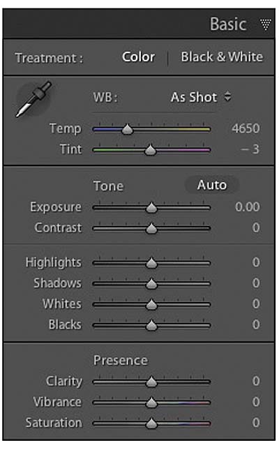
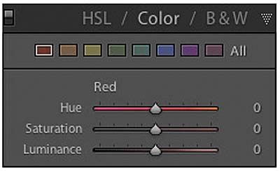
To work on an image in the Develop module, click the word Develop at the top of Lightroom or simply press the D key. Eight different panels are located on the right side of the Develop module. Each one contains a variety of controls that enable you to make specific adjustments to your image. You will probably do most of your work in the Basic panel (Figure 3.1).
)
Figure 3.1 The Basic panel
The Basic Panel
A raw image file contains no adjustments when it comes out of your camera. It does, however, contain the metadata that stores the camera settings used to create the image. This includes aperture, ISO, and shutter speed settings. It also includes the camera’s white balance information, which is what appears in the White Balance control.
Getting those colors right
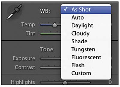
The default White Balance setting is As Shot, but you can change that to several different presets, just as you would on your camera. Included in the list of presets are Auto, Daylight, Cloudy, Shade, Tungsten, Fluorescent, Flash, and Custom (Figure 3.2).
)
Figure 3.2 Raw shooters can select different White Balance presets.
Selecting one of these presets will change the Temperature and Tint settings of the image to the preset value. If you do this manually by using one the sliders below the White Balance presets, the White Balance setting will be set to Custom. If you have something in your image that is neutral in color, you can click on it with the White Balance Selector (the eyedropper) and automatically adjust the white balance. This is also helpful if you have included a white balance card in one of your images, because you can use it to correct white balance in a group of photos taken in the same lighting conditions.
Ideally, you should include a new white balance shot for every changing light situation you are shooting in. If you have not included a white balance card in your image, start with a preset that closely matches the light that your photo was taken in. If the white balance still needs a little adjusting, fine-tune it with the Temperature slider until it looks right. The goal is to remove any color cast, in your image and make the colors look as they should.
Making tonal corrections with the Exposure slider
Once you have adjusted the image’s white balance, it’s time to start correcting the overall brightness and darkness. A good reference for what to adjust is in the histogram in the upper-right corner of your screen. A histogram is a graphical representation of the tones in your photo; the darkest areas are on the left, and the brightest parts are on the right. If your image is overexposed or has areas that are so bright that they appear as white and have no visual information, the histogram will have a spike on the right side. If there is a lot of black in the photo, the histogram will have a large spike on the left side. The key is to make sure that you have good tones throughout the image and that the blacks and whites are as accurate as possible. The easiest way to do this is by adjusting the Exposure sider.
If you need to make overall adjustments to the image brightness, you can do so by moving the Exposure slider, which has a default setting of 0. The adjustments are related to stops in exposure value. You can make the image five stops brighter by moving the slider to the right or five stops darker by moving it to the left.
)
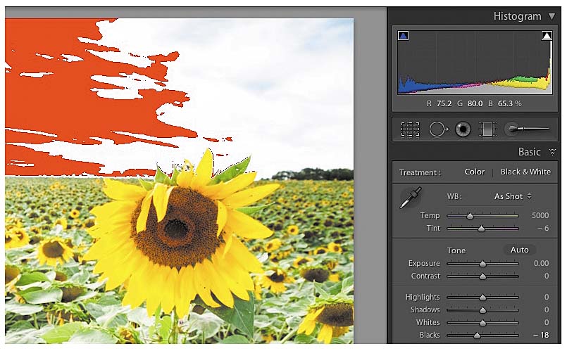
Figure 3.3 The clipping warning indicates where your highlights and shadows need adjusting.
Adjusting image contrast
The Contrast slider is set to 0 by default, and moving it to the right increases the contrast in your image. A contrast increase means that you will have a decrease in the amount of midtones of the image, making them either darker or lighter. By lowering the adjustment (moving the slider to the left), you increase the midtones by making dark areas lighter and light areas darker. Adding contrast often adds some visual impact to the image, but you should be careful not to go overboard. Sometimes a subject looks better with a flat contrast. For example, a gray, overcast day is low contrast, and a bright sunny day is high contrast. Each look can be appropriate at times in your photos.
Saving your highlights
The Highlight slider is an amazing tool for fixing those areas in your photo that are too bright without making the rest of the image darker. As you move the Highlight slider to the left, the brightest parts of the photo get darker and darker. The best way to use this tool is to watch the highlight clipping warning in the histogram (Figure 3.3). You can continue moving the Highlight slider to the left until the warning disappears. An easier way to do this is to click the highlight warning triangle and then move the Highlight slider to the left until the red overlay on the image disappears.
If you aren’t clipping highlights but find that they need a little brightening, simply move the Highlight slider to the right.
Lightening your shadows with the Shadow slider
If you have the opposite problem of too many dark areas with no detail, you can try using the Shadow slider. This slider was called Fill Light in previous versions of Lightroom. Moving this slider to the right lightens the darkest parts of your image without affecting the highlights. The slider can be adjusted to a setting of 100, but it usually isn’t necessary to move it more than 20 points to fix most problems. You can also move the slider to the left if you want to darken the shadow areas with minimal effect on the midtones and highlights.
Better-looking blacks
The Blacks slider works specifically on the darkest parts of the image. Sometimes it’s necessary to increase the blacks, especially if you made a lot of Shadow modifications. Moving the Blacks slider to the left inceases the black/dark areas of an image and adds some contrast and a little increase in color saturation. Moving the slider to the right lightens the blackest parts of the image. The Blacks slider does not have much effect on the midtones or brightest tones in the image.
Fine-tuning your whites
Another change in Lightroom 4 is the addition of the Whites slider, which replaces the Brightness slider in previous versions. The Whites slider acts in the same fashion as the Blacks slider, but it affects the brightest parts of the image without touching the midtones and blacks.
Adding some visual punch with the Clarity slider
Of all the sliders in the Basic panel, the one I always use is Clarity. This adjustment adds contrast to the midtones in a way that can punch up a dull image or soften an image that looks too crisp. The default setting for this adjustment is 0; moving it to the right increases midtone contrast and makes the image look crisper and snappier. Moving the slider into the negative numbers decreases the midtone contrast and gives the image a softer look. This is a great way to improve skin tones in a portrait. The best way to make Clarity adjustments is to zoom your image to a 100% view so that you can better judge the effects of the slider.
Brightening dull colors
The Vibrance slider lets you make adjustments to the less colorful parts of your image. By moving the slider to the right, the saturation of less colorful areas increases without affecting the already saturated areas. The algorithm that controls the adjustment was written so that skin tones are not as affected by the increase of saturation. You can also get a more subtle palette of colors by reducing the vibrance of the image.
From black and white to crazy colors with Saturation
If you want to boost all the colors in your image, use the Saturation slider. Moving it to the right increases the saturation of all colors in the image. Moving it to the left decreases saturation all the way to the point of looking like a black-and-white image.
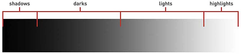
The Tone Curve Panel
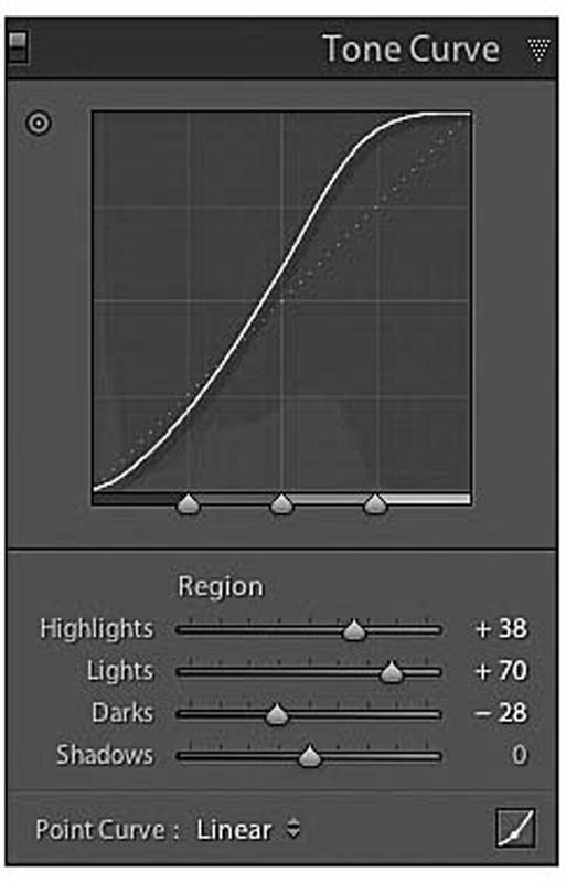
Although contrast adjustments are available in the Basic panel, it’s sometimes necessary to have a little more control over which areas of contrast are affected. This is where the Tone Curve panel comes into play. The four sliders can be adjusted to the right for lightening or left for darkening (Figure 3.4). The top slider is for highlights, which are the brightest parts of the image. The Lights slider works on the brighter tones without affecting the highlights or darker areas. The Darks slider affects darker portions of the image without affecting the lights and highlights. The Shadows slider works on just the darkest portions of the image (Figure 3.5). If you don’t want to use the sliders, you can try using the Target Adjustment tool. To activate it, click the small circular bullseye to the upper left of the Tone Curve graph. You can also press Command+Alt+Shift+T (Ctrl+Alt+Shift+T). When the tool is active, place the cursor on the area of the image that you want to change, and then click and drag your mouse. Moving the mouse up lightens the area; moving it down darkens the area. When you’re finished, click Done at the bottom of the preview window.
)
Figure 3.4 The Tone Curve gives you more control over image contrast.
)
)
Figure 3.5 Tonal regions are controlled by the different curve sliders.
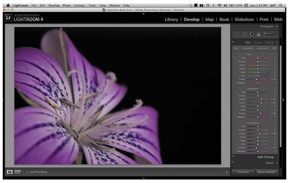
Adjusting Colors
The White Balance tool in the Basic panel allows for color corrections, but what if you want to make changes to a particular color in the image? If that’s the case, you need to check out the HSL/Color/B&W panel.
Hue, Saturation, and Luminance
This HSL/Color/B&W panel is divided into three sections. To activate the Hue, Saturation, and Luminance tools, click HSL in the panel’s title bar. The HSL panel (Figure 3.6) is divided into four sections with the first being Hue. The Hue sliders allow you to make modifications to the actual colors. If you want your yellows to look greener, move the slider to the right. If you want them to look more orange, move it to the left. These color shifts are fairly subtle and are for fine-tuning your colors on an individual basis.
)
Figure 3.6 The HSL panel adjustment sliders.
If you want to adjust the saturation of a color, click the word Saturation to switch to that portion of the panel. These sliders allow you to increase or decrease the saturation, or how vivid the individual colors appear. You can actually move a slider all the way to the left to turn a color gray, which is handy for applying some special effects to your images.
The Luminance sliders darken or lighten a specific color in the image. They don’t affect the vividness, just how bright or dark the color is.
If you want to see all three of the adjustment tools in one panel, click the word ALL for an expanded panel view (Figure 3.7).
)
Figure 3.7 Expand the HSL panel to see all the sliders by clicking ALL.
Color panel
The Color panel is another way of making HSL changes using a different format for the adjustment. You can click on a color block at the top and then use the Hue, Saturation, and Luminanace sliders below to make your changes (Figure 3.8).
)
Figure 3.8 The Color panel makes adjustments similar to the sliders in the HSL panel.
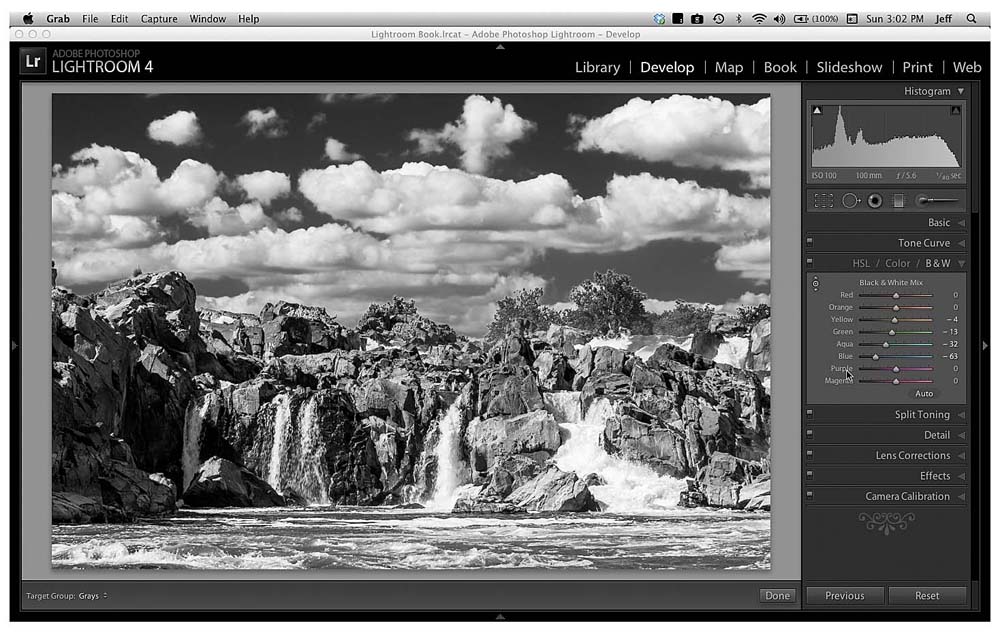
Creating great black-and-white images
Clicking the B&W adjustment panel will instantly turn your image to a black-and-white version. Lightroom renders an auto-conversion, which is why the sliders are not set to 0. I find that the auto-conversion is not as good as one that I adjust myself, so I reset the sliders to 0 by double-clicking each color name. Then I move each slider while looking at the image to get the desired tonal effect. The sliders work by targeting individual colors and adjusting their gray values in the image. This means that if you have a blue element in the image, like the sky, you can move the Blue slider to the left to darken just those areas that are blue (Figure 3.9).
)
Figure 3.9 Adjust the color sliders to make a great looking black-and-white image.
Another favorite method for adjusting the tones in an image is to use the Target Adjustment tool, like you did in the Tone Curve panel. Activate the tool by clicking the little bullseye in the panel or by pressing Command+Alt+Shift+G (Ctrl+Alt+Shift+G). When the tool is activated, just drag it on areas of the image that you want to lighten or darken, and the tool will autmatically make those changes to the different sliders based on the underlying color you are sliding the cursor over.
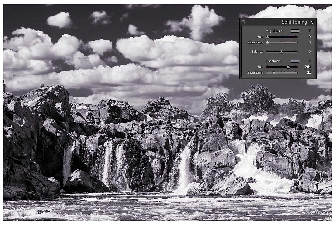
Creating Split Tones
Split Toning is a way to add color hues to the highlights and shadows of your black-and-white photos. It is a look that dates back many decades and is probably most famously known by the name Sepia tone. Using the Split Toning tool is very simple. After adjusting your image to make it black and white, select the desired Hue that you want for the highlights, shadows, or both, and then increase the Saturation to control how much color toning is introduced. You can also use this panel on color images, but it’s much more effective in black and white (Figure 3.10).
)
Figure 3.10 Split Toning can add some great color effects to black-and-white photos.
All Raw Files Need Sharpening
When you click the Detail panel, you’ll see that some base sharpening has already been applied to your photo. The reason is that raw images do not have sharpening added by the camera, like JPEGs do, so Lightroom adds a little bit to get you started. If you are working with JPEG images, the files will have zero sharpening applied as a default. Once again, the reason is that your camera has already applied sharpening when creating the JPEG file, and Lightroom does not want to oversharpen your images.
Applying sharpening
When applying sharpening, you should first zoom in to a 100% view so that you can see the precise results of your sharpening efforts. Then raise the Amount slider to a level that provides good detail to sharpen edges in the image. The goal of sharpening is to make the edges look better without affecting the elements that shouldn’t be sharp, like the sky, skin, or a flat surface. Typically, you’ll get the best results with the Amount slider set somewhere between 50 and 100.
The Radius slider controls how much the sharpening extends out from the edges. The default setting is 1; I leave it set there most of the time. If you have an image that looks fuzzy, you can try raising this slider a bit, but be careful not to go overboard.
The Detail slider is set to 25 by default, and that is generally where I leave it. You can raise it if you want to increase small details, like intricate lines. When using this slider, avoid introducing halos. If you move the Detail slider too high, you’ll get contrast lines around your edges that can look like glowing halos. If you start seeing them, lower the Details slider until they disappear.
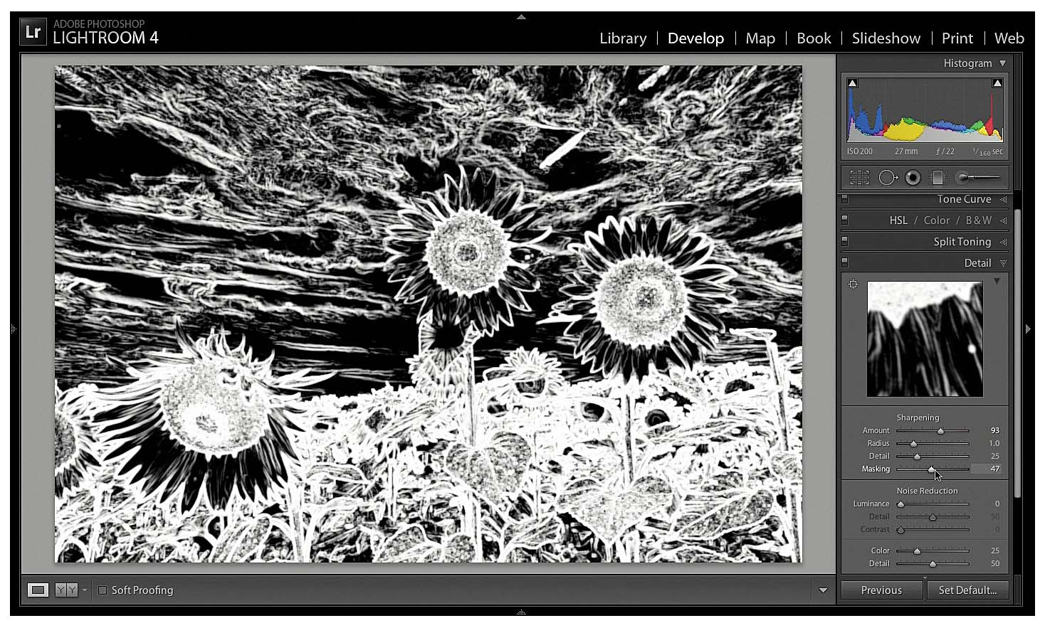
The Masking slider is one of my favorites. It allows you to mask out or restrict the sharpening to only the edge areas of the image and avoid the surfaces. Using the slider is as simple as moving it to the right, but it can be difficult to see the results, which is why I prefer to use a visual helper. Hold down the Option (Alt) key while dragging the slider, and a black-and-white mask will appear on the image in the preview window. At first the window will appear completely white, but as you move the slider to the right, you’ll see portions of the image turn black (Figure 3.11). Keep moving the slider until just the edges that you want sharpened are white, and everything else is black.
)
Figure 3.11 Hold down the Option (Alt) key while moving the Masking slider to see where sharpening is being applied.
If you aren’t sure where to start with your Sharpening settings, try these: Amount 70, Radius 1.0, Detail 30, and Masking 70. Then move the sliders and fine-tune for your image. It’s important not to oversharpen your photos. A sharp image with good details is great, but an image that is oversharpened will stick out like a sore thumb.
Taming the noise
Sometimes it’s necessary to shoot with a high ISO, even though you know it will add digital noise to your image. When this happens, you can turn to the Noise Reduction sliders to help eliminate the problem. Most noise you will encounter can be handled by adjusting the Luminance slider. All that’s required is to move the slider to the right until the noise in your image is gone. Too much noise reduction can make your picture look soft, so don’t overdo it. The default settings for the Detail and Contrast sliders are usually adequate for most situations, but you can fine-tune them after reducing the noise with the Luminance slider. You might find that you need to readjust your Sharpening settings after applying noise reduction.
The Color slider is set to a default of 25 and rarely needs to be adjusted. If you are still seeing small multicolored specks in your image, move the Color slider to the right until they are gone (Figure 3.12).
)
Figure 3.12 Adjust the Luminanace slider to reduce image noise.
Lens Correction
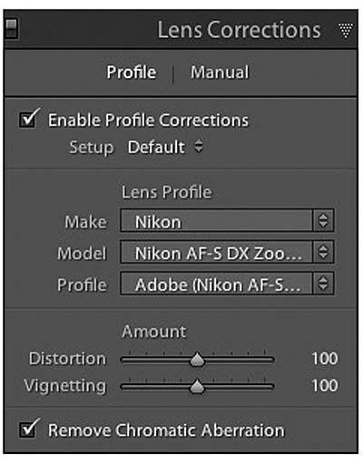
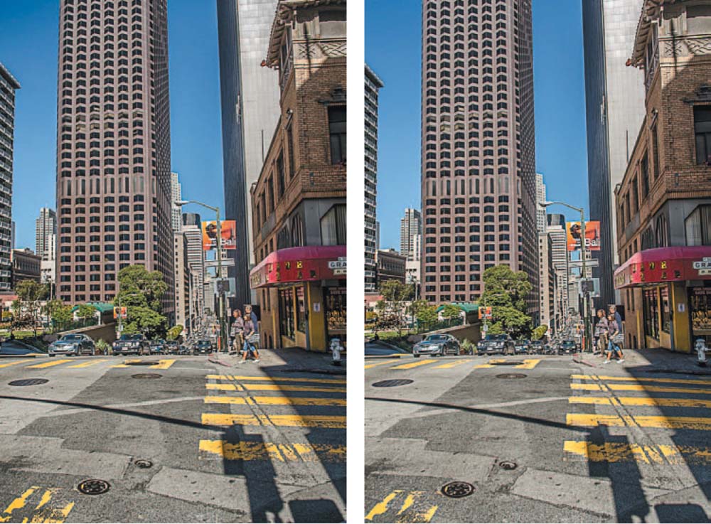
When you take a photograph, it’s sometimes easy to forget how much curved glass the light is passing through in the lens to make the image on the sensor. All that glass can have some negative effects in your image in the form of distortion and vignetting. If you are shooting raw images, there’s a good chance that Lightroom will be able to automatically correct those problems by using Lens Profiles. By selecting the Enable Profile Corrections check box, Lightroom will look at your image metadata to determine the lens make and model, and then match it to one of the presets (Figure 3.13). If you shot JPEG, you can try to locate the lens by manually clicking in the Make, Model, and Profile drop-down lists. Figure 3.14 shows an uncorrected image on the left with dark vignetting on the corners and some barrel distortion or curving of straight lines. The image on the right has had the corrective profile applied, which has improved those problems.
)
Figure 3.13 Select the Enable Profile Corrections check box to activate auto-lens correction with Lens Profile presets.
)
Figure 3.14 The figure on the left has line distortion and dark vignetting in the corners. The image on the right has been corrected using auto-lens correction.
If you can’t find your lens in the list, access the Manual adjustments and manually make changes to correct problems like distortion and vignetting.
Adding Some Effects to Your Image
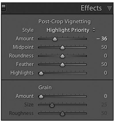
Vignetting that comes from your lens can be a problem, which is why there is a correction for it. But when you want vignetting in your image, it’s called an effect. Vignetting is a very popular effect that you’ll see in all sorts of photos. It is a way of darkening or lightening the edges/corners of an image to draw the viewer’s eyes in towards the center of the frame and the subject (Figure 3.15). Using the sliders in the Effects panel to create a vignette is pretty easy. Just move the Amount slider to the left for a dark vignette and to the right for a lighter effect (Figure 3.16). You can control how far into the image the vignette extends by using the Midpoint slider. Using the Roundness slider you can make the vignette pattern appear more rounded by moving it to the right or a little more squared off by moving it to the left. The Feather slider controls how soft the fall-off is between the vignette and the image. The Highlights slider lets you protect light areas from the effects of the vignette. So, for example, if you are vignetting a landscape that includes a sky and you want the majority of the vignette only on the darker ground area, you could move the Highlights slider to the right and recover the brightness in the corners of the lighter-colored sky.
The Effects panel also contains a Grain effect that introduces film-like grain in your image. This is different than noise and is mostly used to give images an older vintage look.
)
Figure 3.15 Edge vignetting was added to this image using the Effects panel.
)
Figure 3.16 The Effects panel lets you add vignetting and fake film grain.
The Camera Calibration Panel
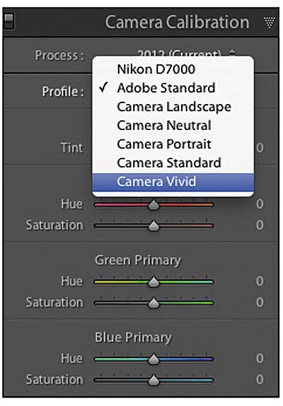
Have you ever looked at the image on your camera’s LCD screen and thought, wow, this looks great! and then when you look at it on your computer screen, it’s a little disappointing? You’ve probably experienced this if you shoot raw, because the image you see on your camera is a JPEG that has been corrected and enhanced by the camera. But because you are working with a raw file, all of those enhancements are stripped away when you open it on your computer. A quick way to add back some of that pizzazz is to select a new camera profile from the Camera Calibration panel.
Improving your image with camera profiles
Camera profiles are settings that attempt to match the camera manufacturer’s colors in different shooting scenarios. The Adobe Standard profile is the default setting for all raw files. It is fairly generic and treats all raw files the same way, no matter which camera produced them. It is simply a base enhancement to improve color rendering in the yellows, reds, and oranges of your image.
Camera profiles are specific to your camera and often contain choices, such as Camera Standard, Landscape, Vivid, Portrait, and Neutral, but each might be slightly different for your camera make and model (Figure 3.17).
)
Figure 3.17 Camera profiles can easily be changed in the Camera Calibration panel.
Using the profiles is as easy as selecting a new profile from the drop-down menu. You will get an instant preview in the main preview window. There’s no way of knowing which profile will look best, so it’s best to try them all. I find I get the best results with the Landscape and Vivid profiles. They can be a little contrasty, though, so I don’t necessarily use them all the time. It really depends on the subject.
By the way, if you shoot JPEG, you will not be able to use any of the presets on this panel. In fact, if you have a JPEG loaded and click the Camera Calibration panel, the only profile that appears is Embedded, which means that your image already has a profile assigned to it by the camera.
Develop Presets
One way you can greatly improve the speed with which you process your images is through the use of presets. Lightroom comes loaded with some built-in presets for your use, but you can also create your own custom presets tailored to the way you process images.
Using and previewing Develop presets
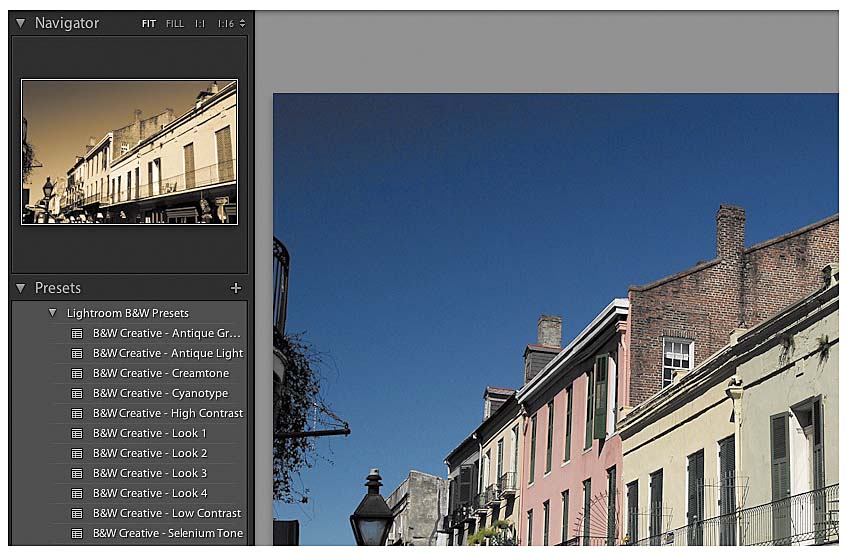
The Preset panel is located to the left of the preview window, just under the Navigator panel. I like to combine the use of these two panels when working with presets because the Navigator allows me to quickly preview the look of a preset without having to apply it to my image. The Preset panel is very simple to use; just expand one of the preset groups and then move your mouse over a preset. The preset look will immediately be displayed on your image in the Navigator panel. You can quickly move your mouse over the presets and preview the effect until you find just the right one. Then all you have to do is click the preset name, and Lightroom applies it to the image in the preview window (Figure 3.18).
)
Figure 3.18 You can quickly preview a Develop preset by moving your mouse over the preset name and viewing it in the Navigator.
Creating custom presets
You can create customized presets to help you speed up your image processing by applying image corrections that you use over and over again.
- Select a typical image that you would process, and then press D to access the Develop module.
- Apply all of the corrections and adjustments to the image that you normally would, like Camera Calibration, Detail sharpening, and Basic Develop settings.
- When you’re done, click the plus (+) symbol at the top of the Preset panel to open the New Develop Preset dialog.
- Name your preset and set the location (I use the default User Presets folder).
- Deselect any Develop settings that you do not want included in the preset. You can also click the Check None button and then go back and select those you want to include (Figure 3.19).
- Click the Create button, and then look in the Preset panel under the User Presets for your new custom preset.
)
Figure 3.19 The new Develop Preset box lets you customize which settings will be applied in the preset.
Your preset will act just like those built into Lightroom, and you can see a preview of it in the Navigator panel when you hover your mouse over the preset name. Click to apply the preset to your image. You can also use these presets during the import process, as discussed in Chapter 1.
Go Back in Time with a Snapshot
If you’ll be doing a lot of work on an image, you might want to create some snapshots along the way. A snapshot is like a bookmark in that it will take you back to a specific point in your image processing. So, if you’ve done some basic processing of your image and you want to try some special effects, you can create a snapshot and then proceed with your processing. If at any time you want to revert to the saved version, you can just click the name in the Snapshots panel and you are instantly transported back to that saved point. Snapshots can also be handy if you want to create several different versions of your image using Virtual Copies (see the section “Virtual Copies and Image Stacks” later in this chapter).
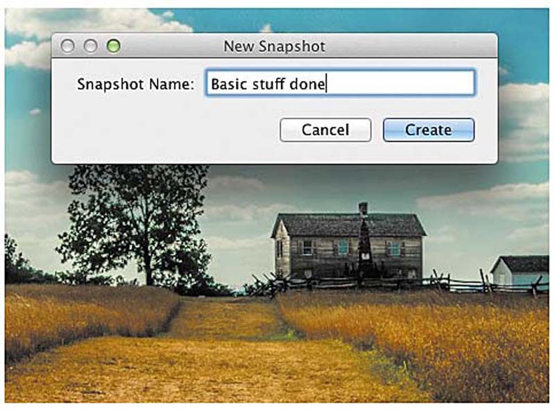
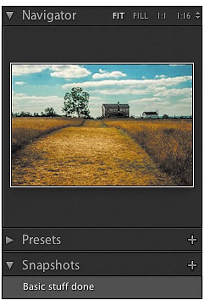
To create a snapshot, find a point in your processing that you want to save and then press the plus (+) symbol on the Snapshots panel title bar. Enter a name for your snapshot, and then click the Create button (Figure 3.20). When you hover your mouse over the snapshot, the same image will be displayed in the Navigator panel (Figure 3.21).
)
Figure 3.20 Creating a snapshot of your image allows you to go back to a specific point in the develop process.
)
Figure 3.21 Your new snapshot will be available in the Snapshots panel.
A Quick History Lesson
Because Lightroom is essentially a database, it is very easy for it to keep track of everything you do to an image while working in the Develop module. These processing changes are tracked in the History panel. The first item in the panel is usually the image import. If you move your mouse over this entry, you’ll see a preview of how your image looked at that point in the Navigator. As you continue to work on your image, you’ll add steps to the history. This list can get very long depending on how much you do to your image. If you want to go back to any point in the history, just click on that version and your image will be reset to that point in the process (Figure 3.22). A word of warning; you can click on any point in the history line and then back to the latest change only if you don’t do any other processing. The moment you perform a new processing step on the older image, all of the old history that took place after the point you went back to will be gone forever. It’s kind of like messing with the time-space continuum.
)
Figure 3.22 The History panel remembers every step of your image processing.
Virtual Copies and Image Stacks
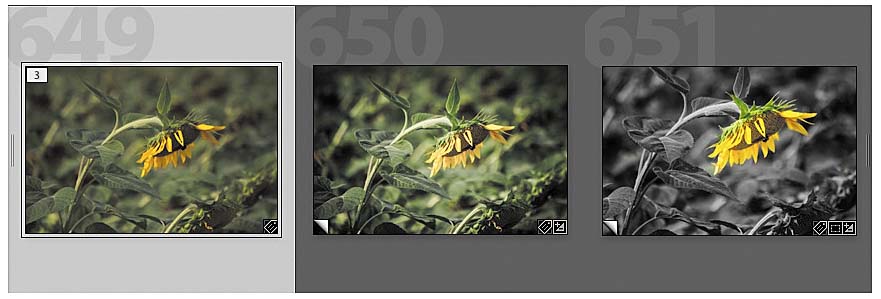
Virtual Copies is one of those features that really separates Lightroom from all other image editing software. Due to the way Lightroom works, edits to the image are virtual in nature. You can make all the crazy changes to an image in the Develop module that you want, and if you then open that image from the actual folder location in another program, you wouldn’t see any of the Lightroom edits. The reason is that the edits are not physically applied to an image until it is exported out of Lightroom. This means that you can create as many virtual copies of your images as you want without worrying that you are filling your hard drive. Virtual Copies lets you apply different processing edits to the same image so that you can create different versions or compare different techniques (Figure 3.23). I like to do this when I’m creating a black-and-white version of my image. I might make one virtual copy and do a straight black-and-white conversion on it, and then make another copy and apply a split tone effect, and so on.
)
Figure 3.23 Creating virtual copies lets you experiment with different processing settings.
The biggest benefit is that I can export any of the virtual copies as an image file with all of the edits and changes, just like I can with my original images.
Creating your copies
There are several different ways to create a virtual copy. Go to the menu and choose Photo > Create Virtual Copy. You can also Control-click or right-click on an image and then choose Create Virtual Copy. Perhaps the easiest method is to press Command+’ (Ctrl+’). When you activate the command, you should see a message that reads “Virtual Copy 1 Created.” You should also see a new copy of your image to the right of the original. You can tell that an image has been cloned because it will have a number in the top-left corner of the thumbnail that shows how many versions exist. In Figure 3.23 you can see that the thumbnail on the left has the number 3 in it because there are two copies. You can tell which images are the copies because of the fold in the lower-left corner of the thumbnail.
Stacking your copies (and anything else)
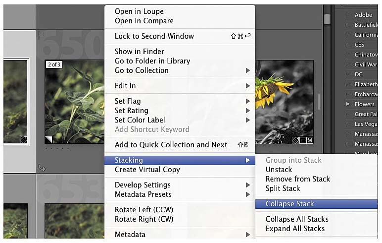
When you create a virtual copy, Lightroom automatically creates an image stack of the original and the copies. Image stacks are a way to group a bunch of images into one stack so that you only see the top image of the stack. To collapse the stack, Control-click or right-click on any image in the group, be it the original or a copy, and then choose Stacking > Collapse Stack to hide the other images in the stack (Figure 3.24). To expand a stack, choose Stacking > Expand Stack. To quickly expand or collapse a stack, click the set of double vertical lines on the side of the leftmost image in the stack.
)
Figure 3.24 You can collapse a stack so that just one image in the stack is visible.
If you want a different image to appear on top of the stack, you can Control-click or right-click on it and then choose Stacking > Move to Top of Stack. When your stack is collapsed, this image will be the one you see on top (Figure 3.25).
)
Figure 3.25 You can select which image from the stack will be on top when the stack is collapsed.
You don’t have to limit your stacking to just virtual copies. If you have a group of images that are similar and you don’t need to see each one, just make a stack of them by selecting all of the images you want stacked and then Control-click or right-click and choose Stacking > Group into Stack. I use this feature all the time for my bracketed HDR images. There’s no need for me to see three or five different exposures of the same subject, so all I have to do is stack them to avoid clutter in my Library. Plus my HDR brackets are much easier to work with.
Applying Edits to Multiple Images
At times you’ll have a group of imported images that will all require the same processing. This is most often the case when you’ve taken photos of a similar subject under constant conditions using the same camera settings, like a landscape shoot. When that happens, there is no reason to open each image in the Develop module and apply the same edits one after another. Instead, select a large group of images that you want to apply the same processing to and press D to enter the Develop module. Then work on the first image, performing all of the corrections and enhancements necessary to improve the look of the image.
Once the image has been processed to your liking, click the Sync button at the bottom right. This button is normally labeled Previous and allows you to apply the Develop settings from the last processed image to the one that is currently in the preview window. With multiple images selected, the button changes to Sync and allows you to synchronize the Develop settings across all selected images.
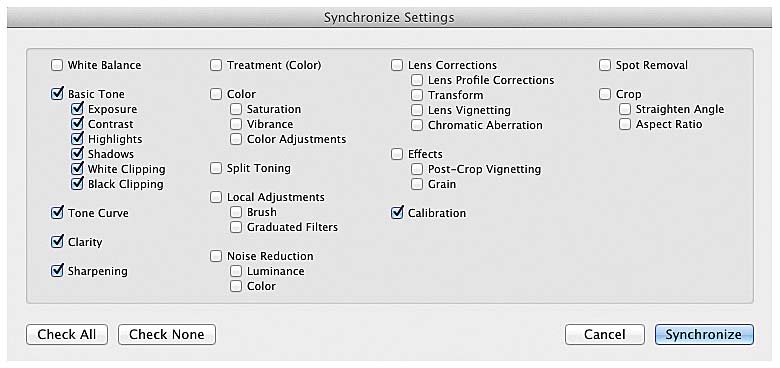
When you click the button, the Synchronize Settings dialog appears with options for synchronizing any or all of the Develop settings from the current image. You can elect to have all of the settings synchronized or just a few (Figure 3.26). Once you’ve made your selections, click the Synchronize button to apply the changes to the other selected images.
)
Figure 3.26 Choose which Develop settings you want to apply to the synchronized images.
Synching from the Library
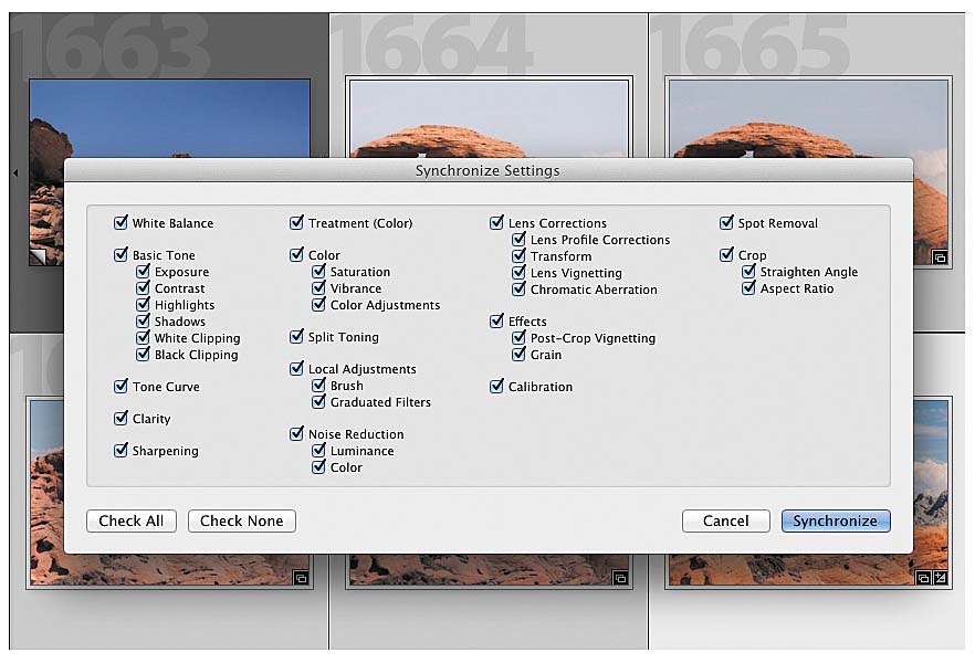
It’s also possible to synchronize your Develop settings from the Library. Just open an image in the Develop module and edit it as you normally would. Then switch back to the Library. Select another image while keeping the just developed image selected. The key is to make the thumbnail that you want to copy from the focused image. When you select other images, they will all appear to have lighter gray thumbnail frames than the unselected images. The focus image will have a slightly brighter frame than the other selected images. You can click once on any selected image to make it the focused image in the group. When you have the desired image set as the focused image, click the Sync Settings button located at the bottom right of the Library panel. The familiar Synchronize Settings dialog appears (Figure 3.27). Just as before, choose the settings you want to apply to the selected images, and then click Synchronize.
)
Figure 3.27 You can sync the focused image with other selected photos directly from the Library.
Copy and paste your processing
If you don’t want to apply the Develop settings to a large group but would rather pick and choose which individual images you want to paste the settings to, you can use the Copy feature to record all of the edits applied to the current image. The Copy button is located to the left and under the History panel. Click the Copy button, and a dialog similar to the Synchronize dialog will appear. Just as before, select the Develop settings you want to copy from the current image, and then click the Copy button. When you come across an image that you want to apply those settings to, select it and press the Paste button (it’s located next to the Copy button). Lightroom holds your copied settings in memory until you press the Copy button again or close the program.