- It's Not the Style, It's the Content
- Seek Depth
- Finding Balance: Density and Multidimensionality
Finding Balance: Density and Multidimensionality
This takes me back to the visualization wheel. Is it possible to use it to find the right balance between density and lightness, novelty and redundancy, functionality and decoration? Yes, it is. But it is hard work and depends on the project you are designing, the audience your graphic is aimed at, and the publication you work for. Nonetheless, there are some generic personal rules of thumb that I apply to my own work. They are based on intuition and experience, so don’t expect them to have any scientific validity.
Think of a project of your making and where it might sit on the visualization wheel. Focus first on the Density-Lightness and Multidimensionality-Unidimensionality axes, as in Figure 4.6. Try to define how dense and dimensional your graphic is.
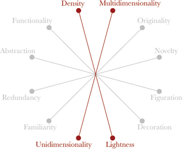
Figure 4.6. Let’s focus first on these two axes.
Then try this: move the position of your graphic at least 10 percent toward the multidimensionality and density end of the axes. I do this to compensate for the fact that we usually underestimate what our readers are capable of. Next:
- Organize your graphics in layers. First, offer a summary of the data, such as a good intro, some averages, or highlights of the main figures. This will be the entry point into the graphic, clueing readers into how to read what follows.
- Beneath the outer layer of your onion-like graphic, on the next level, include as many inner layers of information as possible. Don’t include everything, of course. Make editorial decisions based on the story and your focus.
- Structure the layers in a logical order. In some cases, the structure will be linear. In others, you can organize the navigation (regardless of whether you are doing a print or an interactive project) so that readers can explore as they wish.
The interactive visualization in Figure 4.7 illustrates how to apply these abstract principles in the real world. It is a complex, deep, interactive presentation analyzing how much each of the 513 Brazilian congressional representatives spends per month on telephone calls, along with the aggregates for 2011 and the averages and totals by party.
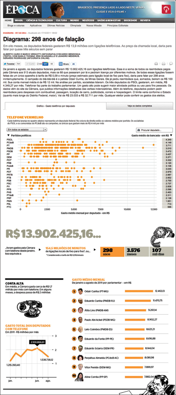
Figure 4.7. How Much Brazilian Representatives Spend On Telephone a Month. Revista Época: http://revistaepoca.globo.com/diagrama/noticia/2011/10/diagrama-298-anos-de-falacao.html.
The headline “298 Years of Speaking,” along with the huge R$ 13.902.425,16 figure, is the eye-catching element. This is the first layer of information, the one that will make readers interested: That’s a lot of money by Brazilian standards. The first layer also includes the worst offenders: a ranking of the top 10 spenders.
After that, readers can follow a navigation path of their own. They may want to see only the representatives from their state (several filters are built into the graphic to allow this), or see how much a particular congressman spent over 2011 (clicking on any of the circles will reveal the specifics). This is the exploratory component of the visualization. We are not just showing stuff—we are providing tools to let our readers manipulate that stuff.
Functionality and Abstraction
Let’s go to the next two axes in the visualization wheel (Figure 4.8). The more space you devote to decoration, the less room you will have to explain your story properly, to develop it with different angles, and to give necessary context to your data. When building your graphic, think about structure first and eye candy later. If decorative flourishes leave you without enough real estate for your substance, you’ll be in trouble.
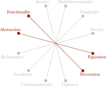
Figure 4.8. Moving on to decide where to define our graphics using the visualization wheel.
Unfortunately, designers and journalists often worry too much about visual styles and illustrations before they think about how the data should be organized and hierarchized to make sense. We saw examples of this previously, but let me give you another.
Figure 4.9 contains a graphic by Good magazine, a fun and nice-looking presentation, one of those this publication is deservedly famous for. But can you easily see patterns in it? Try to identify the states with a higher obesity rate, or states where people use more public or private transportation. You will have to actively search for your answers and memorize a good deal of data to accomplish these tasks. In other words, the graphic is all about presentation. It’s not good at all when it comes to helping us explore the data.
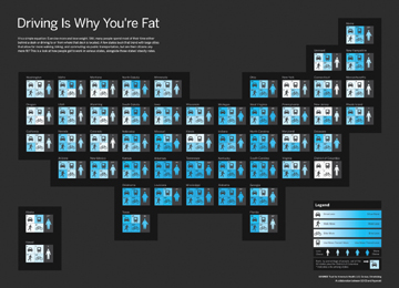
Figure 4.9. “Driving Is Why You Are Fat,” a nice-looking project by Hyperakt for GOOD magazine.
One reason for this is that the map may not be the best way to display the data, and the little pictograms, fun as they are, do not help us perceive variations in obesity rates between states. It’s hard to see how fat or thin each figure is compared to the others. In this case, traditional graphic forms—a bar chart for comparisons or a scatter-plot for correlations between obesity and car use—might work better.
We’ll return to the relationship between abstraction and figuration in Part 2, which deals with visual cognition. For now, let me just add that using illustrations and pictograms à la Neurath is more than acceptable, depending on your audience and where your project is published. Highly abstract statistical charts may not always be the best answer (see Figure 4.10). That said, by taking the figurative road, you could end up infantilizing your data, patronizing readers by treating them as though they aren’t very bright, rather than enlightening them. Never, ever dumb down your data just because you think your readers will not “get it.”
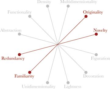
Figure 4.10. The last two axes of the visualization wheel.
Fun-tionality
Does this mean that you can’t have fun with your projects, go a little crazy every now and then, and experiment with unusual or even wacky graphic forms? Not at all. Experimenting (carefully) with novel forms is not just a whimsical impulse, it’s a necessity. By pushing the boundaries every so often, we help readers increase their visual vocabulary. A decade ago, scatter-plots, slopegraphs (like the one used in the prisons project in Chapter 3), and proportional symbol maps were rarities in the media. Today, they are almost as mainstream as bar charts and time-series plots.
In general, the rule of thumb I apply, based on the axes of my own visualization wheel, is: The less common the graphic form I choose for my visualization, the more redundancy I should include. In other words, if you intend to display your data in a novel way, make sure you include an explanation of how it works, with enough clues for readers to understand its mechanism.
Figure 4.11 shows an example of this approach. It is one of many information graphics that Época magazine published right after the November 2010 Brazilian presidential elections. The central visual element, the map, with its colors identifying the winner in each district, is easy enough to read. But what about the bizarre compass on the right, which someone in the newsroom jokingly referred to as a “horoscope chart”?
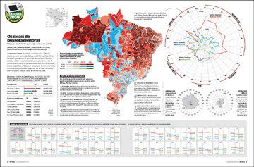
Figure 4.11. “The Signs of the Electoral Compass.” Época magazine. See the text on the next page for a full explanation.
The compass—from which the project took its headline, “The Signs of the Electoral Compass”—is a radar chart, and there is a specific reason why we chose to use it.
Each radius of the wheel corresponds to a state in Brazil, organized according to its position in the map. Notice that the northeastern states appear on the top-right quadrant of the wheel, the southeast states on the bottom-right, and so on. You can also see this in the grouping of the states: Northeast (Nordeste), Southeast (Sudeste), South (Sul), Central West (Centro-Oeste), and North (Norte). This is a traditional way of clustering states in large regions.
Within the wheel are three color lines: the red representing results for Dilma Rousseff, candidate of the Brazilian left; the blue for José Serra, candidate of the center-right; and the green for Marina Silva, candidate for the (surprise) Green Party.
The position of the vertices of the color lines on each of the radii is proportional to the percentage of votes won by the candidate in that state. The farther from the center the vertex is, the more votes the candidate received.
You can see at a glance that the left has a disproportionally high percentage of votes in the northeast, the poorest region in Brazil, whereas the center-right has much better results in the richer southern states, such as Santa Catarina, Paraná, and São Paulo. This is exactly what we wanted to highlight by positioning the states according to their place on the map. We wanted to suggest that Dilma Rousseff’s red line was stretching out like a rubber band toward the northeast, while Jose Serra’s line was undergoing a similar pull toward the south. In other words, we were more interested in the bigger trends and patterns than in the specifics.
The “Boom” Effect
My friend Luiz Iria, the infographics director at Abril Group, South America’s largest magazine publisher, describes the emotional power of a good infographic with irrepressible Brazilian wit and enthusiasm: “I want my readers to flip the page and, boom! The infographic shows up as an explosion!”2
Luiz’s infographics are spectacular displays of visual pyrotechnics, perfectly adapted to the publications he works for: Superinteressante (popular science), Mundo Estranho (science for kids), and Aventuras na História (popular history). These publications are full of short texts, eye-catching special effects and headlines, with no pretense of depth. They are great at what they do, which is to provide basic educational tools for the masses.
You can see an example of Luiz’s work in Figure 4.12, on Brazilian rodeos.
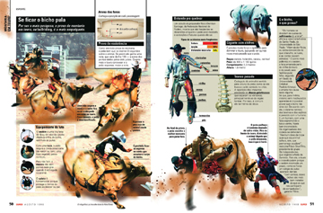
Figure 4.12. Luiz Iria’s infographic for Superinteressante magazine, Editora Abril (Brazil).
The boom effect Luiz speaks of is an aspiration of every professional in this field. You do want to attract readers. But not all readers respond to the same kinds of booms; one type of boom can be beneficial for a particular project, but counterproductive in another one. It would be inappropriate, for instance, to transfer Superinteressante’s style to The Economist or Bloomberg BusinessWeek—and vice versa. Their readers are different, and so should be their graphics styles. Emotions matter, but not all emotions are aroused by identical phenomena. Sometimes you can stimulate the viewer’s feelings through a beautiful illustration; at other times, by making sophisticated type and color choices.
In Chapter 3, I mentioned Donald A. Norman’s Emotional Design (2004), a book in which the famous information designer confessed that the approach he had taken in his previous and classic The Design of Everyday Things (1988) had missed a crucial element. He wrote:
- In writing The Design of Everyday Things (1988) I didn’t take emotions into account. I addressed utility and usability, function and form, all in a logical, dispassionate way—even though poorly designed objects infuriate me. But now I’ve changed. Why? In part because of new scientific advances in our understanding of the brain and of how emotion and cognition are thoroughly intertwined. We scientists now understand how important emotion is to everyday life, how valuable. Sure, utility and usability are important, but without fun and pleasure, joy and excitement, and yes, anxiety and anger, fear and rage, our lives would be incomplete.3
Beauty and functionality are intertwined, or should be. Beautiful and intriguing objects leave us in a better mood and predispose us to have patience when the time comes to learn how to use them. The perception of meaningful beauty is a lubricant for the mind’s gears and a boost for memory. If you don’t believe me, take a look at Figure 4.13. I’ll bet the way you think about sex change surgery will never be the same from this moment on.
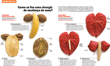
Figure 4.13. “How sex change surgeries work.” Renata Steffen, William Vieira, Alex Silva and Sergio Gwercman. Superinteressante magazine, Editora Abril (Brazil).
It is crucial to remember our priorities as visual communicators. Here’s Tufte, once more:
- All the history of information displays and statistical graphics—indeed of any communication device—is entirely a progress of methods for enhancing density, complexity, dimensionality, and even sometimes beauty.4
In the end, and above all, avoid being true to one of the saddest, cruelest, but also most accurate quotes on journalism I have read in the past few years. It comes from Evgeny Morozov, a critic of new media:
- Journalists, always keen to sacrifice nuance in the name of supposed clarity.5

