10 Fundamental Rules of Designing for Digital Magazines
10 Fundamental Rules of Designing for DPS Magazines
After working with Diane Burns on our book Digital Publishing with Adobe InDesign CS 6, I realized that print-centric designers need to rethink how to present their content when they're designing for a digital market. Here are my top 10 suggestions for creating digital magazines that are viewed on tablets.
- Provide navigation clues. While most people intuitively know how to turn pages in a printed publication, they might not know all the techniques for using tablets. Tapping differs from swiping. Readers might not know how to use the finger commands to pinch and zoom. Different areas of the screen could respond differently to the same action. Time magazine's digital app has a special Help page that explains how to use its various features, as shown in Figure 1. Providing this kind of assistance is especially important if your app uses special icons for interactive features.
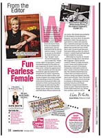
- Use both vertical and horizontal layouts. I know it's twice the work, but you really should take advantage of the two orientations for tablets. I like to read in landscape mode, but Cosmopolitan has only a portrait mode. I end up skipping that magazine because it's not convenient for me to read in that orientation. In addition, the designer has simply converted the print layout into a digital version. Everything is crammed onto the screen. The text is much too small to read (Figure 2b), and the print layout is too cluttered for tablet viewing (Figure 2b).
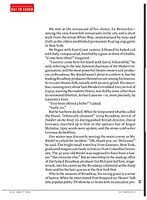
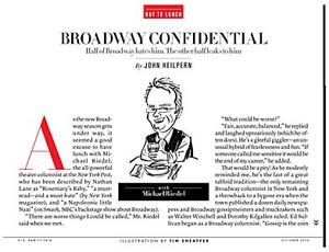
- Adjust your layouts for each orientation. Be aware of the design differences between portrait and landscape. Vanity Fair, one of the first magazines to go digital, has done an excellent job of crafting its layout for each orientation. Portrait and landscape versions have different layouts. I really like the way a single-column story in portrait mode (Figure 3a and Figure 3b) becomes a two-column layout in landscape mode (Figure 3c and Figure 3d). This makes the column width much easier to read. I also like the use of whitespace.
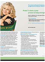
- Use landscape and portrait formats to best advantage. If you advertise in a magazine that has both print and digital content, take advantage of the extra room that digital content provides. Almost all the ads in the digital magazines I read have a single portrait layout with a zoom tool for viewing in the landscape mode. This is the cheap way of just throwing your layout into the digital magazine. But I was impressed with the advertisement for the prescription drug Prolia. Ordinarily drug ads have to squeeze all that legal boilerplate drug-interaction information onto the side of the page (see Figure 4) or on the following spread. But Prolia uses the scrolling nature of digital content to display the main visual without cluttering up the page with the boilerplate (see Figure 5a and Figure 5a).
- Remember what your audience wants. Just because you're moving to a digital delivery doesn't mean that you have to sacrifice certain features of your print publication. The New Yorker recognizes that many print readers open the magazine and leaf through the pages for just the cartoons. How could they replicate this capability in a digital publication? The New Yorker did this by putting a special link on the opening page of the app. It clearly gives the reader the option to "Read the cartoons first" (see Figure 6). Cartoon readers have the same experience that they can get in the print publication.
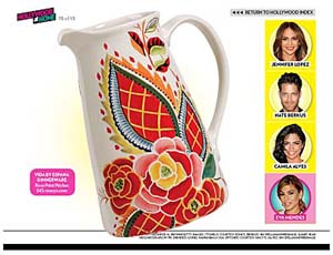
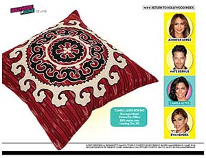
- Rethink how a "page" should look. In a print publication, each page has its own layout. But each page of a digital publication can morph into another layout. People does an excellent job of designing for the digital page. One way they do this is to have the reader click buttons on the page that change the main layout, as shown in Figures 7a–7d.
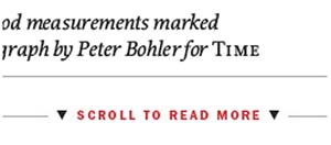
- Try to agree on the same indicators as other publications use. One thing that makes me crazy is inconsistencies between different publications. For instance, many digital magazines use the scrolling text feature to have readers swipe up or down to reveal more text within an area. This is a great idea. The problem is the indicator that the publication uses to tell the reader to swipe up or down. Most publications use a down arrow to indicate that more text is available below, as shown in Figure 8a. This design makes some sense. But other publications use an up arrow to indicate the direction that the user should swipe to see the additional text, as shown in Figure 8b. I suppose it makes sense to that designer, but it's confusing to readers who are used to the format in other publications. It would help if all magazines could show some consistency. It's even more frustrating when the indicators used by magazines from the same company (People and Time, for example) are different, as in Figure 9.
- Help your readers. It's not a sign of weakness if you have to be blatant about the limitations of your digital layout. For instance, while Entertainment Weekly uses both horizontal and vertical layouts in its digital publication, some vertical pages just don't translate well to a horizontal layout—so they make those pages inaccessible to the horizontal layout. When the reader gets to that type of page, the explicit visual shown in Figure 10 explains that the display should be rotated to show the page correctly.
- Go to the movies! You may have come from a print background, but you can still incorporate videos into your digital publication in plenty of ways. Time, People, and Wired all use videos in their digital magazines. This option gives the reader an incentive to continue reading the magazine in digital format (see Figure 11a). Even better, you should let readers know that this "bonus" content isn't available in the print format of the publication (see Figure 11b).
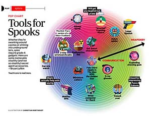
- Add a sense of play. Ten years ago, people sat down with a magazine and calmly read the articles. The only action was gently turning the pages. But today's readers are an active bunch with twitchy fingers poised over the tablet's surface—ready to tap, swipe, pinch, and drag. Give them some activity to do on your pages (see Figure 12a–Figure 12c). It may feel like you're turning your publication into a video game, but that's just the nature of the digital world.
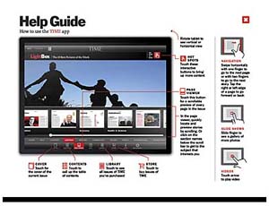
Figure 1 The Help Guide for the Time app explains how to use the interactive features.
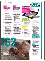
Figure 2b These pages for Cosmopolitan's digital magazine are straight conversions from the print magazine. They don't translate well to a digital device.
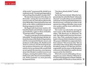
Figure 3d Vanity Fair creates two separate layouts for its portrait mode (Figure 3a–Figure 3b) and landscape mode (Figure 3c–Figure 3d).
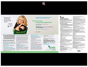
Figure 4 In landscape mode, this ad for Prolia displays all the information on a single page.
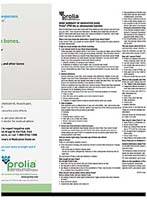
Figure 5b In portrait mode, the information is presented in a single page that the viewer swipes through to read. The boilerplate information doesn't clutter the view.
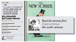
Figure 6 A special link on the cover of the digital New Yorker takes the reader to the cartoons section.
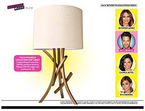
Figure 7d These examples from People's digital publication show how the same page can display four different layouts. In this case, the reader clicks a celebrity's picture to see a home furnishing product associated with that celebrity.

Figure 8b Time (Figure 8a) indicates a scrolling area with arrows pointing down. But its sister publication People (Figure 8b) uses up arrows to indicate the same gesture. This follows the direction of the swipe used to see the additional content.
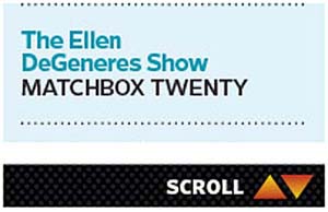
Figure 9 Entertainment Weekly covers its bases with both up and down arrows.
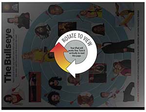
Figure 10 This clear set of instructions helps readers to understand why they can't see a particular page in horizontal format.
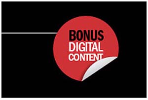
Figure 11b Time takes full advantage of multimedia content in its digital publication. Not only is the page headlined with the title Video (Figure 11b); it also indicates that this extra information isn't found in the print publication (Figure 11b).
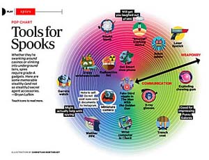
Figure 12c Wired gives readers lots of interactive features such as these buttons in the illustrations. The viewer taps each image to read more information.
If you keep these 10 rules in mind, your DPS applications will be better received by readers.
