Figure 1 John Snow's 1854 cholera outbreak map, my favorite information graphic.
Every human community—nations, ethnic and cultural groups, professional guilds—inevitably raises a few of its members to the status of heroes and weaves myths around them. We love heroes because they embody the virtues each age promotes without the counterbalance of quotidian, petty shortcomings1. We unconsciously love myths, too, because they enhance social cohesion, they educate, and they give us purpose.
The visual display of information is no stranger to heroes and myth. In fact, being a set of disciplines with a relatively small amount of practitioners and researchers, it has generated a staggering number of heroes, perhaps as a morale-enhancing mechanism. Most of us have heard of the wonders of William Playfair's Commercial and Political Atlas, Florence Nightingale's coxcomb charts, Charles Joseph Minard's Napoleon's march diagram, and Henry Beck's 1933 redesign of the London Underground map2. However, no myth is more widespread than Dr. John Snow's 1854 cholera map, which opens this article. It is also an example of why myths may be obstacles to the healthy development of knowledge.
John Snow, Movie Star
John Snow's myth is one of a rebel scientist of humble origins fighting against ingrained prejudices. I won't bore you with the details of his tale, as it has been beautifully narrated elsewhere3. Let me just offer a brief summary: In the nineteenth century, cholera was a disease that killed many thousands a year. Today, we know that cholera is caused by a bacteria—Vibrio cholerae—which has been shaped by evolution to spread itself in a devilish manner: It provokes severe vomiting and diarrhea. If its victims live very close to each other and they don't have access to adequate sanitary conditions, it is likely that the fluids they release will contaminate sources of water or food.
Until the 1870s, most scientists were convinced that cholera, as most other sicknesses, was caught by breathing the stinky effluvia that emanated from foul water and soil, or from decaying wastes. This miasma—“bad air”—theory of disease was based on persistent correlational observations: Contagious maladies hit poor areas harder.
According to myth, John Snow was one of the few physicians who bravely defied their equals by hypothesizing that cholera was a waterborne disease caused by a germ. He wrote academic papers to make his case, but no one listened to him. The tide shifted when a brutal outbreak in 1854, in which hundreds of Londoners perished within a few weeks, led him to produce his famous map. On it, thin, tiny strokes represent deaths and circles show the locations of water pumps. The message of the map is clear: Deaths cluster around the Broad Street well, which had been poisoned by fecal matter from a sick baby (this was discovered later). John Snow not only drew the map, but he also convinced the local authorities to remove the handle of the water pump, an action that stopped the outbreak. Snow, many have said, changed medicine forever.

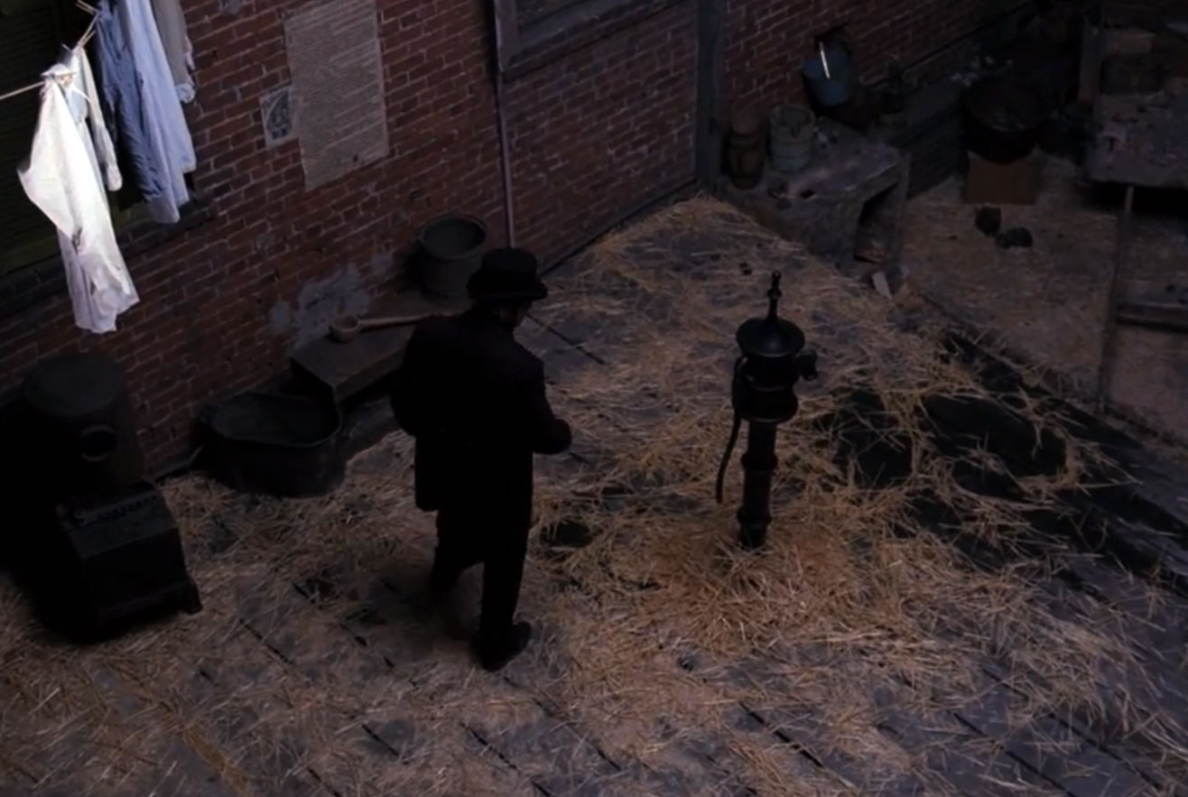
Figure 2 Image from the movie Snow: Epidemiology Begins.
This is, roughly, the story narrated in the nice short indie film Snow: Epidemiology Begins4 by writer and director Isaac Ergas. When the movie was launched, Ergas said that it helped him merge his interests in public health—he's an expert in biostatistics—and storytelling—he holds a degree in Film and Television Production from the University of Southern California. Despite the obvious budgetary constraints, the movie is a joy: Seeing Snow drawing lines under the warm light of a gas lamp gave me goose bumps. This DVD belongs in any well-stocked personal graphics library.
In a phone conversation, Ergas told me that he might expand the short movie into a longer feature film in the future if he gets enough funding5. I hope that this happens with all my heart. It will make an excellent educational resource. And, more importantly, it can be the basis for a class discussion about why the story outlined in the previous paragraphs is a convenient fable6.

Figure 3 John Snow, staring at Broad Street water pump. Image from Snow: Epidemiology Begins.
The Forgotten Others: H.W. Acland
Myths outshine truth even if they are usually far less interesting. Snow's story is not an exception. Mythification has transformed him into the enlightened medical Sherlock we have inherited. But, as Tom Koch reminds us in his splendid Cartographies of Disease: Maps, Mapmaking, and Medicine (2005), Snow was ultimately unsuccessful in persuading the scientific mainstream to adopt the waterborne germ theory. His work was just a link—an impressive one, though—in a long chain that eventually led to the demise of miasma theory, sadly after Snow's death, in 1858. As ages pass by, history becomes legend, legend becomes myth7, and it is the task of dedicated historians to bring things back into place. Koch's work is remarkable in this sense.
Koch explains that Victorian scientists didn't resist Snow because they were stubborn idiots. They resisted him because they had evidence against what he was claiming. It was imperfect evidence, yes, based on connections not rigorously sieved with the modern methods of data analysis, largely unavailable at the time. But still. The myth of the hero who singlehandedly wrecked miasmatic theory obscures the fact that those who held on to it were also thoughtful fellows. It is unfortunate that we don't study them further, as we humans learn much more from our mistakes—both individual and collective—than from our successes.
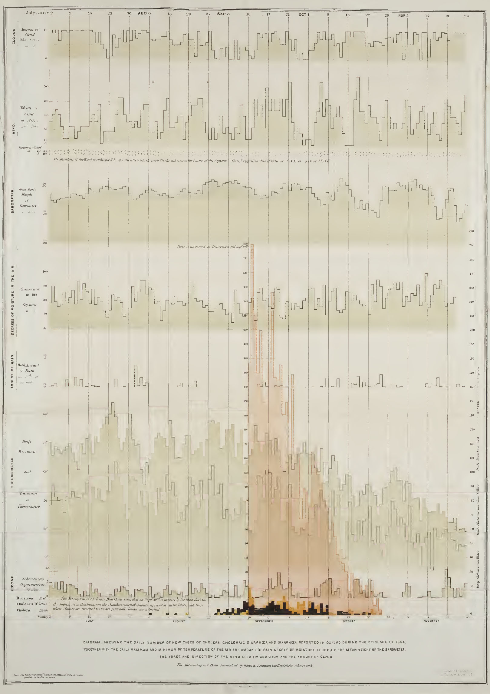
Have you ever heard from Henry W. Acland, for instance? It is very likely that you haven't. He authored a monumental report, Memoir on the Cholera at Oxford, released precisely in 1854. It is in the public domain and available as a high-resolution PDF on the website of the University of Yale's School of Medicine8. Acland's volume is a feast of neatly arranged tables, logical arguments, and maps. It also includes a gorgeous graph that depicts the covariation of cholera incidence, temperature, humidity, rainfall, wind speed, and other variables9. It has become one of the historical landmarks I show in my classes and workshops.

Figure 4 H.W. Acland's chart of cholera and diarrhea cases in relation to weather conditions such as high and low temperatures, rain, atmospheric pressure, and wind.
One of the main points of Acland's book was that the incidence of cholera was related not only to summer weather conditions, but also to altitude. He and other researchers had observed that cholera used to spare mountainous countries and high-altitude towns and neighborhoods. It is appropriate to quote Tom Koch extensively to understand where their theory came from:
"It was presumably obvious to everyone. High temperatures and low winds were the conditions that generated cholera in the odiferous wastes that sat in the heat along the banks of the Thames. The smell would have been strongest where the riverbank dried and the sun beat most strongly on the urban effluvia that washed onto it. Winds were insufficient to blow away the poisonous, choleric air. At higher altitudes the temperature would be cooler and winds possibly more fulsome. The evidence was in the nose, of course, because at those altitudes one did not smell the stench so evident at the riverbanks and the people therefore were healthier."
And here's a most revealing paragraph:
“Like much of the science of every era, it missed an intervening vector (…) the fact that water sources at higher elevations typically relied on well water draw from aquifers or highland streams rather than the polluted Thames. But the mapping and here, the mapmaking, were clear, consistent, and, if ultimately incorrect, still rigorous.”
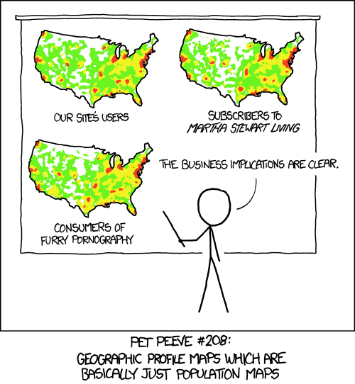
Still rigorous. Indeed it was. No matter how colossal Acland's and others' reasoning flaws were, they constitute rich lessons that we should bring back from the past, study, and cherish. Doesn't this story make you think about the dangers of unprofessional correlation analyses, of confirmation bias, and of extracting spurious messages from your own graphics, for instance? Aren't these very current concerns in a time when the availability of oceans of data spurs so many sloppy thematic maps, masterfully mocked by the XKCD comic strip?10 .

Figure 5 XKCD, on the challenges of many map-based modern data visualizations.
Against Heroes
We should also be wary of potential modern myths and heroes, of course. If reason and discussion are the means by which a discipline purges itself of historical fables—or, at least, the way that it reveals their inner complexity—the same should happen with their contemporary equals. Say that the media, in its craving for hyperbole, begins calling someone the "Marie Curie of visualization" due to the convincing quality of her early work. For the sake of argument, imagine that this person takes her own myth too seriously and turns into a peddler interested only in spreading dogma, making a buck of it, and avoiding debates with her peers out of fear of seeing her theories crumble.
Would a woman like that deserve the Curie label? Of course not, as she could not be considered a true scholar or scientist anymore, but a prophet. However, without proper checks, her teachings and myth would perpetuate and even block the path to maturity if the area she works in is young. Perhaps this has not happened in visualization yet, but it might. Other intellectual communities have devised mechanisms to deal with these situations, peer-review and polite but honest criticism among them. It is my perception that infographics and visualization haven't, at least outside academia. We respect our sacred cows too much and, as a consequence, we are largely dependent on arguments from authority. If you feel that this is a warning against those who write extensively about these topics—that includes myself—you are right. It is worrying that written thoughts are often taken as immutable truths, and not as provisional entities that must be subjected to reason and testing.
Let me close the parenthesis and go back to my main point: We immortalize the Snows of this world and condemn the Aclands to oblivion. Perhaps we shouldn't. We know too little about the hard-working losers who struggled mightily and mightily failed. Adopting a mythical stance is like looking at mountains that peer through high clouds while flying on a plane and assuming that their peaks are all that exist. Snow, Nightingale, Playfair, and other patron saints of visualization are those peaks. The anonymous, failed, neglected Aclands are the slopes. They are silently waiting to be explored.
NOTES:
(1) Achilles' irrepressible wrath and appetite for glory in the Iliad appear as character flaws to us, citizens of modern democracies, but they were virtues in the era in which gutting enemies with spear and sword were noble tasks. Had Achilles been born today, he would need to be a different kind of person to be deemed a hero.
(2) If you have not heard of any of these, visit Shawn Allen's short history of visualization: http://interactiondesign.sva.edu/classes/datavisualization/2010/07/08/introduction/.
(3) I recommend The Ghost Map by Steven Johnson as a good starting point to learn about Snow. Also, read the excellent series of posts by Michael Sandberg: http://datavizblog.com/. Wikipedia's article about Snow is good, too http://en.wikipedia.org/wiki/John_Snow_(physician).
(4) Visit http://snowthemovie.com/ to watch the trailer and get the DVD.
(5) The short movie was paid for with an Alfred P. Sloan science grant.
(6) Read Tom Koch's Cartographies of Disease: Maps, Mapping, and Medicine (2005) and Disease Maps: Epidemics on the Ground (2011).
(7) Guess from which famous movie trilogy I've stolen this sentence.
(8) H.W. Ackland's Memoir on the Cholera at Oxford: http://ia701208.us.archive.org/32/items/39002086311736.med.yale.edu/39002086311736.med.yale.edu.pdf.
(9) As it happens, Acland's graph is not entirely original. A similar one can be found in a report prepared by the General Board of Health to be presented at the British Parliament. This graph is also mentioned by Koch.
(10) The original can be found here: http://imgs.xkcd.com/comics/heatmap.png If you have never visited XKCD, please be aware that it is one of the finest sources of geeky fun out there: http://xkcd.com/.

