A Confederacy of Truth-Tellers: The Bright (But Challenging) Future of Small or Independent Visualization Teams

Years from now, when someone finally dares to chronicle the fiery unfolding of modern information visualization, I hope that he or she won't pay tribute just to the large teams that have become the default and lazy answer when we're asked about who's leading the field: "The New York Times graphics desk." Rather, I'd like to learn about the deeds of the individual underdogs and the small firms springing up here and there, and see their strenuous efforts revealed and praised, because they're responsible for a good part of the current boom.
In my career, I've met many of those underdogs and come to admire their creativity, candidness, and commitment to truth and the public. The latest in my personal collection of success stories is the tiny visualization division of Texty.org.ua, an independent online media organization in Ukraine. Tiny is an accurate adjective, as Texty's data and graphics operation comprises just two people: Anatoly Bondarenko (data analyst, designer, and programmer) and Roman Kulchinsky (journalist, reporter, and editor). Nonetheless, the quantity and quality of Texty's projects parallel that of much larger groups. Devote time to visiting the Texty website and exploring these projects. [1] They're lessons of excellence in visual communication.
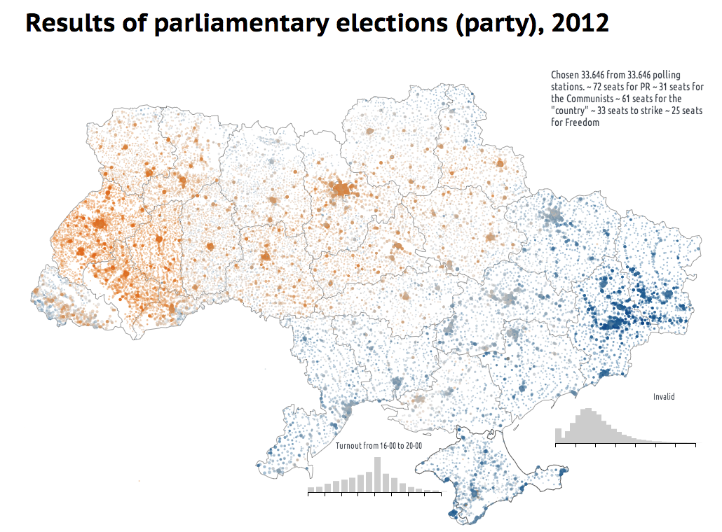
The first interactive Anatoly showed me when we met in Kiev in May 2013 is a bubble map—what cartographers call a proportional or graduated symbol map. [2] It encodes the results of the 2012 Parliamentary elections, as shown in Figure 1. The main contenders were the coalition formed by the pro-Russian Communists and the Party of the Regions, of the current president, Viktor Yanukovych (blue); and the opposition alliance, led by the Party of the Fatherland, which is moderately conservative and pro-European (orange).

Figure 1 Results of 2012 Ukrainian parliamentary elections: A project by Texty.org.ua (use Google Translate to read it in English). Click to enlarge.
Even if, like me, you don't understand a word of Ukrainian, I believe that you'll find the map eloquent. It unveils what the current Ukrainian political landscape looks like. A second after my eyes landed on it, I exclaimed, "This is a house divided!" And indeed it is. Just notice the gray seam that separates the blue East and the orange West. Since its independence, Ukraine functions essentially as two different countries, politically and culturally. I was amazed by the power of adroitly crafted pictures to communicate clearly and to bridge clefts between languages and cultures.
It was a fortunate coincidence that during my flight to Kiev I read Nicco Mele's book The End of Big: How the Internet Makes David the New Goliath. [3] Mele, who has worked as a digital media designer for Howard Dean and Barack Obama, describes a present in which radical connectivity—the "breathtaking ability to send vast amounts of data instantly, constantly, and globally"—undermines the foundations of old organizations: big media, big publishing, big entertainment, big government, and so forth.
"The devices and connectivity so essential to modern life," he writes, "put unprecedented power in the hands of every individual—a radical redistribution of power that our traditional institutions don't and perhaps can't understand." Mele sees this phenomenon as liberating and empowering; in a frictionless digital world, any person willing to inform others doesn't need to comply with the seemingly foolish quirks of analog media. You want to publish? You just go ahead and put your word out. The tools to do it have never been easier to use, or cheaper. Many of them are free or open source.
Mele's book made me think about visualization. Small interactive graphics teams like Texty's take advantage of the wonders of the digital world. Their existence would have been a chimera just a decade ago. But The End of Big also prompted me to consider possible shortcomings. Mele doesn't dodge thorny uncertainties. In the case of trustworthy journalism, he writes, "it remains unclear if emerging, upstart news organizations empowered by radical connectivity can ensure the kind of accountability Big Media did in its heyday[…]. Unless we carefully build a watchdog capacity into today's emerging media institutions, the End of Big could see an infinite wash of user-generated 'news' that fails to arrest the decay of our democratic institutions and the rise of corrupt and unscrupulous demagogues."
Can independent organizations make up for the dwindling of Big Media? That's an unsettling question, although there are some glimpses of hope: ProPublica and the Texas Tribune, for instance. [4] In the case of visualization, would small graphics groups or individuals be able to act as merciless watchdogs if most large organizations vanish? Perhaps, but only if, right after they somehow secure funding, they're true to certain ideals. When I finished reading The End of Big, I put my iPad down, got a piece of paper, and started scribbling some notes as I thought: What would those ideals be? I came up with a tentative list of interconnected suggestions:
• Focus on what matters.
• Think and act journalistically.
• Partner up.
The following sections examine these ideals in more detail.
Focus on What Matters
How many visualizations of airplane flight paths, languages used on Twitter, Facebook friend networks, and votes in the Eurovision song contest does the world need? [5] I'd argue, not as many as we see nowadays. On the other hand, how many graphics about inequality, poverty, education, violence, war, political corruption, science, the economy, the environment, etc., are worth publishing? I'll leave the answer to you, but you can guess what mine is.
I know of no research to back up my theory, but I would guess that visualization designers are, on average, nerdier and more technophilic than your average Jane and Joe. When we have the freedom to choose what topics to cover, we tend to lean toward issues most people don't care much about, but that we consider fun and cool. We also tend to focus on areas in which data can be found easily and arranged in a neat way—Internet and social media usage are the obvious examples, but there are many others.
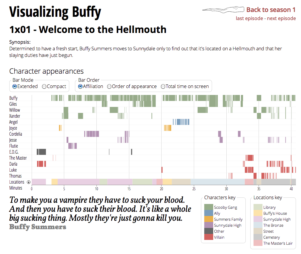
I'm not sinless, by the way. Between January and May 2013, I oversaw a visualization project by a Spanish student, Esteve Boix, which I've described in detail in my website. [6] Its topic was Joss Whedon's geeky TV show Buffy, the Vampire Slayer (see Figure 2). A portion of my soul—the one that remains stuck in an adolescence filled with Dungeons & Dragons and comic books—was enthralled. The other side—the emotionally hardened adult—wondered whether the energy spent in timing the appearances of characters in the show and other trivial minutiae could not have been better spent in more worthwhile endeavors.

Figure 2 Visualizing Buffy, a project by Esteve Boix. Click to enlarge.
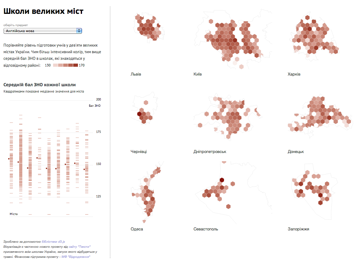
We, the designers, artists, and visual communicators in general, have an objective moral obligation to improve our communities, to inform citizens and increase their understanding of relevant matters. I use the words objective and moral with full knowledge of their slippery meanings. [7] I have nothing against graphics that display, say, the geographical spread of grocery store and supermarket brands; in fact, I may enjoy your visualization very much. [8] But days on this planet of ours are 24 hours long; life expectancy at birth in the U.S. is currently 79 years; and the existence of an afterlife is highly dubious, to say the least. It's advisable that we spend our time wisely. Therefore, when weighing what project to undertake next, you should think twice. Instead of a fancy visualization on your daily calorie intake and consumption, perhaps you could do something about the quality of schools in your country (see Figure 3)?

Figure 3 A comparison of schools in the nine largest Ukrainian cities, a project by Texty.org.ua. In the drop-down menu on the left, you can select different criteria to reveal the performance of the schools in each district. (Use Google Translate to read it in English.) Click to enlarge.
Think and Act Journalistically
I'm a collector of quotations. One of my favorites comes from Liberty and the News, a 1920 book by Walter Lippman, a founding father of modern journalism. It reads: "There can be no higher law in journalism than to tell the truth and to shame the devil." I'd be happy to live by that ideal.
You may think that you're not a journalist, but rather a designer, a developer, an artist, or an engineer. However, I contend that if your daily job consists of designing tools for general audiences to explore and comprehend complex phenomena, you are committing journalistic acts on a regular basis: You organize and arrange timely, relevant information for citizens to make decisions about their lives and communities. Therefore, your work should be subject to the same professional and ethical mandates proper journalists learn and (hopefully) follow: Be honest, truthful, and accurate; double-check your information; and strive for clarity, but also for completeness and d epth, etc.
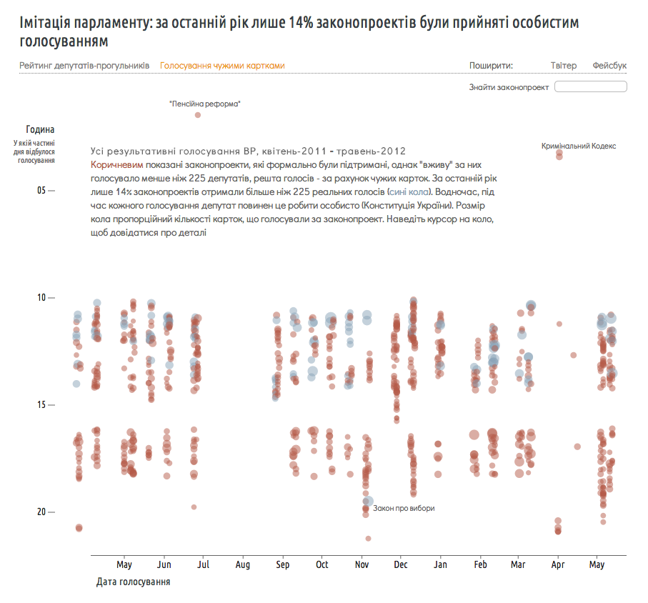
What about the shaming-the-devil portion? That's also crucial. People in power, in both public and private spheres, must be held accountable. Texty's visualization team offers many examples of how to do this (see Figure 4). The Ukrainian Constitution states that no bill can be passed in the Ukrainian Parliament without a quorum; representatives must be present in the hall to vote. However, many Ukrainian politicians are apparently not very fond of showing up for work, so sometimes they either leave their voting cards with colleagues, or they ask those same colleagues to vote for them. Texty mapped all bills passed between April 2011 and May 2012. The red ones were approved without quorum and therefore are likely unconstitutional. Only 14% of bills (the blue ones) were passed legally. A true shame.

Figure 4 Bills passed in the Ukrainian Parliament between April 2011 and May 2012, a project by Texty.org.ua. Red dots represent bills passed without quorum, which is irregular. (Use Google Translate to read it in English.) Click to enlarge.
Partner Up
Being on your own or in a small, independent team is a reliable way to enjoy creative freedom, but it has downsides—to begin with, lack of resources, manpower, and knowledge. It's simply impossible to be an expert in all the tools and skills needed to produce effective visualizations: storytelling, statistics, cartography, graphic design, programming, illustration, 3D, animation, and so on. Collaboration begins in your own workplace, by hiring people with very different but complementary skill sets. Remember, Texty's visualization team consists of a tech person and a journalist. If you're a freelancer, you could think of building a small network of people with whom you feel comfortable working.
The pace at which humans produce and publish data nowadays also makes the life of the wannabe "lone wolf" very hard. As a consequence, we're seeing signs of a growing ecosystem in which ad hoc temporary partnerships between professionals and organizations of various sizes are becoming common. A recent and exciting example is the data-driven investigative reporting project called "Secrecy for Sale: Inside the Global Offshore Money Maze," [9] which "exposes more than 100,000 offshore entities in tax havens" and reveals the networks that connect them. Coordinated by the International Consortium of Investigative Journalists, 112 journalists in 58 countries contributed to the project. I like to call this emerging phenomenon "the confederacy of truth-tellers." Perhaps this loose confederacy will solve the challenges Nicco Mele identified in The End of Big. Visualization and infographics designers should become a very active part of it.
Notes
[1] All of Texty's visualization projects can be found here. I use Google Chrome to translate the copy of the graphics automatically.
[2] Learn more about this kind of data map here.
[3] See http://endofbig.com/.
[4] Both ProPublica and the Texas Tribune are independent, nonprofit investigative reporting organizations.
[5] If you believe that I'm exaggerating, navigate the archives of websites like FlowingData, Information Aesthetics, or VisualComplexity.com, which showcase visualization projects from around the world.
[6] See the post "The Quantified Buffy" on my Functional Art website.
[7] If you want to understand where I'm coming from, I recommend reading Sam Harris' book The Moral Landscape: How Science Can Determine Human Values (Free Press, 2011).
[8] I'm not making this up; see Nathan Yau's "Grocery Store Geography."
[9] See details in the International Consortium of Investigative Journalist's "Secrecy for Sale: Inside the Global Offshore Money Maze."
