Responsive Design with Adobe Photoshop CC and Adobe Edge Reflow CC (Preview)
Constant change. That’s seems to be the mantra of the web. Over the past several years, a lot has changed with regards to how we conceptualize, design, and build sites. For years, lots of us have started our web designs in a program like Adobe Illustrator or Photoshop (“how about Fireworks?” I can hear someone yell). Ever since responsive design came into being, designers and developers have been faced with workflow challenges. Do you design several iterations (mobile, tablet, desktop) in a program like Photoshop and hope an explanation of interactivity will suffice, or do you design “in-browser,” or a combination? Responsive design and all of the exciting new technologies we have at hand are definitely a game changer.
The web design landscape is changing, but with Edge Reflow CC and Photoshop CC, a designer can create a working mockup that will give the client (or other) an idea of what the finished responsive design will look like. Adobe Edge Reflow CC connects directly to Photoshop CC so that you can easily import assets, content, and shapes directly into Reflow, creating a starting point for your responsive designs. Edge Reflow is actually a design tool that you can use to design and test designs in different screen sizes (see Figure 1).
In this article, I’ll take you through a generic responsive design process, starting in Photoshop, to give you an idea of how it’s intended to work.
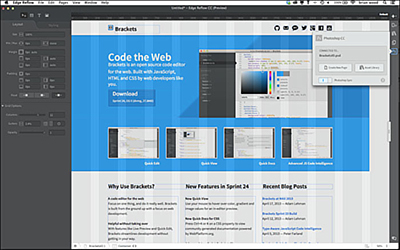
Figure 1 Edge Reflow in action
Let’s look at the workflow
So, let’s take a look at the Photoshop CC to Edge Reflow CC workflow.
- If you want to follow along, download a trial of Edge Reflow CC and Photoshop CC (if you don’t already have it). Also, download the demo Photoshop file towards the bottom of that same page (see Figure 2).
- Save the demo Photoshop file called BracketsIO.psd that you downloaded from the Edge Reflow site in step 1, in a folder on your hard drive. Open that .psd file in Photoshop CC.
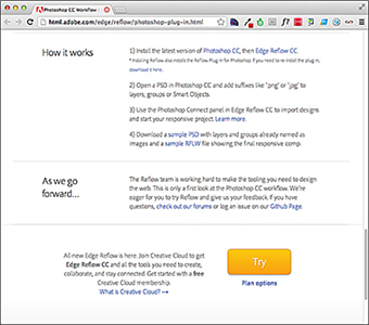
Figure 2 Download the programs (if necessary) and demo file.
Adobe Photoshop CC recently updated with a new feature called Adobe Generator. This allows you to create image assets in real time as you work, eliminating the tedious steps of copying, slicing and exporting each layer manually, and saving you time. This is going to come into play in the Edge Reflow workflow, as you’ll see.
Next, you’ll see how you need to set up your design file in Photoshop CC to be able to use that content in Edge Reflow.
- Look in the Layers panel in Photoshop CC, and you will see that some of the layers that contain vector and raster image content are named with an image extension, like “hero.png” (see Figure 3).
- .png (the default value is png32 with semi-transparent alpha), .png8, .png24, .png32
- .jpg (the default value: 9), .jpg(1-10), .jpg(1-100%)
- .gif
- 1-n%, (Number) px x (Number) px for scaling
- “logo.png” produces a png32 file
- “hero.jpg10” produces a 1x asset with max quality
- Choose File > Generate > Edge Reflow Project.
- Open the BracketsIO.rflw file by double-clicking, and it should open in Adobe Edge Reflow.
- Choose Source Sans Pro from the menu to replace Myriad Pro with Source Sans Pro.
- Click the Asset Library panel icon on the right side of the workspace to show the project assets. You should see all of the images that were generated from the named layers/groups in Photoshop. This panel is where you can delete an asset, update an asset, and relink to another asset (among other things).
- Grab the resize handle on the right side of the design area and drag it to the left.
- Drag the resize handle to roughly the 1000px mark on the horizontal ruler. Click the + to the far right of the ruler to add a media query breakpoint. A color bar appears above the ruler (mine is purple), and it has a number on the right that indicates the viewport width at that breakpoint.
- Drag the resize handle to roughly 768 px (for this exercise, don’t worry about it being exact). Click the + again to set another breakpoint.
- Click each of the color bars above the design (just above the ruler) to quickly change between the viewport sizes.
- Click the Photoshop CC Connect icon on the right side of the workspace, and you will see that the Edge Reflow project file is connected to the BracketsIO.psd file.
- In Edge Reflow, with the Photoshop CC Connect panel showing, click the Photoshop Sync button to enable the sync feature.
- Back in Photoshop CC, select the large “hero” image to the right of the “Code the web” heading. Choose Image > Adjustments > Invert. Leave the file open in Photoshop (you don’t have to save) and return to Edge Reflow.
- Notice the Asset Library panel icon now has a yield sign on it. Open the Asset Library panel and scroll to find the hero.jpg image. An update icon appears to the right of the name. Click the update icon to update the image in Edge Reflow.
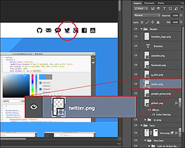
Figure 3 Setting up the layer and group naming
In order to generate web-optimized images from content in Photoshop, you need to rename the layers or layer groups you want to export, adding a web image extension like .png, .gif, or .jpg. So, for instance, if a layer were called “logo” and you wanted it to be a PNG8, you could name it as “logo.png8.”
Here are some examples:
Here are some examples of how tags can be used:
You can even go so far as to create multiple assets for each image. This can be useful for creating images for high-res and standard resolution displays; “200% logo-retina.png, logo.png” produces both a 2x (high-res) and a 1x (standard res) asset.
The Adobe Generator will be used to create the images used in Adobe Edge Reflow and make it so that we no longer have to slice in most cases.
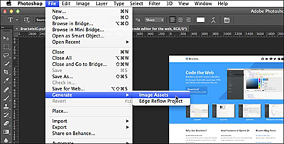
Figure 4 Use Adobe Generator to create image assets
Now that the image content is prepped in the Layers panel, you can create the Reflow project.
Look in the folder that contains the open psd (BracketsIO.psd). You will see a new folder called “BracketsIO-reflow.” This folder contains the Reflow project file called BracketsIO.rflw as well as the generated assets in a folder called “assets” (see Figure 5).
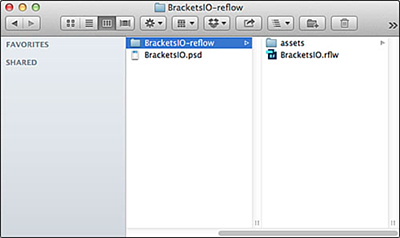
Figure 5 The Reflow project file and assets
You most likely will see a Replace Missing Fonts dialog box (see Figure 6). Edge Reflow allows you to access and work with the web fonts available with your Creative Cloud subscription (called Edge Web Fonts). If you used a Creative Cloud font by just syncing your Typekit fonts using the Creative Cloud to get them on your desktop, I found that they are currently not supported (this may change in the future).
The font “Myriad Pro” isn’t a supported web font, so you can either choose from one of the Edge Web Fonts (click the T+ or choose Manage Fonts from the menu) or by adding a Typekit ID.
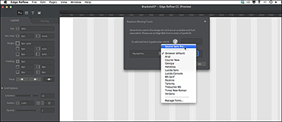
Figure 6 Replace a missing font
After fixing the missing fonts, the layout will be generated in Edge Reflow. This is just a starting point for you and may not mirror the Photoshop file exactly.
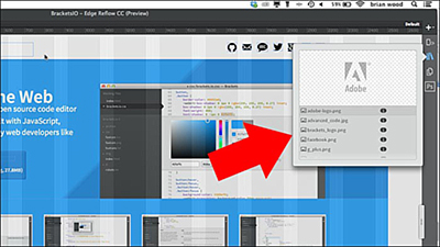
Figure 7 The assets generated for our Edge project by the Adobe Generator engine
At this point, you could go about selecting content in the design and making edits to get the design where you want it to be.
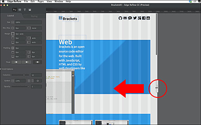
Figure 8 Resize the design
You will see the content shifting, some of it not the way you would want it to. The resize handle is how you see how the design appears in different viewport widths (think browser width). Currently the design view is set at 2500 px in width because that was the width of the Photoshop file. That is huge—and much wider than most screens. Our job is to design for all viewport widths so that the necessary content appears and that it looks good (and is easy to navigate).
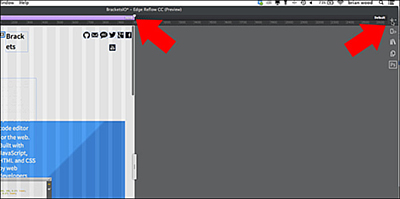
Figure 9 Set your first media query breakpoint
In responsive design, a media query is a way to indicate to the browser changes in CSS styling based on parameters like width or orientation (among others). We call these breakpoints because they are inserted to fix design and UI issues (among other things). Breakpoints come in major (like the three main device sizes—desktop, tablet, and mobile)—and minor sizes (a size where a small fix may be necessary).
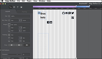
Figure 10 Set another breakpoint
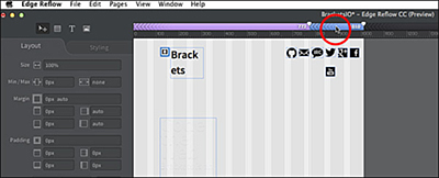
Figure 11 Navigate between breakpoints
The hard work comes in when you need to reconfigure the design to work at a specific viewport size (breakpoint). I would check out this Adobe TV video (and other videos on Adobe TV) to learn more about editing the responsive design.
These days, mobile-first design is all the rage, and it makes sense in most cases. Mobile-first means you design for mobile devices first, and then, based on that design and content, progressively enhance the design based on the viewport size and device (tablet vs. desktop sometimes). I wanted to mention this because the design Adobe offers is not geared towards mobile first. If you wanted to do this, you could design the Photoshop file at a mobile width (see Figure 12).
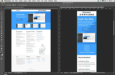
Figure 12 The desktop design version in Photoshop (left) and mobile design (right)
Another great feature of working with Photoshop CC is that you can create new pages based on other designs or update the assets (images) from the original Photoshop file on the fly.
One interesting thing to note is that whatever file is open in Photoshop, the panel in Edge Reflow will show that the project file is connected to that open file.
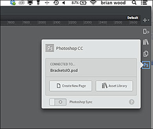
Figure 13 The Photoshop CC Connect panel
If you were to make a change to the BracketsIO.psd file in Photoshop, like a text or image change, that change would not be reflected in Edge Reflow, by default. If you do want to bring in the changes you made in Photoshop CC, you could click Create New Page to create a new page in Edge Reflow based on the current state of the open (and saved) Photoshop file. You can view the pages in your Reflow project by clicking the Pages icon above the Photoshop CC Connect icon.
By enabling the sync feature in Edge Reflow, we can update the image content based on the Photoshop file, which is what you’ll do next.
Now, if you make changes to the image content in the Photoshop file in Photoshop, it would update the asset in the Edge Reflow project. Any changes to content (like text made in Photoshop) won’t be updated in your Edge Reflow project.
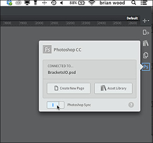
Figure 14 Enable sync with Photoshop CC
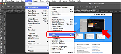
Figure 15 Make a change to an image in Photoshop
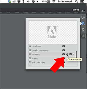
Figure 16 Update the asset in Edge Reflow
One last feature in the Photoshop CC Connect panel in Edge Reflow is the Asset Library Button. If you were to click the Asset Library button with our project open in Edge Reflow, the assets for the current project (in our case our images), would be added to the Reflow library and be available to other projects as well.
As I mentioned earlier, by default, there currently is no mechanism to export the content (HTML, CSS, etc.). BUT, if you preview in a browser from Edge Reflow, by choosing View > Preview in Chrome (for instance), the necessary content needed to preview the site in a browser (HTML, CSS, etc.) will be generated and put into the assets folder that is next to the Reflow project file. As a word of warning, this content (css, html) is not intended to be used as-is in a final production site. Currently it is set up for preview purposes only (but you could make it work if you or someone you work with knows what he or she is doing).