Case Study: Comcast
A leading provider of television, high-speed Internet, and digital voice services in the United States, Comcast uses qualitative and quantitative research to inform the iterative design process it applies to all aspects of its site.
Qualitative studies play a critical role in Comcast’s design process. Williamson noted that in one redesign process during 2012, “We had over a thousand customers and prospective customers involved before we tested online....We had ethnographic research, customer panels, and online customer panels.” The Comcast team also “went into the homes of over 20 customers and saw how they interacted with Comcast,” which provided “critical” experiences that analytics “data cannot replace.”
The following business case shows how insights gathered from qualitative studies triggered a redesign of the company’s “TV Options” page, which customers use when purchasing television service online. This section walks the reader through the redesign process from beginning to end, showing how the qualitative study findings led to the formulation of hypotheses and redesign options, and finally to the first tests and the selection of highly effective new designs.
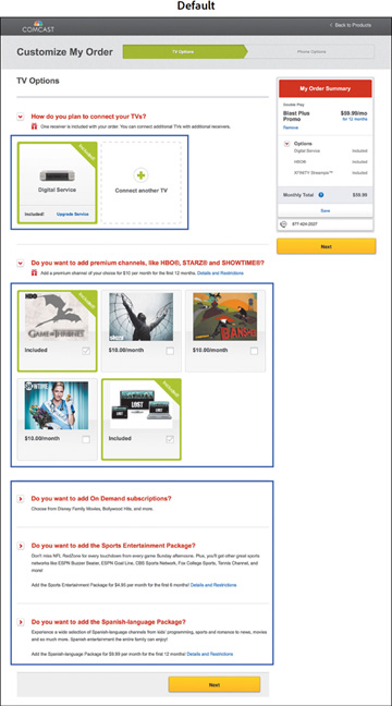
The goal of the “TV Options” page is to help customers choose their receiver type and to select service upgrades, such as premium channels. However, qualitative studies suggested three page elements were underperforming: receiver selection, premium channel logos, and other add-on options further down on the page. The default version of the page, with these three elements highlighted, appears in Figure 4.2.

Figure 4.2 The default page with three elements highlighted for testing.
The qualitative study findings related to these three elements and the steps researchers took in response are summarized here.
Finding. Not all customers interacted with the first step of the process to learn more about upgrading to an HD or HD DVR receiver.
- Hypothesis. Customers do not notice the option to upgrade a receiver.
- Validate with analytics. Does the link to upgrade the receiver get very few clicks?
- Test idea. Find out whether more customers would upgrade if more information about the options to switch to an HD or HD DVR receiver appeared on the page without requiring additional clicks.
Finding. All customers understood how to select and deselect premium channels, so this function seems user friendly. However, the website highlighted specific shows carried on these channels rather than the actual channels, and several customers commented that they hadn’t heard of these shows. Example: “I never heard of Boss. I never saw Contagion.”
- Hypothesis. Highlighting channel names rather than specific shows will clarify the process of adding premium channels.
- Validate with analytics. Do premium channel selections vary based on the featured shows?
- Test idea. To appeal to a wider audience, feature prominent channel names (HBO, Showtime, etc.) rather than specific shows.
Finding. Several customers commented that they didn’t know what was included in the add-ons. Example: “What exactly is included in the Sports Package?”
- Hypothesis. Customers don’t realize they can click on the toggle switches for more information. Because the switches are arranged in rows, followed by messaging for each add-on, customers may be mistaking them for bullet points.
- Validate with analytics. Do customers rarely click on these toggle switches?
- Test Idea. Replace individual offers with a one-line message reading “More customization options” to help customers understand that the image to the left is a toggle switch that, when clicked, will reveal the details of the offers.
As noted earlier, researchers targeted receiver selection, premium channel logos, and add-on content for design testing. An alternate version of each element was built and placed in a multivariable test (MVT). A multivariable, or multivariate, test is a special type of A/B test in which several page elements are tested across multiple recipes. Rather than simply testing two versions of the page—one with the original elements and one with the new ones—multiple versions of the page are tested, each including a different combination of the elements. In addition to determining which version of the page has the highest performance, this type of test measures the success of each element.
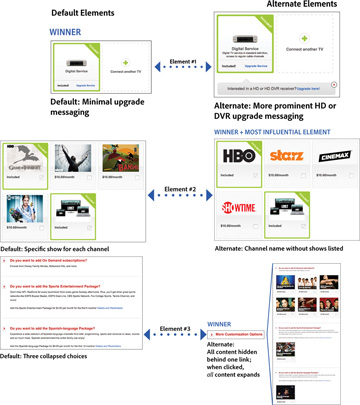
The default and alternate versions of each element are shown in Figure 4.3. This figure also includes which version of each element won and which out of all three elements most influenced the performance of the page:

Figure 4.3 The default and alternate versions of each of the three elements tested. This figure includes the winning version of each element, as well as the most influential of the three winning elements in terms of overall impact on the page.
- Receiver section. The default version has a blue link to upgrade. The alternate version adds a prominent message to upgrade to an HD or HD DVR receiver.
- Premium channel logos. The default version features a specific show for each premium channel. The alternate version features channel logos instead of shows.
- Other add-ons. The default version places content behind four toggle switches. The alternate version places content behind a single toggle switch, which, when clicked, expands to show all up-sell content at once.
The business goal was to increase the purchase conversion rate as well as the overall revenue per visitor (RPV). As Figure 4.3 shows, the winning version of the receiver selection element was not the new design but the original; however, the new versions emerged as winners for both the premium channel element and the add-ons further down on the page.
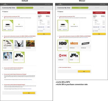
When Comcast integrated all three winning designs into the page and tested this revamped page against the original one, it found the changes drove a 4.6 percent lift in the purchase conversion rate and a 5.6 percent lift in RPV. The default and winning versions of the page are pictured in Figure 4.4.

Figure 4.4 The default version of the page next to the redesigned page, which contains all the winning elements.
Because the impact of each element had been isolated, Comcast was also able to measure how much each one influenced the performance of the final version of the page: The premium channel element was the most influential, accounting for over 60 percent of the increase in RPV, indicating that, of the three elements tested, it was the original version of this feature that had presented the largest obstacle to customers completing their goals.
The main recommendation was to push the winning version of the page to all visitors. Additional proposals included running follow-up design tests of each variable to further simplify the user experience, starting with the premium channel element, because it had emerged as the most important one overall.