Working with Alternate Layouts in Adobe Muse CC (2014 release)
Note: This excerpt does not include the lesson files. The lesson files are available with purchase of the book.
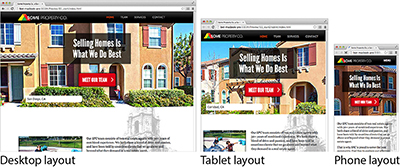
These days when you’re creating a website, you may need to consider which mobile devices the site will be viewed on. Adobe Muse allows you to create alternate layouts for each page of your site. Although this isn’t “responsive design,” which means the entire design detects and resizes to display optimally on the viewport size, it is a form of adaptive design.
Here’s how alternate layouts work in Adobe Muse: For the sake of simplicity, suppose you have a website with a single web page and you decide that you need the viewing experience to be optimal on desktop, mobile, and tablet devices. You can start with any of those design layouts, and then create versions for the other layouts. For every version you create, Adobe Muse will create another set of HTML pages. When a page is opened in a device, the correct page is opened, depending on the size of that device. Adobe Muse generates code for the site that includes detection scripts that identify which type of computer or device and which type of browser the visitor is using to access the page. The detection code then automatically displays the correct layout. You don’t have to do anything to ensure that visitors using a tablet will see the tablet layout and visitors using smartphones will see the phone layout. It all happens behind the scenes.
Why would you create alternate layouts for a mobile device? Often, a site designed with desktop viewing in mind has larger images and more information (images, scripts, etc.). Mobile devices that view your site tend to have slower processors and connection speeds. So sending all of the same larger images and content to a mobile device may make for a slower and less-than-optimal experience.
The mobile layout features in Adobe Muse enable you to optimize your mobile layouts so device users do not download larger files unnecessarily. The alternate layout allows you to serve up smaller, resized image files; therefore, the site performs well across all platforms and browsers.
First, you’ll explore the final site in your browser.
- Open a browser and type http://spc-mobile.businesscatalyst.com/ to open the site to preview what you’ll build.
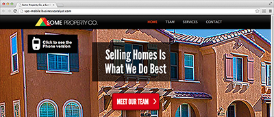
- On the home page of the site in the browser, click the “Click to see the phone version” link on the left side of the page to open a new browser window and to see an example of the phone version.
- Close the browser and return to Adobe Muse.
A desktop site may contain many additional pages with text and image content that might not be applicable to visitors using a mobile device. Before creating an alternate mobile or tablet layout from an existing desktop design, spend some time imagining the use cases for mobile visitors. Be aware that if you try to display all of the desktop content on a small device, it can become unmanageable and difficult for visitors to navigate. One of the skills you gain as you begin designing sites for tablets and smartphones is the ability to convey useful information that is easy to read using a simplified layout and larger buttons that mobile visitors can interact with on a touch screen.
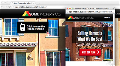
Figure 10-3 When the new browser window opens, you should see a smaller window that contains the phone layout. Explore the page to see how the menu works and the content on the pages.
The capability to create alternate layouts in Muse enables you to create a single Adobe Muse project file that includes up to three different layout designs to be displayed on the corresponding screen size. All three layouts use the same domain name (such as my-site.com), so you can distribute a single URL to promote the site.
Adding an alternate layout
To create a new mobile layout for a phone, for instance, you’ll first need to review the content of the existing site and determine which items are needed for the smartphone user experience. Because smartphone visitors are often on the go and are viewing the content on a small screen, it’s important to simplify the design and display only the content that is useful and easy to interact with on a touch screen.
Next, you’ll add an alternate layout to the SPC site so the user experience is optimal on phones.
- With the SPC site still open, make sure that Plan mode is showing.
- Click the + Phone button above the site map to create a new phone layout.
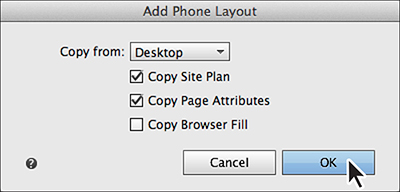
- In the Add Phone Layout dialog box, select the following options:
- Copy From: Desktop
- Copy Site Plan: Selected (the default setting)
- Copy Page Attributes: Selected (the default setting)
- Copy Browser Fill: Deselected (the default setting)
- Click OK.
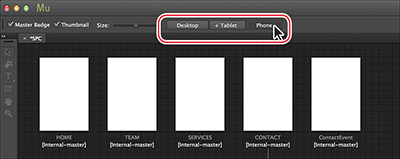
- In Plan mode, click the Desktop button to return to the Desktop site map. Click the Phone button to see the phone site map and page thumbnails.
- With the Phone site map showing, hover the pointer over the ContactEvent page thumbnail and click the X button in the upper-right corner of the page to delete it.
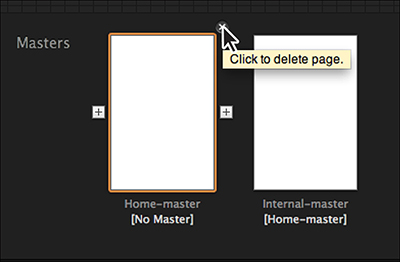
- Hover the pointer over the Home-master page and click the X button in the upper-right corner of the page to delete it. The Phone layout only needs one master page.
In Plan mode you’ll see three buttons above the site map thumbnails: Desktop, + Tablet, and + Phone. At the moment, the Desktop layout option is selected because that is the default layout for the site. You can create a new layout at any time by clicking the desired button. Layouts that have not yet been created display a plus (+) sign next to their name. In the case of the SPC site, the Desktop layout is the only one we have created.
Currently, you’ll only see the options None or Desktop because you only have a desktop layout. If you were to click the + Tablet button above the site map after adding the phone layout, you would be able to choose from either the Desktop or Phone layout. You can choose None if you want to create the new layout from scratch.
Notice the note that appears if you were to select Copy Browser Fill. Mobile layouts that appear on a phone typically have no or little padding. This means that the page area will most likely cover the browser fill unless the page has padding or the page area fill has some transparency.
Adobe Muse creates a site plan for the phone layout. Page names, the site’s structure, and attributes of the master page are copied over from the Desktop layout. The Phone button no longer displays a plus (+) sign next to its name, because the layout has been added to the Adobe Muse project.
Notice in the site map thumbnails that the page content from the original desktop pages is not added to the phone layout pages. That is intentional to allow you to copy just the content you actually want into each page of a mobile layout. As you copy the content from the Desktop layout that you want to add into each new page in the Phone layout, you can resize it to fit within the smaller dimensions of the mobile screen.
The same pages and master pages appear in both layouts now. On a mobile device, the user’s experience may not be exactly the same as viewing the site in a desktop browser. That means that some of the pages may not be necessary and content may be pared down a bit, depending on your design and preference.
When you’re deciding which content and pages to keep, you really need to consider the user experience on a mobile device. Some argue that it should mirror the desktop experience as much as possible, and others believe that it should simply display a synopsis of the content—so mobile users can get the important information and get out.
With the phone site map set up, you’re ready to begin designing the mobile experience.
